play icon for videos
Sopact Sense showing various features of the new data collection platform
Is your monitoring and evaluation ready for AI Age?

Continuous Monitoring and Evaluation

Build and deliver a rigorous monitoring and evaluation framework in weeks, not years. Learn step-by-step guidelines, tools, and examples—plus how Sopact Sense makes your data clean, connected, and ready for instant analysis.

Why Traditional Monitoring and Evaluation Fails

Mission-driven organizations spend years building complex M&E systems—yet still struggle with data duplication, delays, and incomplete insights.
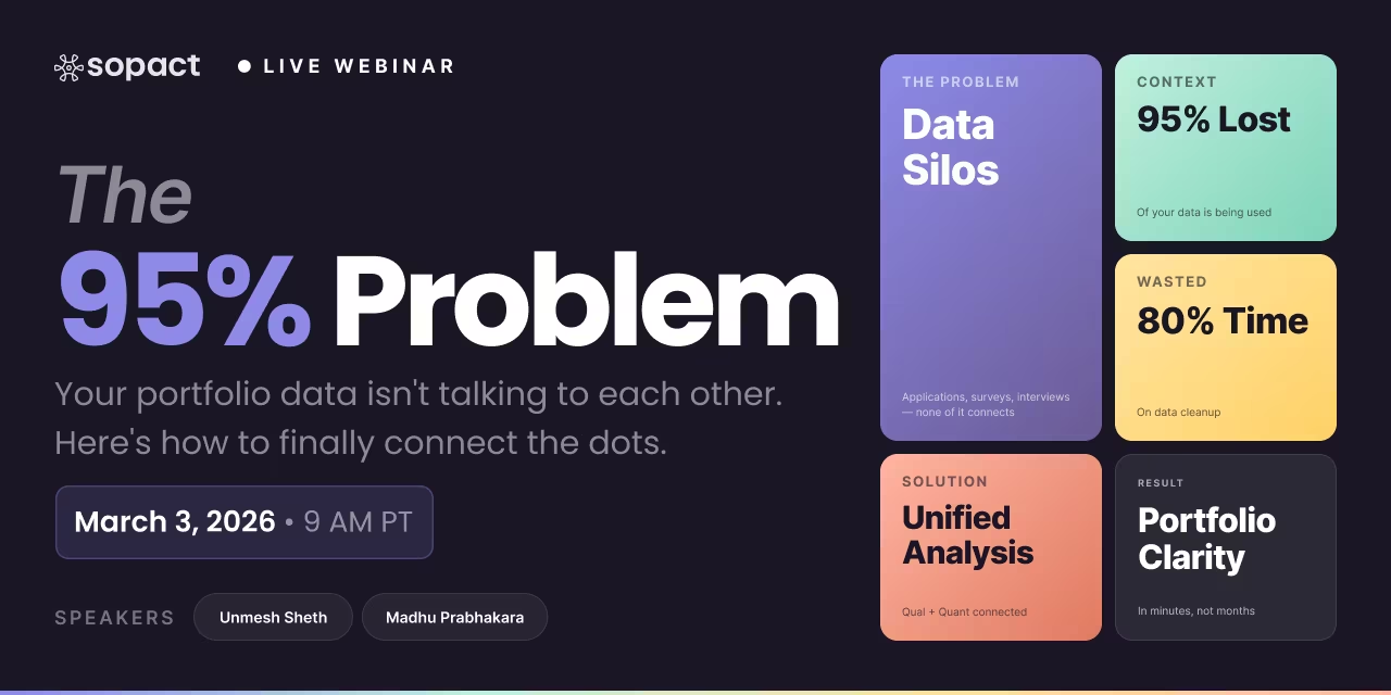
80% of analyst time wasted on cleaning: Data teams spend the bulk of their day fixing silos, typos, and duplicates instead of generating insights
Disjointed Data Collection Process: Hard to coordinate design, data entry, and stakeholder input across departments, leading to inefficiencies and silos
Lost in translation: Open-ended feedback, documents, images, and video sit unused—impossible to analyze at scale.

Time to Rethink Monitoring and Evaluation for Today’s Needs

Imagine M&E that evolves with your goals, prevents data errors at the source, and feeds AI-ready datasets in seconds—not months.
Upload feature in Sopact Sense is a Multi Model agent showing you can upload long-form documents, images, videos

AI-Native

Upload text, images, video, and long-form documents and let our agentic AI transform them into actionable insights instantly.
Sopact Sense Team collaboration. seamlessly invite team members

Smart Collaborative

Enables seamless team collaboration making it simple to co-design forms, align data across departments, and engage stakeholders to correct or complete information.
Unique Id and unique links eliminates duplicates and provides data accuracy

True data integrity

Every respondent gets a unique ID and link. Automatically eliminating duplicates, spotting typos, and enabling in-form corrections.
Sopact Sense is self driven, improve and correct your forms quickly

Self-Driven

Update questions, add new fields, or tweak logic yourself, no developers required. Launch improvements in minutes, not weeks.

Monitoring and Evaluation

A Complete Guide for Mission-Driven Organizations

Author: Unmesh Sheth — Founder & CEO, Sopact
Last updated: August 9, 2025

For mission-driven organizations, Monitoring and Evaluation (M&E) is more than a reporting requirement — it’s the foundation for understanding whether your programs are creating meaningful, lasting change. Done well, M&E turns data into actionable insights, ensuring resources are used effectively, strategies are adapted in real time, and stakeholders have clear evidence of impact.

In today’s environment, where funders, partners, and communities expect transparency, timeliness, and measurable results, traditional once-a-year evaluation reports are no longer enough. Opportunities for course correction can’t wait for the next annual PDF — they need to be acted on as soon as new information emerges.

That’s where continuous, AI-enabled M&E comes in. Platforms like [.c-sense-tooltip]Sopact Sense[.c-underline-blue][.c-underline-blue][.c-sense-tooltip-box][.c-sense-tooltip_triangle][.c-sense-tooltip_triangle][.c-sense-tooltip_logo][.c-sense-tooltip_logo][.c-text-16]Sopact Sense offers AI-powered surveys with built-in lightweight CRM and top-class qualitative data analytics using our very own AI agent.[.c-text-16][.c-sense-tooltip-box][.c-sense-tooltip] make it possible to collect, analyze, and share results in real time — without sacrificing data quality or context. Whether you’re managing a global health program, a local education initiative, or a cross-sector coalition, modern M&E ensures you can track progress, identify risks, and adapt strategies instantly.

Why Monitoring and Evaluation Is More Critical Than Ever

[.c-box-inline]How is M&E Guide is structured[.c-box-inline]

[.c-box-wrapper][.c-box]This guide covers core components of effective Monitoring and Evaluation, with practical examples, modern AI integrations, and downloadable resources. It’s divided into five parts for easy reading:[.c-box][.c-box-wrapper]

M&E Frameworks — Compare popular frameworks (Logical Framework, Theory of Change, Results Framework, Outcome Mapping) with modern AI-enabled approaches.

[.d-wrapper][.colored-blue]Indicators[.colored-blue][.colored-green]Data Collection[.colored-green][.colored-yellow]Survey[.colored-yellow][.colored-red]Analytics[.colored-red][.d-wrapper] 

  1. M&E Indicators — Understand input, output, outcome, and impact indicators, and how to design SMART, AI-analyzable indicators.
  2. Data Collection Methods — Explore quantitative, qualitative, mixed methods, and AI-augmented fieldwork techniques.
  3. Baseline to Endline Surveys — Learn how to design, integrate, and compare baseline, midline, and endline datasets.
  4. Real-Time Monitoring and Advanced Practices — Use dashboards, KPIs, templates, and AI alerts to keep programs on track.

[.c-highlighted]Monitoring and Evaluation Frameworks[.c-highlight-yellow][.c-highlight-yellow][.c-highlighted] Why Purpose Comes Before Process

Many mission-driven organizations embrace monitoring and evaluation (M&E) frameworks as essential tools for accountability and learning. At their best, frameworks provide a strategic blueprint—aligning goals, activities, and data collection so you measure what matters most and communicate it clearly to stakeholders. Without one, data collection risks becoming scattered, indicators inconsistent, and reporting reactive.

But here’s the caution: after spending hundreds of thousands of hours advising organizations, we’ve seen a recurring trap—frameworks that look perfect on paper but fail in practice. Too often, teams design rigid structures packed with metrics that exist only to satisfy funders rather than to improve programs. The result? A complex, impractical system that no one truly owns.

The lesson: The best use of M&E is to focus on what you can improve. Build a framework that serves you first—giving your team ownership of the data—rather than chasing the illusion of the “perfect” donor-friendly framework. Funders’ priorities will change; the purpose of your data shouldn’t.

Popular [.c-highlighted]M&E Frameworks[.c-highlight-yellow][.c-highlight-yellow][.c-highlighted] (and Where They Go Wrong)

  1. Logical Framework (Logframe)
    • Structure: A four-by-four matrix linking goals, outcomes, outputs, and activities to indicators.
    • Strength: Easy to summarize and compare across projects.
    • Limitation: Can become rigid; doesn’t adapt well to new priorities mid-project.
  2. Theory of Change (ToC)
    • Structure: A visual map connecting activities to short-, medium-, and long-term outcomes.
    • Strength: Encourages contextual thinking and stakeholder involvement.
    • Limitation: Can remain too conceptual without measurable indicators to test assumptions.
  3. Results Framework
    • Structure: A hierarchy from outputs to strategic objectives, often tied to donor reporting.
    • Strength: Directly aligns with funder expectations.
    • Limitation: Risks ignoring qualitative, context-rich insights.
  4. Outcome Mapping
    • Structure: Tracks behavioral, relational, or action-based changes in boundary partners.
    • Strength: Suited for complex, multi-actor environments.
    • Limitation: Less compatible with quick, numeric reporting needs.

From Framework to Practice: Continuous, Context-Specific Data

Using Sopact Sense, you can move beyond static, annual frameworks into a living M&E system:

  • Enrollment & Unique IDs: Each participant is registered as a contact with a unique ID, eliminating duplicates.
  • Context-Specific Forms: Mid-program and post-program feedback forms are linked to participants so each person can only respond once.
  • Real-Time Qualitative Analysis: Responses—whether surveys, interviews, or parent notes—are analyzed through Intelligent Cell™ to surface trends, red flags, and improvement areas instantly.
  • Continuous Updates: Instead of waiting for an end-of-year report, your framework becomes a dynamic dashboard that reflects ongoing progress and areas for action.

This approach keeps the framework flexible but purposeful—always anchored in improvement, not just compliance.

How AI-Enabled Frameworks Change the Game

Traditional frameworks are valuable, but they can be slow to adapt and limited in handling qualitative complexity. AI-enabled M&E frameworks solve these challenges by:

  • Dynamic Adaptation — Change indicators or evaluation criteria mid-project without re-importing or reformatting data.
  • Data Readiness from the Start — Unique IDs, relational links, and validation rules ensure clean, connected data.
  • Qualitative Integration — Intelligent Cell™ analyzes open-ended responses, PDFs, and transcripts, instantly coding them into framework-aligned categories.
  • Real-Time Reporting — Framework performance is visualized live in dashboards, not trapped in static PDFs.

Youth Program Mointoring and Evaluation Example

In the following example, you’ll see how a mission-driven organization uses Sopact Sense to run a unified feedback loop: assign a unique ID to each participant, collect data via surveys and interviews, and capture stage-specific assessments (enrollment, pre, post, and parent notes). All submissions update in real time, while Intelligent Cell™ performs qualitative analysis to surface themes, risks, and opportunities without manual coding.

[.c-button-green][.c-button-icon-content]Launch Evaluation Report[.c-button-icon][.c-button-icon][.c-button-icon-content][.c-button-green]


If your Theory of Change for a youth employment program predicts that technical training will lead to job placements, you don’t need to wait until the end of the year to confirm. With AI-enabled M&E, midline surveys and open-ended responses can be analyzed instantly, revealing whether participants are job-ready — and if not, why — so you can adjust training content immediately.

Live Example: Framework-Aligned Policy Assessment

Many organizations today face mounting pressure to demonstrate accountability, transparency, and measurable progress on complex social standards such as equity, inclusion, and sustainability. A consortium-led framework (similar to corporate racial equity or supply chain sustainability standards) has emerged, engaging diverse stakeholders—corporate leaders, compliance teams, sustainability officers, and community representatives. While the framework outlines clear standards and expectations, the real challenge lies in operationalizing it: companies must conduct self-assessments, generate action plans, track progress, and report results across fragmented data systems. Manual processes, siloed surveys, and ad-hoc dashboards often result in inefficiency, bias, and inconsistent reporting.

Sopact can automate this workflow end-to-end. By centralizing assessments, anonymizing sensitive data, and using AI-driven modules like Intelligent Cell and Grid, Sopact converts open-text, survey, and document inputs into structured benchmarks that align with the framework. In a supply chain example, suppliers, buyers, and auditors each play a role: suppliers upload compliance documents, buyers assess performance against standards, and auditors review progress. Sopact’s automation ensures unique IDs across actors, integrates qualitative and quantitative inputs, and generates dynamic dashboards with department-level and executive views. This enables organizations to move from fragmented reporting to a unified, adaptive feedback loop—reducing manual effort, strengthening accountability, and scaling compliance with confidence.

Next Step: From Framework to Practice

Step 1: Design a Data Collection From Framework

Build tailored surveys that map directly to your supply chain framework. Each partner is assigned a unique ID to ensure consistent tracking across assessments, eliminate duplication, and maintain a clear audit trail.

The real value of a framework lies in turning principles into measurable action. Whether it’s supply chain standards, equity benchmarks, or your own custom framework—bring your framework and we automate it. The following interactive assessments show how organizations can translate standards into automated evaluations, generate evidence-backed KPIs, and surface actionable insights—all within a unified platform.

[.c-button-green][.c-button-icon-content]Bring Your Framework[.c-button-icon][.c-button-icon][.c-button-icon-content][.c-button-green]

Step 2: Intelligent Cell → Row → Grid

Traditional analysis of open-text feedback is slow and error-prone. The Intelligent Cell changes that by turning qualitative data—comments, narratives, case notes, documents—into structured, coded, and scored outputs.

  • Cell → Each response (qualitative or quantitative) is processed with plain-English instructions.
  • Row → The processed results (themes, risk levels, compliance gaps, best practices) align under unique IDs.
  • Grid → Rows populate into a live, shareable grid that combines qual + quant, giving a dynamic, multi-dimensional view of patterns and causality.

This workflow makes it possible to move from raw narratives to real-time, mixed-method evidence in minutes.

Traditional vs. Intelligent Cell → Row → Grid

How mixed-method analysis shifts from manual coding and static dashboards to clean-at-source capture, instant qual+quant, and living reports.

Traditional Workflow

  • Capture: Surveys + transcripts in silos; IDs inconsistent.
  • Processing: Export, cleanse, de-duplicate, normalize — weeks.
  • Qual Analysis: Manual coding; word clouds; limited reliability.
  • Quant Analysis: Separate spreadsheets / BI models.
  • Correlation: Cross-referencing qual↔quant is ad-hoc and slow.
  • QA & Governance: Version chaos; uncontrolled copies.
  • Reporting: Static dashboards/PDFs; rework for each update.
  • Time / Cost: 6–12 months; consultant-heavy; high TCO.
  • Outcome: Insights arrive late; learning lags decisions.

Intelligent Cell → Row → Grid

  • Capture: Clean-at-source; unified schema; unique IDs for every record.
  • Cell (Per Response): Plain-English instruction → instant themes, scores, flags.
  • Row (Per Record): Qual outputs aligned with quant fields under one ID.
  • Grid (Portfolio): Live, shareable evidence stream (numbers + narratives).
  • Correlation: Qual↔quant links (e.g., scores ↔ confidence + quotes) in minutes.
  • QA & Governance: Fewer exports; role-based access; audit-friendly.
  • Reporting: Designer-quality, living reports—no rebuilds, auto-refresh.
  • Time / Cost: Days not months — ~50× faster, ~10× cheaper.
  • Outcome: Real-time learning; adaptation while programs run.
Tip: If you can’t tie every quote to a unique record ID, you’re not ready for mixed-method correlation.
Tip: Keep instructions human-readable (e.g., “Show correlation between test scores and confidence; include 3 quotes”).

The result is a self-driven M&E cycle: data stays clean at the source, analysis happens instantly, and both quantitative results and qualitative stories show up together in a single evidence stream.

Mixed Method in Action: Workforce Training Example

This flow keeps your Intelligent Cell → Row → Grid model clear, practical, and visually linked to the demo video.

From Months of Iterations to Minutes of Insight

Launch Report
  • Clean data collection → Intelligent Column → Plain English instructions → Causality → Instant report → Share live link → Adapt instantly.

Step 3: Review Automated AI Report for Deep Insights

Access a comprehensive AI-generated report that brings together qualitative and quantitative data into one view. The system highlights key patterns, risks, and opportunities—turning scattered inputs into evidence-based insights. This allows decision-makers to quickly identify gaps, measure progress, and prioritize next actions with confidence.

For example, above prompt will generate redflag if case number is not specified

From Months of Iterations to Minutes of Insight

Launch Report
  • Clean data collection → Intelligent Grid → Plain English instructions → Instant report → Share live link → Adapt instantly.

Key Takeaway

Whatever framework you choose — Logical Framework, Theory of Change, Results Framework, or Outcome Mapping — pairing it with an AI-native M&E platform like Sopact Sense ensures:

  • Cleaner, more reliable data.
  • Faster, more adaptive decision-making.
  • Integration of qualitative and quantitative insights in a single, unified system.

Monitoring and Evaluation Indicators

Why Indicators Are the Building Blocks of Effective M&E

In Monitoring and Evaluation, indicators are the measurable signs that tell you whether your activities are producing the desired change. Without well-designed indicators, even the most carefully crafted framework will fail to deliver meaningful insights.

In mission-driven organizations, indicators do more than satisfy reporting requirements — they are the early warning system for risks, the evidence base for strategic decisions, and the bridge between your vision and measurable results.

1. Input Indicators

Measure the resources used to deliver a program.
Example: Number of trainers hired, budget allocated, or materials purchased.

  • AI Advantage: Real-time tracking from finance and HR systems, automatically feeding into dashboards.

2. Output Indicators

Measure the direct results of program activities.
Example: Number of workshops held, participants trained, or resources distributed.

  • AI Advantage: Automated aggregation from attendance sheets or mobile data collection apps.

3. Outcome Indicators

Measure the short- to medium-term effects of the program.
Example: % increase in literacy rates, % of participants gaining employment.

  • AI Advantage: AI-assisted text analysis of open-ended surveys to quantify self-reported changes alongside numeric measures.

4. Impact Indicators

Measure the long-term, systemic change resulting from your interventions.
Example: Reduction in community poverty rates, improvement in public health metrics.

  • AI Advantage: AI can merge your program data with secondary datasets (e.g., census, health surveys) to measure broader impact.

Designing SMART Indicators That Are AI-Analyzable

A well-designed indicator should be Specific, Measurable, Achievable, Relevant, and Time-bound (SMART) — and in today’s context, it should also be AI-ready from the start.

AI-Ready Indicator Checklist:

  • Structured Format: Indicators should be stored in a way that links them to relevant activities, data sources, and reporting levels.
  • Clear Definitions: Include explicit scoring rubrics or coding schemes for qualitative measures.
  • Unique Identifiers: Use IDs to link indicators to specific data collection forms, contacts, or organizational units.
  • Metadata Tags: Assign category tags (e.g., gender, location, theme) so AI can filter and compare across groups.

Example: AI-Scorable Outcome Indicator

Indicator:
“% of participants demonstrating improved problem-solving skills after training.”

Traditional Approach:
Manually review post-training surveys with open-ended questions, coding responses by hand — often taking weeks.

AI-Enabled Approach with Sopact Sense:

  • Open-ended responses are analyzed by Intelligent Cell™ in seconds.
  • Responses are scored against a rubric (e.g., “Not Evident,” “Somewhat Evident,” “Clearly Evident”).
  • Scores are aggregated and compared to baseline in real time.

Avoiding Common Pitfalls in Indicator Design

  • Overloading with too many indicators: Focus on those most critical to decision-making.
  • Using vague language: Replace “improved skills” with measurable definitions.
  • Neglecting qualitative measures: AI makes qualitative scoring scalable — use it.
  • Not linking indicators to your framework: Ensure each indicator has a clear place in your Logical Framework, Theory of Change, or other model.

Live Example: Indicator-Aligned Assessment

Indicators are not just a reporting requirement — they are the nervous system of your M&E process. By making them SMART and AI-ready from the start, you enable:

  • Faster reporting with less manual coding.
  • Integrated analysis of quantitative and qualitative data.
  • Continuous learning and mid-course corrections.

Data Collection Methods for Monitoring and Evaluation

Why Data Collection Strategy Determines Evaluation Success

Even the best frameworks and indicators will fail if the data you collect is incomplete, biased, or inconsistent. For mission-driven organizations, choosing the right data collection methods is about balancing accuracy, timeliness, cost, and community trust.

With the growth of AI and digital tools, organizations now have more options than ever — from mobile surveys to IoT-enabled sensors — but also more decisions to make about what data to collect, how often, and from whom.

Quantitative vs. Qualitative Data Collection

Quantitative Methods

Collect numerical data that can be aggregated, compared, and statistically analyzed.
Examples:

  • Structured surveys with closed-ended questions
  • Administrative records (attendance, financial data)
  • Sensor readings (temperature, water flow, energy use)

Best For: Measuring scale, frequency, and progress against numeric targets.

Qualitative Methods

Capture rich, descriptive data that explains the “why” behind the numbers.
Examples:

  • In-depth interviews
  • Focus groups
  • Open-ended survey questions
  • Observations and field notes

Best For: Understanding perceptions, motivations, and barriers to change.

Mixed Methods

Combine quantitative and qualitative approaches to provide a more complete picture.
Example:
A youth leadership program collects attendance data (quantitative) alongside open-ended feedback on leadership confidence (qualitative). AI tools then link the two, revealing not just participation rates but also the quality of participant experiences.

Monitoring and Evaluation Template

Workforce Training

This downloadable template gives practitioners a complete, end-to-end structure for modern M&E—clean at the source, mixed-method by default, and ready for centralized analysis. It’s designed to compress the M&E cycle from months to days while improving evidence quality.

What’s inside the template (works across tools)

  • README_Instructions
    Step-by-step setup: create unique IDs, publish instruments (pre/post/follow-up), enforce capture validation, and enable live reporting.
  • Data_Dictionary
    Field-level schema for roster, sessions, assessments, and follow-ups. Includes types, allowed values, and which fields are required.
  • Roster
    Participant records with consent and cohort IDs (the backbone for joining quant + qual later).
  • Training_Sessions
    Session metadata and attendance tied to Participant_ID; built for completion/attendance metrics out of the box.
  • Pre_Assessment / Post_Assessment / Followup_30d
    Quantitative items (scores, Likert self-efficacy) and qualitative prompts (barriers, examples, outcomes) captured on the same record for true mixed-method analysis.
  • Indicators
    Ready-to-use definitions, numerators/denominators, disaggregation, frequency, and targets for:
    • Enrollment, Attendance Rate, Completion Rate
    • Score Gain, Confidence Gain
    • Placement Rate (30d), Wage (30d)
    • Qual Evidence Coverage
  • Analysis_Guide
    Plain-English instructions you can paste into your analysis/AI workflow to:
    1. extract & summarize narratives, 2) align & validate to the right ID,
    2. correlate & explain (numbers + quotes), 4) monitor & adapt over time.
      Includes example Excel formulas (XLOOKUP, COUNTIFS) for teams that analyze in spreadsheets.
  • Derived_Metrics
    Worked examples per participant (score/ confidence gains, completion, placement) so teams see how to move from raw data to decision-ready evidence—fast.
  • Reporting_Views
    Curated KPIs and evidence for program teams, funders, employers, and participants—ready to turn into living reports.
  • Governance
    Consent, privacy, access roles, QA, and retention practices embedded from the start (so quality is designed in, not cleaned later).

Monitoring and Evaluation Example

How to Use the Template

Below is a practical walkthrough for a Workforce Training cohort that shows exactly how the template is used end-to-end.

1) Centralize & ID

  • Create one project/workspace for the cohort.
  • Enforce unique IDs for participants, sessions, and responses.
  • Turn on required fields and list validations (Likert, employment status, consent).

2) Capture mixed-method data at the source

  • Publish Pre_Assessment (baseline test + confidence + “Why enroll?”).
  • Track Training_Sessions and Attendance for each participant.
  • Publish Post_Assessment (post test + confidence + “What barrier?” + “Give one example of applying skills”).
  • Run Followup_30d (employment status, wage, confidence now, “What changed?”).

3) Derive key metrics in minutes

  • Score Gain = Post_Test – Pre_Test
  • Confidence Gain = Confidence_After – Baseline_Confidence
  • Completion Rate = attended ≥ threshold
  • Placement (30d) = employed at 30 days
  • Wage (30d) = monthly wage (employed only)
  • Qual Evidence Coverage = % records with substantive quotes

4) Correlate numbers with narratives (no manual coding)

  • Ask your analysis engine:
    “Show relationship between Score Gain and Confidence Gain; include 3 representative quotes illustrating how skills were applied.”
  • Prompt to surface obstacles:
    “Cluster Open_Barrier responses, rank by frequency and impact, and map clusters to Completion and Placement (30d).”
  • Prompt to evidence outcomes:
    “From Open_Outcome and Open_Example_Application, extract one short quote per subgroup to illustrate improvements alongside KPIs.”

5) Share living reports by stakeholder

  • Program team: score/ confidence gains, barriers, attendance → iterate training content weekly.
  • Funders: placement, wage change, completion → attach 2–3 quotes per KPI for credibility.
  • Employers: skills attained, attendance, application examples → signal job readiness.
  • Participants: private progress snapshots → encourage completion and ongoing practice.

Result: you get credible, multi-dimensional insight while the program is still running—so you can adapt quickly, not after the fact.

Download the M&E Template & Example

Use this call-to-action block anywhere on your page. It’s lightweight, accessible, and matches your existing p-box style.

Download: Monitoring & Evaluation Template + Example

Download Excel

End-to-end workforce training workbook: clean-at-source capture, mixed-method assessments, ready-made indicators, derived metrics, and stakeholder reporting views.

Built to centralize data, align qual + quant under unique IDs, and compress analysis from months to minutes.

  • Roster, Sessions, Pre/Post/Follow-up with unique IDs
  • Indicators + Derived Metrics for fast, credible insight
  • Reporting views for program teams, funders, employers, participants
XLSX · One workbook · Practitioner-ready

Monitoring & Evaluation (M&E) — Detailed FAQ

Clean-at-source capture, unique IDs, Intelligent Cell → Row → Grid, and mixed-method analysis—how modern teams move from compliance to continuous learning.

What makes modern M&E different from the old “export–clean–dashboard” cycle?
Foundations

Data is captured clean at the source with unique IDs that link surveys, interviews, and stage assessments. Intelligent Cell turns open text into coded themes and scores; results align in the Row with existing quant fields, and the Grid becomes a live, shareable report that updates automatically. The outcome: decisions in days—not months.

50× faster10× lower costNumbers + narratives
  • Cell: Apply plain-English instructions (e.g., “Summarize; extract risk; include 2 quotes”). Output: themes, flags, scores.
  • Row: Cell outputs align with quant fields (same record ID). Missing items raise 🔴 flags.
  • Grid: All rows roll up into a living, shareable report (filters, comparisons, drill-downs).

This is mixed-method by default: every narrative is tied to measurable fields for instant correlation.

Validation happens at capture: formats, ranges, required fields, referential integrity, and ID linking. That makes data BI-ready and eliminates rework later. Teams stop rescuing data and start learning from it.

Yes—because every narrative is attached to the same unique record as your metrics. You can ask, “Show if confidence improved alongside test scores; include key quotes,” and see evidence in minutes.

  • Must-haves: centralization (no silos), clean-at-source, qual+quant in one schema, plain-English analysis, living reports, fair pricing.
  • Skip: bloated ToC diagrammers without data links, consultant-heavy dashboards, one-off survey tools that fragment your stack.

Attach ToC assumptions to real signals (themes, risks, outcomes by stage). The Grid becomes a feedback loop: assumptions verified or challenged by current evidence—not last year’s PDF.

Clean capture enforces consent, minimization, and role-based access at entry. Fewer exports = fewer uncontrolled copies. That’s lower risk and easier audits.

Teams compress a 6–12-month cycle into days by eliminating cleanup and manual coding. That translates to ~50× faster delivery and ~10× lower total cost of ownership.

  • Start: roster/CRM, survey capture, identity (unique IDs), analytics warehouse.
  • Later: bespoke ETL and pixel-perfect BI themes (after your core flow is stable).

Watch a short demo of designer-quality reports and instant qual+quant correlation:

https://youtu.be/u6Wdy2NMKGU