play icon for videos
Use case

AI-Powered Impact Reporting: From Clean Data Collection to Instant Insight

Traditional impact reporting takes months of manual work and still misses the “why” behind the numbers. With Sopact Sense, every response is linked, clean, and analyzed instantly—blending qualitative and quantitative feedback into decision-ready insights in minutes.

Impact reports are slow, manual and context-poor

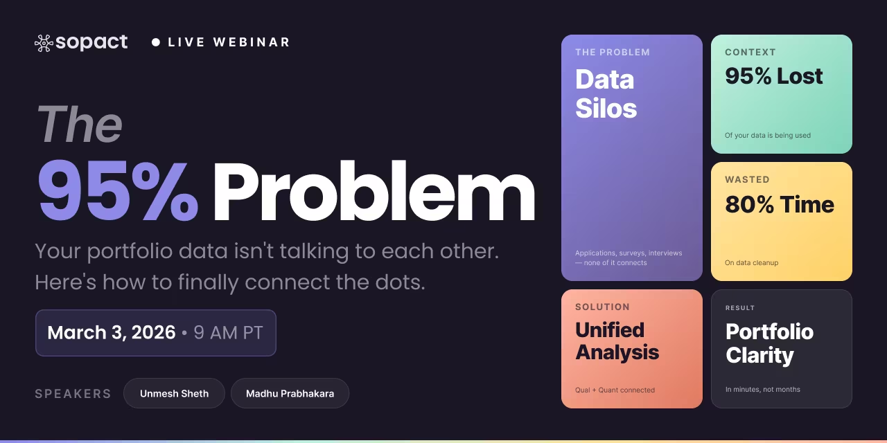
80% of time wasted on cleaning data
Fragmented data tools delay clean reporting pipelines.

Data teams spend the bulk of their day fixing silos, typos, and duplicates instead of generating insights.

Data teams spend the bulk of their day fixing silos, typos, and duplicates instead of generating insights.

Disjointed Data Collection Process
Qualitative narratives are ignored in numbers-only reports.

Hard to coordinate design, data entry, and stakeholder input across departments, leading to inefficiencies and silos.

Open-ended feedback—interviews, transcripts, stories—often doesn’t make it into dashboards, so the “why” behind outcomes remains hidden.

Lost in Translation
Static reports arrive too late to support action.

Open-ended feedback, documents, images, and video sit unused—impossible to analyze at scale.

By the time monthly/annual dashboards are completed, programs have changed, funder questions have shifted, and the report is already obsolete. Sopact

TABLE OF CONTENT

Author: Unmesh Sheth

Last Updated:

October 22, 2025

Impact Reporting

From Endless Dashboards to Self-Driven Insight, Why the Old Way Broke Down

In an era when funders, boards and community partners expect more than just numbers, impact reporting can no longer be a slow, static checkbox. Too often, organisations produce monthly or annual dashboards after months of manual work — and still miss the deeper story of why change happened and who it really affected.

With Sopact Sense, impact reporting evolves into a high-velocity, decision-ready process: the moment data is collected, it’s cleaned, linked, and analysed — integrating quantitative metrics and qualitative stories into one live, shareable report.

In this article, you will learn how to:

  1. Collect data built for clean, audit-ready analysis rather than post-fact cleanup.
  2. Link numbers and narratives so you can show what changed and why it mattered.
  3. Replace one-off PDFs with “living” reports that adapt to new questions in minutes.
  4. Automate frameworks, rubrics and themes so reporting is no longer a bottleneck.
  5. Use real-time insight to inform program design, strengthen board conversations and deepen funder trust.

For years, organizations accepted that impact reporting meant compromise. Months of manual cleanup and dashboard development produced reports that still fell short—delayed, fragmented, and missing the context funders and boards actually needed.

AI has changed the equation. By automating evaluation and assessment, Sopact transforms reporting from a labor-intensive task into a real-time, self-driven learning process. Each response becomes an insight the moment it’s collected, with both quantitative and qualitative context intact.

The shift isn’t just about speed—it’s about quality. During a recent implementation with Action on Poverty, Christine and Ha described the difference in stark terms. Christine paused her old survey entirely, saying Sopact’s reporting was so much stronger she’d rather wait for migration. Ha admitted what once took her hours in Google Sheets still wasn’t half as good as the instant reports she now receives.

That contrast captures the breakthrough: what once required months of effort for results that were only halfway there can now be delivered instantly—and at a far higher standard. Here’s proof in action: we just walked Action on Poverty—an organization we’ve worked with for six years—through the platform. In less than an hour, she built reports that used to take months of effort and heavy resources.

What Is an Impact Report?

An impact report is supposed to bridge data and decisions. Stakeholders — funders, boards, executives — ask for proof: metrics, breakdowns, outcomes. On paper, the request sounds simple. In practice, the process has been brutal.

The request lands on a data team or a consultant. They dig through messy spreadsheets, patch together SQL queries, and struggle with BI tools. Draft after draft disappoints, with numbers that don’t reconcile and context that’s missing. Ten, fifteen, even twenty iterations later, a “final” dashboard is declared ready. By then, months have passed, tens of thousands of dollars have been spent, and decisions have already been made.

That is the paradox of traditional impact reporting: built for accountability, delivered too late for agility. A report that should have been a steering wheel ends up as a rearview mirror.

Automating What Others Can’t

This is where Sopact is different. Whatever can be automated in evaluation and assessment, we automate.

  • Frameworks like IRIS+ or B Analytics, which once cost millions and years to operationalize, can now be mapped in days — with richer narrative context included.
  • Rubrics and Theory of Change models that consultants used to code manually can be auto-tagged and analyzed instantly.
  • Surveys, PDFs, and transcripts that would overwhelm legacy tools are processed in real time, linked directly to stakeholder IDs.
Here’s how it plays out. A funder asks for an updated impact report. Instead of kicking off months of IT work, the program manager opens Sopact Sense. The data is already clean at the source, every response linked to a unique ID. The manager types in plain English: “Executive summary with test score improvements, show confidence change pre→mid, include two participant quotes on challenges and wins.”

Minutes later, a designer-quality report appears. Quantitative trends sit side by side with qualitative evidence, every number linked back to its source. Instead of a static PDF, the manager shares a live link that can be regenerated on the fly. If the funder asks, “What about results by location?”, the manager simply updates the request and the system produces the answer.

This is the transformation: from endless dashboards to living insights. From dependency-driven reports to self-driven learning. From six-figure, consultant-heavy projects to automation that saves months, years, and budgets — while raising the quality standard beyond anything possible before.

Why Multi-Dimensional AI Automation Changes Everything

Traditional dashboards were one-dimensional. They showed numbers but rarely context. They looked polished but cracked the moment a new stakeholder request came in — a demographic cut, a cohort comparison, or the integration of participant stories. Each change required weeks of manual cleanup, SQL queries, and dashboard redesign. By the time the update was ready, the decision window was already gone.

Sopact replaces this brittle model with multi-dimensional AI automation. Instead of locking you into one format, the system adapts instantly across different layers of evaluation and assessment:

  • Documents & Reports (AI Cell): Extract insights from 5–100 page PDFs, interviews, or self-reported narratives. In minutes, long reports are summarized, coded, and converted into metrics.
  • Individual Participants (AI Row): See each person’s journey in plain language — skills gained, confidence shifts, or risk factors — without manual analysis.
  • Cross-Participant Patterns (AI Column): Compare survey results, track outcomes over time, or run “theme by demographic” matrices that once took months to analyze.
  • Cohorts & Programs (AI Grid): Build BI-ready reports that cross-analyze cohorts, interventions, and metrics. What once required consultants and six months of work now takes a single instruction.

This isn’t just about faster reporting. It’s about replacing static dashboards with living insights that combine numbers and narratives. A training program manager can now generate a polished, evidence-linked report in minutes, complete with quantitative trends and participant stories — the kind of analysis that previously required multiple consultants, expensive BI tools, and 10–20 iterations.

With multi-dimensional automation, evaluation shifts from compliance overhead to a continuous learning engine. Any evaluation task that can be automated — from rubric scoring to IRIS+ mapping — is now done better, faster, and at a fraction of the cost.

Report Library & Impact Report Template

Jumpstart your reporting with ready-to-use libraries or build customized templates tied directly to clean, evidence-based data.

Report Library

Browse a library of pre-built impact, program, and ESG reports. Every chart cites its source data and updates in real time.

Metric lineage Excerpt links Auto refresh

Impact Report Template

Use narrative-first templates that bind KPIs to themes and document evidence, ready to regenerate as rubrics evolve.

KPI ↔ drivers Version control Audit-ready

The Future of Impact Reporting

In the next five years, impact reports will become living documents. Funders will expect continuous updates, not annual snapshots. AI tools will allow donors to compare programs side by side: “Which initiative shows stronger confidence shifts in STEM education?”

Organizations that embrace self-driven, structured, and story-rich reporting will be discoverable, credible, and funded. Those that cling to static dashboards will be invisible.

Conclusion: Reports That Inspire

The old cycle—requirements, IT, vendors, Power BI, 20 iterations, months of delay—was exhausting. It drained resources and stifled learning.

The new cycle—self-driven, intelligent, flexible—puts control back in the hands of program teams. It turns raw data into living stories in minutes. It combines numbers with narratives, credibility with speed.

With Sopact, impact reporting is no longer a burden. It’s your most powerful way to inspire boards, funders, and communities—without the wait, without the cost, and without the endless cycle of dashboards.

Start with clean data. End with a story that inspires.

Impact Reporting — Frequently Asked Questions

What is impact reporting?

Impact reporting transforms raw program data into a story stakeholders can trust. It doesn’t just display numbers like score gains or retention rates—it pairs them with participant voices, quotes, and themes so decision-makers see both outcomes and experiences. Boards, funders, and program teams get a complete view in minutes rather than weeks.

Sopact’s approach anchors every claim with evidence: numbers show the “what,” stakeholder narratives explain the “why.” This combination builds confidence that results are real, actionable, and aligned with the mission.

Why do traditional impact dashboards take months and still feel stale?

Conventional dashboards depend on IT teams, external vendors, or consultants configuring tools like Power BI or Tableau. Every update means manual cleanup, SQL scripts, and rounds of revisions across 10–20 stakeholders. By the time the final version is ready, the program has already moved on.

The result is a dashboard that looks polished but delivers outdated insight. Sopact believes reporting must be continuous, not an afterthought tied to quarterly or annual cycles.

How does Sopact change the cycle?

Sopact collects clean, BI-ready data at the source using unique IDs that link quantitative and qualitative inputs. Our Intelligent Grid then generates a designer-quality report instantly—no IT tickets, vendor backlogs, or months of iteration required. The process reduces analysis time by 90% or more.

This lets program staff focus on using insights, not chasing data. Reports become living tools that evolve as soon as new information is added.

What is Intelligent Grid?

The Intelligent Grid is Sopact’s self-serve reporting layer. Users type plain-English instructions like “Executive summary with test score improvement; show confidence pre→mid; include participant positives and challenges.” The system assembles a complete, professional report automatically.

It’s like having a built-in analyst and designer in one—eliminating the endless back-and-forth with technical teams while ensuring every report reflects the questions that matter most today.

Can I mix qualitative and quantitative data in one report?

Yes. Sopact was built to unify both. Numeric fields like test scores, completion rates, or demographic counts sit directly alongside open-ended themes, sentiment analysis, and representative quotes. The report doesn’t force you to choose between “hard” numbers and “soft” stories—it integrates both seamlessly.

This combined view explains not just whether change happened, but why. It’s especially powerful for funders who expect outcomes to be credible and contextualized.

What does a great impact report include?

A strong report follows a proven structure: Executive Summary → Program Insights → Participant Experience → Confidence & Skills Shift → Opportunities to Improve → Overall Impact Story. Each section blends metrics with lived experiences so stakeholders see the full arc of progress.

Sopact reports build this structure automatically, ensuring consistency across cycles while leaving room to adapt to program-specific goals or funder requests.

How fast can I publish?

With Sopact, publication happens in minutes once data is collected. Reports are generated instantly and shared as live links—no static PDFs that go out of date the moment they’re sent. Stakeholders always have access to the latest version, reducing confusion over “which file is final.”

Fast turnaround also means insights are available during the program, not months afterward, allowing real-time course corrections.

Do I still need Power BI/Tableau/SQL?

Not to build or share reports. Sopact replaces the heavy lifting of dashboards with a narrative layer stakeholders actually read. If you already use BI stacks for deep technical analysis, you can keep them—but Sopact ensures frontline teams and funders don’t wait for IT or consultants to interpret results.

In practice, Sopact acts as the bridge: BI tools stay for technical drill-downs; Sopact delivers the immediate, human-readable story.

How does this help fundraising?

Speed plus credibility changes the funding conversation. Funders see timely outcomes, clear improvement areas, and real participant voices—all in one narrative. This shortens due diligence, demonstrates accountability, and builds trust that an organization can deliver and measure impact reliably.

Many Sopact clients report faster grant renewals and stronger donor relationships because reporting is no longer a bottleneck.

How do requirements changes get handled?

Sopact makes revisions simple. If stakeholders ask for a new demographic breakdown or a cohort comparison, you update the plain-English instruction and regenerate the report. No rebuilds, tickets, or waiting on developers—it’s immediate.

This flexibility ensures reports stay responsive to changing funder or board priorities without extra costs or delays.

Is data privacy addressed?

Yes. Reports can exclude personally identifiable information (PII), display only aggregated results, and be shared via secure, controlled links. Sensitive fields can be masked or omitted entirely, ensuring compliance with privacy standards.

Sopact’s design balances transparency with protection, so organizations build trust while safeguarding participant confidentiality.

What’s a concrete example of impact?

Girls Code, a workforce development program, used Sopact to generate a live impact report in minutes. The findings: +7.8 average test score improvement, 67% of participants built web apps by mid-program, and confidence moved from mostly “low” to 33% “high.” Funders could see the outcomes and the voices behind them without delay.

This is the kind of timely, evidence-based narrative that accelerates decisions and builds stronger partnerships.

Impact Reporting Examples

Sopact Sense generates hundreds of impact reports every day. These range from ESG portfolio gap analyses for fund managers to grant-making evaluations that turn PDFs, interviews, and surveys into structured insight. Workforce training programs use the same approach to track learner progress across their entire lifecycle.

The model is simple: design your data lifecycle once, then collect clean, centralized evidence continuously. Instead of months of effort and six-figure costs, you get accurate, fast, and deeper insights in real time. The payoff isn’t just efficiency—it’s actionable, continuous learning.

Here are a few examples that show what’s possible.

Training Reporting: Turning Workforce Data Into Real-Time Learning

Training reporting is the process of collecting, analyzing, and interpreting both quantitative outcomes (like assessments or completion rates) and qualitative insights (like confidence, motivation, or barriers) to understand how workforce and upskilling programs truly create change.

Traditional dashboards stop at surface-level metrics — how many people enrolled, passed, or completed a course. But real impact lies in connecting those numbers with human experience.

That’s where Sopact Sense transforms training reporting.

In this demo, you’ll see how Sopact Sense empowers workforce directors, funders, and data teams to go beyond spreadsheets and manual coding. Using Intelligent Columns™, the platform automatically detects relationships between metrics — such as test scores and open-ended feedback — in minutes, not weeks.

For example, in a Girls Code program:

  • The system cross-analyzes technical performance with participants’ confidence levels.
  • It reveals whether improved test scores translate into higher self-belief.
  • It identifies which learners persist longer and what barriers appear in free-text responses that traditional dashboards overlook.

The result is training evidence that’s both quantitative and qualitative, showing not just what changed but why.

This approach eliminates bias, strengthens credibility, and helps funders and boards trust the story behind your data.

Workforce Training — Continuous Feedback Lifecycle

Stage Feedback Focus Stakeholders Outcome Metrics
Application / Due Diligence Eligibility, readiness, motivation Applicant, Admissions Risk flags resolved, clean IDs
Pre-Program Baseline confidence, skill rubric Learner, Coach Confidence score, learning goals
Post-Program Skill growth, peer collaboration Learner, Peer, Coach Skill delta, satisfaction
Follow-Up (30/90/180) Employment, wage change, relevance Alumni, Employer Placement %, wage delta, success themes
Live Reports & Demos

Correlation & Cohort Impact — Launch Reports and Watch Demos

Launch live Sopact reports in a new tab, then explore the two focused demos below. Each section includes context, a report link, and its own video.

Correlating Data to Measure Training Effectiveness

One of the hardest parts of measuring training effectiveness is connecting quantitative test scores with qualitative feedback like confidence or learner reflections. Traditional tools can’t easily show whether higher scores actually mean higher confidence — or why the two might diverge. In this short demo, you’ll see how Sopact’s Intelligent Column bridges that gap, correlating numeric and narrative data in minutes. The video walks through a real example from the Girls Code program, showing how organizations can uncover hidden patterns that shape training outcomes.

🎥 Demo: Connect test scores with confidence and reflections to reveal actionable patterns.

Reporting Training Effectiveness That Inspires Action

Why do organizations struggle to communicate training effectiveness? Traditional dashboards take months and tens of thousands of dollars to build. By the time they’re live, the data is outdated. With Sopact’s Intelligent Grid, programs generate designer-quality reports in minutes. Funders and stakeholders see not just numbers, but a full narrative: skills gained, confidence shifts, and participant experiences.

Demo: Training Effectiveness Reporting in Minutes
Reporting is often the most painful part of measuring training effectiveness. Organizations spend months building dashboards, only to end up with static visuals that don’t tell the full story. In this demo, you’ll see how Sopact’s Intelligent Grid changes the game — turning raw survey and feedback data into designer-quality impact reports in just minutes. The example uses the Girls Code program to show how test scores, confidence levels, and participant experiences can be combined into a shareable, funder-ready report without technical overhead.

📊 Demo: Turn raw data into funder-ready, narrative impact reports in minutes.

Direct links: Correlation Report · Cohort Impact Report · Correlation Demo (YouTube) · Pre–Post Video

Perfect for:
Workforce training and upskilling organizations, reskilling programs, and education-to-employment pipelines aiming to move from compliance reporting to continuous learning.

With Sopact Sense, training reporting becomes a continuous improvement loop — where every dataset deepens insight, and every report becomes an opportunity to learn and act.

ESG Portfolio Reporting

Every day, hundreds of Impact/ESG reports are released. They’re long, technical, and often overwhelming. To cut through the noise, we created three sample ESG Gap Analyses you can actually use. One digs into Tesla’s public report. Another analyzes SiTime’s disclosures. And a third pulls everything together into an aggregated portfolio view. These snapshots show how impact reporting can reveal both progress and blind spots in minutes—not months.

And that's not all this good or bad evidence is already hidden in plain sight. Just click on report to see for yourself,

👉 ESG Gap Analysis Report from Tesla's Public Report
👉 ESG Gap Analysis Report from SiTime's Public Report
👉 Aggregated Portfolio ESG Gap Analysis

Automation-FirstClean-at-SourceSelf-Driven Insight

Standardize Portfolio Reporting and Spot Gaps Across 200+ PDFs Instantly.

Sopact turns portfolio reporting from paperwork into proof. Clean-at-source data flows into real-time, evidence-linked reporting—so when CSR transforms, ESG follows.

Why this matters: year-end PDFs and brittle dashboards miss context. With Sopact, every response becomes insight the moment it’s collected—quant + qualitative, linked to outcomes.

Impact Reproting Resouces

“Impact reports don’t have to take 6–12 months and $100K—today they can be built in minutes, blending data and stories that inspire action. See how at sopact.com/use-case/impact-report-template.”

Impact Report Design - Step by Step

Authoring rule: each section contains a short purpose line, one practical use case, and a 3–5 bullet sequence of best practices you can follow verbatim.

1) Organizational OverviewPurpose → Context
Purpose

Anchor the narrative with who you are and why your mandate matters to the communities or markets you serve.

Practical use case

A workforce nonprofit describes its mission to increase job placement for first-gen learners, citing partner employers and local scope.

Best practices
  • State mission, geography, populations served, portfolio in 3–4 lines.
  • Declare 1–3 north-star outcomes (e.g., placement, wage gain).
  • Reference governance and learning cadence.
2) Problem StatementWhy it matters
Purpose

Define the lived or systemic problem in plain language, with scale and stakes.

Practical use case

CSR team reframes supplier-site turnover (28%) as a cost and equity issue affecting delivery and local livelihoods.

Best practices
  • Add 1–2 baseline stats with a brief stakeholder vignette.
  • Clarify who’s most affected and where.
  • Tie the problem to mission or business risk.
3) Impact FrameworkTheory of Change
Purpose

Show how inputs → activities → outputs → outcomes → impacts connect and can be tested.

Practical use case

Impact investor maps capital + technical assistance to SME job creation, with documented thresholds and risks.

Best practices
  • Create a matrix linking key activities and associated outcomes.
  • Align to SDGs/ESG targets; list assumptions inline.
  • Mark short vs long-term outcomes distinctly.
4) Stakeholders & SDG AlignmentWho & Global Fit
Purpose

Make clear who benefits, who contributes, and how work links to global goals.

Practical use case

Program identifies learners (primary) and partners (secondary) mapped to SDG 4.4 and 8.5.

Best practices
  • Segment stakeholders logically.
  • Select 1–3 SDGs; avoid long lists.
  • Show how findings return to each group.
5) Choose a Storytelling PatternNarrative fit
Purpose

Match narrative structure to audience: Before/After, Feedback-Centered, or Framework-Based (ToC/IMP).

Practical use case

Feedback-Centered report elevates participant quotes with scores; board sees “what changed” and “why.”

Best practices
  • Pick one pattern and use it throughout.
  • Start each section with a one-line “so-what.”
  • Pair each visual with a short statement.
6) Focus on MetricsQuant + Qual
Purpose

Select a minimal, decision-relevant set of quantitative KPIs and qualitative dimensions.

Practical use case

Portfolio tracks placement rate, 90-day retention, wage delta; recurring themes (barriers/enablers), confidence shifts.

Best practices
  • Limit to 5–8 KPIs and 3–5 qual dimensions.
  • Define formulas and sources; skip vanity stats.
  • Every chart gets a supporting quote or theme.
7) Measurement MethodologyCredibility
Purpose

Explain tools, sampling, and analysis so reviewers trust results.

Practical use case

Mixed-method design: pre/post surveys + interviews; AI coding with analyst validation; audit trail kept.

Best practices
  • Name tools, timing, response rates.
  • Document coding, inter-rater reviews.
  • Call out known limits and bias handling.
8) Demonstrate CausalityWhy it worked
Purpose

Connect activities to outcomes with logic and converging evidence.

Practical use case

Peer practice plus mentor hours precede test gains; confidence and completion rise in tandem.

Best practices
  • Use pre/post, cohort comparisons.
  • Triangulate with metrics, themes, quotes.
  • State assumptions and alternate explanations.
9) Incorporate Stakeholder VoiceHuman context
Purpose

Ground numbers in lived experience so actions remain empathetic.

Practical use case

Entrepreneur quote links mentor match to buyer access, echoed in revenue gains.

Best practices
  • Get consent for quotes; tag by cohort/site.
  • Balance positive and critical voices.
  • Show changes made from feedback.
10) Compare Outcomes (Pre vs Post)Progress
Purpose

Show movement from baseline to follow-up, explaining drivers of change.

Practical use case

Pre: 42% “low confidence.” Post: 68% “high or very high.” Themes: structured practice, mentor access.

Best practices
  • Display deltas and confidence intervals.
  • Slice by cohort or site.
  • Pair shifts with strongest themes.
11) Impact AnalysisSynthesis
Purpose

Synthesize findings—flagging what was expected/unexpected and why it matters.

Practical use case

Evening cohort outperforms; surprise barrier: public transit reliability on two key routes.

Best practices
  • Pair every chart with a micro-summary or quote.
  • Flag outliers and known limits.
  • List recommended actions with owners and due dates.
12) Stakeholder ImprovementsIteration
Purpose

Document action steps and how you’ll measure effect.

Practical use case

Program introduces transit stipends, pilots mentor hours; monitors effect on engagement.

Best practices
  • List 3–5 actions with clear owners.
  • Define metrics for post-action review.
  • Commit to reporting back to all participants.
13) Impact SummariesExecutive view
Purpose

Provide a skimmable, decision-ready one-pager per section and for the whole report.

Practical use case

Summary page: 3 KPIs, 3 themes, 3 actions—plus a link to the full report.

Best practices
  • Max 9 bullets (3+3+3, theme/metric/action).
  • Use icons or chips, not paragraphs.
  • Reference the live report for drill-down.
14) Future GoalsWhat’s next
Purpose

Translate findings into cycle-specific goals, owners, and resources.

Practical use case

Expand evening cohort sites, +25% mentors, +10-point lift goal, and quarterly learning loop.

Best practices
  • Set 3–5 SMART goals with timelines.
  • Connect each to frameworks and risks.
  • Publish a cadence for review and feedback.

Storytelling Techniques — Step by Step

Clear guidance first. Example card always sits below to avoid squeeze on any screen.

  1. 01
    Name a focal unit early
    Anchor the story to a specific unit: one person, a cohort, a site, or a neighborhood. Kill vague lines like “everyone improved.” Specificity invites accountability and comparison over time. Tip: mention the unit in the first sentence and keep it consistent throughout.
    Example — Focal Unit
    We focus on Cohort C (18 learners) at Site B, Spring 2025.
    Before: Avg. confidence 2.3/5; missed sessions 3/mo.
    After: Avg. confidence 4.0/5; missed sessions 0/mo; assessment +36%.
    Impact: Cohort C outcomes improved alongside access and mentoring changes.
  2. 02
    Mirror the measurement
    Use identical PRE and POST instruments (same scale, same items). If PRE is missing, label it explicitly and document any proxy—don’t backfill from memory. Process: lock a 1–5 rubric for confidence; reuse it at exit; publish the instrument link.
    Example — Mirrored Scale
    Confidence (self-report) on a consistent 1–5 rubric at Week 1 and Week 12. PRE missing for 3 learners—marked “NA” and excluded from delta.
  3. 03
    Pair quant + qual
    Every claim gets a matched metric and a short quote or artifact (file, photo, transcript)—with consent. Numbers show pattern; voices explain mechanism. Rule: one metric + one 25–45-word quote per claim.
    Example — Matched Pair
    Metric: missed sessions dropped from 3/mo → 0/mo (Cohort C).
    Quote: “The transit pass and weekly check-ins kept me on track—I stopped missing labs and finished my app.” — Learner #C14 (consent ID C14-2025-03)
  4. 04
    Show the lever
    Spell out what changed: stipend, hours of mentoring, clinic visits, device access, language services. Don’t hide the intervention—name it and quantify it. If several levers moved, list them and indicate timing (Week 3: transit; Week 4: laptop).
    Example — Intervention Detail
    Levers added: Transit pass (Week 3) + loaner laptop (Week 4) + 1.5h/wk mentoring (Weeks 4–12).
  5. 05
    Explain the “why”
    Add a single sentence on mechanism that links the lever to the change. Keep it causal, not mystical. Format: lever → mechanism → outcome.
    Example — Mechanism Sentence
    “Transit + mentoring reduced missed sessions by removing commute barriers and adding weekly accountability.”
  6. 06
    State your sampling rule
    Be explicit about how examples were chosen: “two random per site,” or “top three movers + one null.” Credibility beats perfection. Publish the rule beside the story—avoid cherry-pick suspicion.
    Example — Sampling
    Selection: 2 random learners per site (n=6) + 1 largest improvement + 1 no change (null) per cohort for balance.
  7. 07
    Design for equity and consent
    De-identify by default; include names/faces only with explicit, revocable consent and a clear purpose. Note language access and accommodations used. Track consent IDs and provide a removal pathway.
    Example — Consent & Equity
    Identity: initials only; face blurred. Consent: C14-2025-03 (revocable). Accommodation: Spanish-language mentor sessions; SMS reminders.
  8. 08
    Make it skimmable
    Open each section with a 20–40-word summary that hits result → reason → next step. Keep paragraphs short and front-load key numbers. Readers decide in 5 seconds whether to keep going—earn it.
    Example — 30-Word Opener
    Summary: Cohort C cut missed sessions from 3/mo to 0/mo after transit + mentoring. We’ll expand transit to Sites A and D next term and test weekend mentoring hours.
  9. 09
    Keep an evidence map
    Link each metric and quote to an ID/date/source—even if the source is internal. Make audits boring by being diligent. Inline bracket format works well in public pages.
    Example — Evidence References
    Missed sessions: 3→0 [Metric: ATTEND_COH_C_MAR–MAY–2025]. Quote C14 [CONSENT:C14-2025-03]. Mentoring log [SRC:MENTOR_LOG_Wk4–12].
  10. 10
    Write modularly
    Use repeatable blocks so stories travel across channels: Before, After, Impact, Implication, Next step. One clean record should power blog, board, CSR, and grant. Consistency beats cleverness when scale matters.
    Example — Reusable Blocks
    Before: Confidence 2.3/5; missed sessions 3/mo.
    After: Confidence 4.0/5; missed 0/mo; assessment +36%.
    Impact: Access + mentoring improved persistence and scores.
    Implication: Funding for transit delivers outsized attendance gains.
    Next step: Extend transit to Sites A & D; A/B test weekend mentoring.
Comprehensive Survey Analysis Methods Comparison
Comprehensive Guide

Survey Analysis Methods: Complete Use Case Comparison

Match your analysis needs to the right methodology—from individual data points to comprehensive cross-table insights powered by Sopact's Intelligent Suite

Method
Primary Use Cases
When to Use
Sopact Solution
NPS Analysis Net Promoter Score
Customer loyalty tracking, stakeholder advocacy measurement, referral likelihood assessment, relationship strength evaluation
When you need to understand relationship strength and track loyalty over time. Combines single numeric question (0-10) with open-ended "why?" follow-up to capture both score and reasoning.
Intelligent Cell+ Open-text analysis
CSAT Analysis Customer Satisfaction
Interaction-specific feedback, service quality measurement, transactional touchpoint evaluation, immediate response tracking
When measuring satisfaction with specific experiences—support tickets, purchases, training sessions. Captures immediate reaction to discrete interactions rather than overall relationship sentiment.
Intelligent Row+ Causation analysis
Program Evaluation Pre-Post Assessment
Outcome measurement, pre-post comparison, participant journey tracking, skills/confidence progression, funder impact reporting
When assessing program effectiveness across multiple dimensions over time. Requires longitudinal tracking of same participants through intake, progress checkpoints, and completion stages with unique IDs.
Intelligent Column+ Time-series analysis
Open-Text Analysis Qualitative Coding
Exploratory research, suggestion collection, complaint analysis, unstructured feedback processing, theme extraction from narratives
When collecting detailed qualitative input without predefined scales. Requires theme extraction, sentiment detection, and clustering to find patterns across hundreds of unstructured responses.
Intelligent Cell+ Thematic coding
Document Analysis PDF/Interview Processing
Extract insights from 5-100 page reports, consistent analysis across multiple interviews, document compliance reviews, rubric-based assessment of complex submissions
When processing lengthy documents or transcripts that traditional survey tools can't handle. Transforms qualitative documents into structured metrics through deductive coding and rubric application.
Intelligent Cell+ Document processing
Causation Analysis "Why" Understanding
NPS driver analysis, satisfaction factor identification, understanding barriers to success, determining what influences outcomes
When you need to understand why scores increase or decrease and make real-time improvements. Connects individual responses to broader patterns to reveal root causes and actionable insights.
Intelligent Row+ Contextual synthesis
Rubric Assessment Standardized Evaluation
Skills benchmarking, confidence measurement, readiness scoring, scholarship application review, grant proposal evaluation
When you need consistent, standardized assessment across multiple participants or submissions. Applies predefined criteria systematically to ensure fair, objective evaluation at scale.
Intelligent Row+ Automated scoring
Pattern Recognition Cross-Response Analysis
Open-ended feedback aggregation, common theme surfacing, sentiment trend detection, identifying most frequent barriers
When analyzing a single dimension (like "biggest challenge") across hundreds of rows to identify recurring patterns. Aggregates participant responses to surface collective insights.
Intelligent Column+ Pattern aggregation
Longitudinal Tracking Time-Based Change
Training outcome comparison (pre vs post), skills progression over program duration, confidence growth measurement
When analyzing a single metric over time to measure change. Tracks how specific dimensions evolve through program stages—comparing baseline (pre) to midpoint to completion (post).
Intelligent Column+ Time-series metrics
Driver Analysis Factor Impact Study
Identifying what drives satisfaction, determining key success factors, uncovering barriers to positive outcomes
When examining one column across hundreds of rows to identify factors that most influence overall satisfaction or success. Reveals which specific elements have the greatest impact.
Intelligent Column+ Impact correlation
Mixed-Method Research Qual + Quant Integration
Comprehensive impact assessment, academic research, complex evaluation, evidence-based reporting combining narratives with metrics
When combining quantitative metrics with qualitative narratives for triangulated evidence. Integrates survey scores, open-ended responses, and supplementary documents for holistic, multi-dimensional analysis.
Intelligent Grid+ Full integration
Cohort Comparison Group Performance Analysis
Intake vs exit data comparison, multi-cohort performance tracking, identifying shifts in skills or confidence across participant groups
When comparing survey data across all participants to see overall shifts with multiple variables. Analyzes entire cohorts to identify collective patterns and group-level changes over time.
Intelligent Grid+ Cross-cohort metrics
Demographic Segmentation Cross-Variable Analysis
Theme analysis by demographics (gender, location, age), confidence growth by subgroup, outcome disparities across segments
When cross-analyzing open-ended feedback themes against demographics to reveal how different groups experience programs differently. Identifies equity gaps and targeted intervention opportunities.
Intelligent Grid+ Segmentation analysis
Program Dashboard Multi-Metric Tracking
Tracking completion rate, satisfaction scores, and qualitative themes across cohorts in unified BI-ready format
When you need a comprehensive view of program effectiveness combining quantitative KPIs with qualitative insights. Creates executive-level reporting that connects numbers to stories.
Intelligent Grid+ BI integration

Selection Strategy: Your survey type doesn't lock you into one method. Most effective analysis combines approaches—for example, using NPS scores (Intelligent Cell) with causation understanding (Intelligent Row) and longitudinal tracking (Intelligent Column) together. The key is matching analysis sophistication to decision requirements, not survey traditions. Sopact's Intelligent Suite allows you to layer these methods as your questions evolve.

Intelligent Suite Capabilities by Layer

Intelligent Cell

  • PDF document analysis (5-100 pages)
  • Interview transcript processing
  • Summary extraction
  • Sentiment analysis
  • Thematic coding
  • Rubric-based scoring
  • Deductive coding frameworks

Intelligent Row

  • Individual participant summaries
  • Causation analysis ("why" understanding)
  • Rubric-based assessment at scale
  • Application/proposal evaluation
  • Compliance document reviews
  • Contextual synthesis per record

Intelligent Column

  • Open-ended feedback aggregation
  • Time-series outcome tracking
  • Pre-post comparison metrics
  • Pattern recognition across responses
  • Satisfaction driver identification
  • Barrier frequency analysis

Intelligent Grid

  • Cohort progress comparison
  • Theme × demographic analysis
  • Multi-variable cross-tabulation
  • Program effectiveness dashboards
  • Mixed-method integration
  • BI-ready comprehensive reports

Real-World Application: A workforce training program might use Intelligent Cell to extract confidence levels from open-ended responses, Intelligent Row to understand why individual participants succeeded or struggled, Intelligent Column to track how average confidence shifted from pre to post, and Intelligent Grid to create a comprehensive funder report showing outcomes by gender and location. This layered approach transforms fragmented data into actionable intelligence.

From Months to Minutes with AI-Powered Reporting

AI-ready data collection and analysis mean insights are available the moment responses come in—connecting narratives and metrics for continuous learning, not one-off reports.
Upload feature in Sopact Sense is a Multi Model agent showing you can upload long-form documents, images, videos

AI-Native

Upload text, images, video, and long-form documents and let our agentic AI transform them into actionable insights instantly.
Sopact Sense Team collaboration. seamlessly invite team members

Smart Collaborative

Enables seamless team collaboration making it simple to co-design forms, align data across departments, and engage stakeholders to correct or complete information.
Unique Id and unique links eliminates duplicates and provides data accuracy

True data integrity

Every respondent gets a unique ID and link. Automatically eliminating duplicates, spotting typos, and enabling in-form corrections.
Sopact Sense is self driven, improve and correct your forms quickly

Self-Driven

Update questions, add new fields, or tweak logic yourself, no developers required. Launch improvements in minutes, not weeks.