

Sopact is a technology based social enterprise committed to helping organizations measure impact by directly involving their stakeholders.
Useful links
Copyright 2015-2025 © sopact. All rights reserved.

New webinar on 3rd March 2026 | 9:00 am PT
In this webinar, discover how Sopact Sense revolutionizes data collection and analysis.
Modern evaluation tools use AI to centralize data, analyze qual+quant simultaneously, and deliver insights in minutes instead of months.
Author: Unmesh Sheth
Last Updated:
February 13, 2026
Founder & CEO of Sopact with 35 years of experience in data systems and AI
Evaluation doesn't have to take months. Discover how AI-native tools automate frameworks and turn fragmented data into instant insights.
Most organizations collect plenty of evaluation data—surveys, interviews, reports, assessments. The problem isn't a lack of information. It's that traditional evaluation tools fragment your data, delay your insights, and miss the connections between what changed and why it changed.
Modern evaluation has evolved beyond static surveys and manual coding. AI-native platforms now automate entire evaluation frameworks, transforming data collection from a compliance burden into a strategic advantage. This shift enables continuous learning loops where insights arrive in time to improve programs, not just report on them.
Let's start with the foundation: understanding which evaluation tools work best for different questions.
Most evaluations fail because they use only one data type. The strongest evidence comes from combining all three approaches.
"How many? How much? How often?"
"Why? How did it feel? What changed?"
"What changed AND why did it happen?"
Quantitative tells you what happened. Qualitative explains why it happened. Mixed methods prove the connection—making evaluation both credible and actionable.
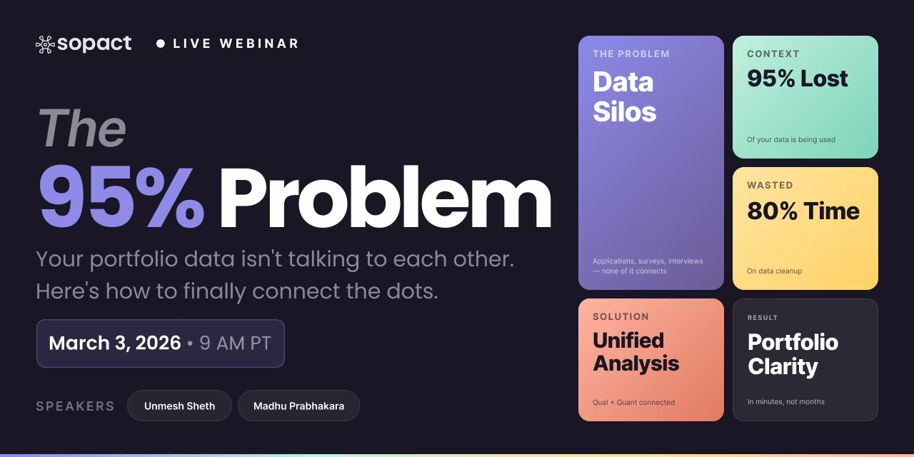
The problem isn't your questions—it's the systems that fragment, delay, and obscure your data. Here are the four gaps that waste 80% of analysis time.
Different tools, spreadsheets, CRMs, and portals create duplicate records, conflicting fields, and version drift. When it's time to answer "Did outcomes improve?" analysts spend days reconciling files instead of analyzing impact.
Even well-designed surveys end up with partial responses, skipped sections, or missing follow-ups. If your tool stops at collection, you're on your own to chase respondents or validate fields across timepoints.
Surveys give you scores. Leaders want to know why scores moved. Most platforms treat open-ended responses and documents as afterthoughts: basic sentiment at best, little thematic analysis, no rubric scoring to make narratives comparable.
Even when data is rich, manual cleaning, coding, and stitching across systems can take weeks. By the time the report arrives, the moment to act has passed.
If you answer "yes" to two or more, you likely need to modernize your evaluation stack:
Common questions about modern evaluation tools and AI-native approaches.
AI-native tools embed intelligence throughout the entire workflow—from data collection to analysis to reporting—rather than bolting AI onto legacy systems. They maintain unique participant IDs automatically, analyze qualitative and quantitative data simultaneously, and update insights in real-time as new data arrives. Traditional tools with "AI features" still require manual data cleaning, separate analysis steps, and delayed reporting.
If your framework has repeatable manual processes—like rubric scoring, thematic coding, or compliance checks—automation typically takes 1-3 weeks to configure and test. The key requirement is clarity: clearly defined evaluation criteria, consistent data collection points, and documented decision rules. Once automated, processes that took weeks happen in minutes.
AI doesn't replace human judgment—it scales it by applying your evaluation criteria consistently across hundreds or thousands of responses. You still define what "high confidence" means, which themes matter, and how to score readiness. AI then applies those definitions uniformly, surfaces patterns you'd miss manually, and flags edge cases for human review. Think of it as having a tireless analyst who never gets fatigued or biased but still needs your expertise to set direction.
Each layer analyzes data at a different scale: Cell extracts insights from individual documents or responses (like a 50-page report), Row summarizes each participant's complete journey, Column identifies patterns across one metric for all participants (like finding the most common barrier), and Grid creates cross-metric dashboards that compare cohorts. Together, they provide 360-degree analysis from individual stories to program-wide trends.
AI-native systems build data completeness into the workflow through automated reminders, unique correction links tied to each participant, and validation checks before analysis begins. Instead of discovering gaps after data collection closes, you get real-time alerts about missing fields and can re-engage participants using their unique links. This reduces bias from incomplete responses and ensures comparisons across cohorts remain valid.
Not necessarily—most organizations keep their core questions and frameworks. The shift is in how data is structured and connected: adding unique participant IDs, linking surveys across timepoints, and designing for both quantitative and qualitative analysis from the start. Modern tools adapt to your evaluation approach while eliminating fragmentation, not forcing you to adopt a completely new methodology.