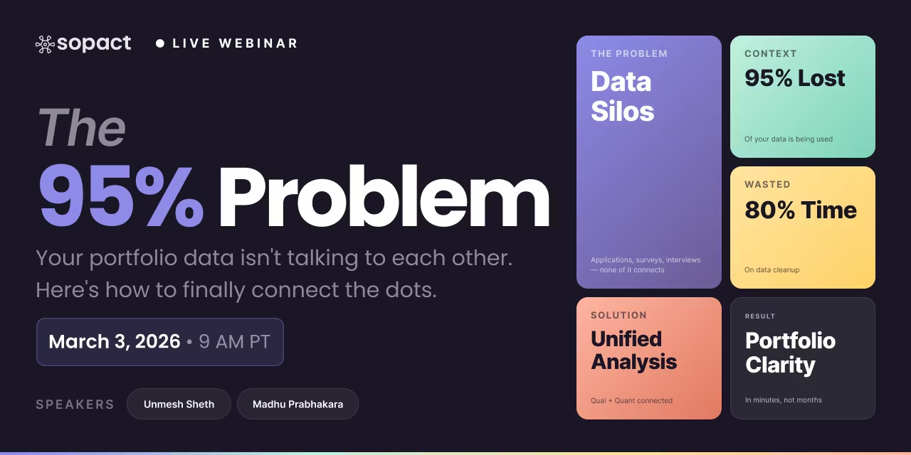
New webinar on 3rd March 2026 | 9:00 am PT
In this webinar, discover how Sopact Sense revolutionizes data collection and analysis.
Build a DEI dashboard that connects qualitative employee feedback with quantitative diversity data. Learn dashboard architecture, KPI selection, and real-time reporting
TL;DR: A DEI dashboard consolidates diversity, equity, and inclusion data into a single visual interface — but most organizations build dashboards that only display quantitative headcounts while ignoring the qualitative employee feedback that explains why numbers change. AI-native platforms like Sopact Sense solve this by combining demographic data, survey responses, and open-ended feedback into unified real-time dashboards that surface both the "what" and the "why." The result: DEI teams move from quarterly static reports to continuous intelligence that drives action, not just compliance.
A DEI dashboard is a centralized visual interface that displays diversity, equity, and inclusion data in real time — combining demographic breakdowns, survey scores, and qualitative feedback into one view. Unlike static DEI reports delivered quarterly, a dashboard updates continuously as new data flows in, enabling teams to spot trends and act before problems compound.
The core purpose of any diversity metrics dashboard is to make invisible patterns visible. Most organizations already collect the raw data — HRIS demographics, engagement surveys, exit interviews, promotion records — but that data lives in disconnected systems. A well-designed DEI dashboard connects these sources and surfaces the relationships between them: which departments are losing diverse talent, where pay gaps exist, and what employees actually say about inclusion in their own words.
For a detailed breakdown of which specific metrics to track, see our companion guide on DEI metrics. This article focuses on how to design, build, and operationalize the dashboard layer that turns those metrics into continuous insight.
Bottom line: A DEI dashboard transforms scattered diversity data into a unified visual system that enables real-time monitoring and faster decision-making.
Most DEI dashboards fail because they visualize only quantitative headcounts — representation percentages, hiring ratios, turnover rates — without connecting those numbers to the qualitative employee experience data that explains why those numbers move. The result is a dashboard that tells you what happened but never why it happened or what to do next.
Traditional DEI dashboards pull demographic data from HRIS systems and display pie charts of representation by department, level, or location. These charts answer surface-level questions ("What percentage of directors are women?") but provide no insight into the employee experience driving those numbers. A retention dashboard showing 22% attrition among Black employees is useless without the exit interview themes explaining why they leave.
Open-ended survey responses, interview transcripts, and employee feedback contain the richest DEI insights — but traditional dashboard tools cannot process unstructured text. Organizations either ignore this data entirely or assign analysts to manually read and code hundreds of responses, a process that takes weeks and introduces human bias. By the time themes are identified, the data is already stale.
Many organizations build DEI dashboards that refresh quarterly or annually, tied to the reporting cadence of their survey analysis process. This means problems that emerge between reporting cycles go undetected for months. A spike in negative inclusion sentiment in March won't surface until the Q2 report lands in July — four months of preventable attrition.
DEI teams often maintain separate dashboards for different data streams: one for HRIS demographics, another for engagement surveys, a third for recruiting pipeline analytics. Each tool has its own login, its own data format, and its own reporting cadence. The result is dashboard fatigue — too many screens showing too many disconnected numbers, with no single view connecting representation to experience to outcomes.
Bottom line: DEI dashboards fail when they separate quantitative metrics from qualitative feedback and deliver static snapshots instead of continuous intelligence.
An effective DEI analytics dashboard includes four layers: demographic representation data, equity metrics like pay and promotion parity, inclusion sentiment from qualitative feedback, and trend analysis showing how all three change over time. Each layer must connect to the others through shared participant identifiers so teams can correlate patterns across data types.
Representation analytics display the composition of your workforce by demographic dimensions — gender, race/ethnicity, age, disability status — across departments, levels, locations, and functions. The key is disaggregation: organization-wide averages mask critical gaps. A company with 45% women overall may have 12% women in engineering leadership. The dashboard must enable drill-down from totals to segments.
Equity analytics surface disparities in pay, promotion velocity, performance ratings, and access to high-visibility assignments. These metrics require comparing outcomes across demographic groups at equivalent levels and tenure. An employee engagement dashboard that doesn't include equity data misses half the picture — employees notice inequity before it shows up in turnover numbers.
Inclusion analytics are where most dashboards fall short. Belonging scores, psychological safety ratings, and open-ended feedback about team culture reveal whether diverse employees actually feel valued. AI-powered qualitative analysis can process thousands of open-ended responses and surface themes like "microaggressions in meetings" or "lack of mentorship access" that no quantitative metric captures. This is the layer that transforms a diversity dashboard into a DEI dashboard.
Trend analytics show how metrics move over time — before and after interventions, across program cohorts, and between collection cycles. Longitudinal tracking requires persistent unique identifiers linking the same participant across multiple data points. Without this, you're comparing snapshots rather than tracking trajectories. Sopact Sense uses unique IDs to connect each person's data across intake, check-in, and exit surveys, enabling true pre/post analysis at both individual and cohort levels.
Bottom line: A complete DEI analytics dashboard connects four layers — representation, equity, inclusion, and trends — through shared identifiers that enable cross-cutting analysis.
Sopact Sense builds real-time DEI dashboards by collecting quantitative metrics and qualitative feedback in a single system with persistent unique IDs, then applying AI analysis to both data types simultaneously. Instead of assembling dashboards from disconnected exports, Sopact's Intelligent Suite generates insights the moment data arrives — no cleanup phase, no analyst bottleneck.
Sopact replaces the multi-tool data collection stack (HRIS export + survey tool + interview platform + spreadsheet) with a single clean-at-source system. Every data point — demographic fields, Likert ratings, open-ended responses, document uploads — enters through one intake process and is immediately linked to a persistent contact record. No CSV exports. No copy-paste reconciliation. For organizations already using data collection workflows in Sopact, adding DEI dashboard views requires no additional infrastructure.
Sopact's Intelligent Suite applies AI analysis to open-ended text responses at the moment of collection. Thousands of comments about workplace inclusion are automatically categorized into themes, scored for sentiment, and correlated with quantitative metrics — all without manual coding. The AI identifies patterns like "employees in remote offices report lower belonging scores and cite lack of informal networking" that would take a human analyst weeks to surface.
The Intelligent Suite operates at four levels of analysis, each corresponding to a dashboard view:
Bottom line: Sopact delivers real-time DEI dashboards by eliminating the data cleanup phase and applying AI analysis to qualitative and quantitative data simultaneously.
The best DEI dashboard for global companies is one that processes qualitative feedback in multiple languages, supports region-specific compliance requirements, and consolidates data from dispersed locations into a single view. Global organizations face unique challenges: DEI metrics that matter in North America (racial representation) differ from those in Europe (gender pay gap reporting) or Asia-Pacific (disability inclusion mandates).
Most enterprise dashboard tools — Workday People Analytics, Visier, SAP SuccessFactors — handle the quantitative representation layer well but struggle with qualitative inclusion data across languages. AI-native platforms like Sopact Sense process open-ended feedback in any language and apply consistent thematic analysis, making it possible to compare inclusion sentiment across regions without translation bottlenecks.
Key requirements for a global DEI dashboard include: multi-language qualitative analysis, configurable metric definitions by region, role-based access controls for local vs. global views, real-time data refresh rather than batch processing, and compliance-ready export formats for jurisdiction-specific reporting. Organizations tracking stakeholder feedback across multiple geographies can extend the same infrastructure to DEI reporting.
Bottom line: Global DEI dashboards must handle multi-language qualitative analysis and region-specific metrics — capabilities that require AI-native architecture, not bolt-on translation layers.
A DEI dashboard displays real-time data with interactive drill-down capability, while a DEI scorecard provides a periodic summary of performance against predetermined targets. Dashboards answer "what is happening now?" while scorecards answer "did we hit our goals?" Organizations need both, but they serve different audiences and different decision cadences.
Scorecards typically appear in board presentations, annual reports, and regulatory filings. They compare current performance against baseline targets — "We aimed for 35% women in leadership by 2026; we're at 29%." Dashboards, by contrast, are operational tools used weekly by DEI teams, HR business partners, and hiring managers to identify emerging issues and course-correct in real time.
The mistake many organizations make is building only a scorecard and calling it a dashboard. A PDF report with six bar charts shared quarterly is a scorecard — it provides no interactivity, no drill-down, and no qualitative context. For guidance on which metrics to include in your scorecard, see DEI metrics.
Bottom line: Dashboards are real-time operational tools; scorecards are periodic performance summaries. Build both, but don't confuse one for the other.
DEI dashboard examples range from basic representation views showing workforce demographics to advanced analytics platforms correlating inclusion sentiment with retention outcomes. The best dashboards combine multiple data types in a single interface rather than siloing each metric in its own chart.
A diversity recruiting dashboard tracks candidate pipeline demographics at every stage — application, phone screen, onsite interview, offer, acceptance. The dashboard highlights where diverse candidates drop off disproportionately (e.g., 40% of applicants are underrepresented minorities but only 15% of onsite interviewees are). Adding AI analysis of interviewer feedback reveals whether subjective assessments show demographic bias patterns.
An employee demographics dashboard displays current workforce composition by department, level, location, and function. The key design principle is disaggregation: instead of one company-wide pie chart, show representation at each level of the hierarchy. Many organizations discover their diversity numbers look healthy at entry level but thin dramatically at director level and above — a pattern invisible in aggregated views.
A pay equity analytics dashboard compares compensation across demographic groups at equivalent job levels and tenure bands. The dashboard must control for legitimate factors (role, experience, location) before highlighting unexplained gaps. Organizations using this type of dashboard typically pair quantitative pay data with qualitative insights from employee engagement surveys asking about perceived fairness.
An inclusion sentiment dashboard processes open-ended feedback from engagement surveys, pulse checks, and exit interviews using AI thematic analysis. Rather than displaying a single "inclusion score," it surfaces the specific themes driving sentiment — "mentorship access," "meeting dynamics," "promotion transparency" — and tracks how those themes shift over time. This is the dashboard type where AI-native platforms like Sopact Sense create the most differentiation from traditional tools.
A DEI initiative impact dashboard measures the outcomes of specific programs — mentoring cohorts, ERG participation, unconscious bias training, sponsorship programs. By linking program participation data to subsequent engagement scores, promotion rates, and retention outcomes, teams can identify which initiatives actually move the needle. This requires longitudinal tracking with persistent participant IDs, a core Sopact Sense capability.
Bottom line: The most effective DEI dashboards combine representation, equity, inclusion, and initiative impact data in connected views rather than isolated charts.
Platforms for tracking diversity metrics fall into four categories: HRIS analytics modules (Workday, SAP SuccessFactors), standalone people analytics tools (Visier, ChartHop), enterprise experience platforms (Qualtrics), and AI-native data intelligence platforms (Sopact Sense). Each category has different strengths depending on whether your priority is demographic reporting, interactive analytics, or qualitative-quantitative integration.
HRIS analytics modules offer the tightest integration with existing employee data but typically lack qualitative analysis capabilities. Standalone people analytics tools provide richer visualization and benchmarking but require data exports from your HRIS. Enterprise experience platforms handle both surveys and analytics but carry enterprise pricing that excludes most mid-market organizations. AI-native platforms like Sopact Sense uniquely combine qualitative and quantitative analysis in real time at accessible price points.
The critical differentiator is whether the platform can analyze open-ended text responses alongside quantitative metrics. Most traditional dashboard tools display numbers well but treat qualitative data as an afterthought — if they process it at all. For a comparison of how different tools handle the underlying DEI metrics, see our companion guide.
Bottom line: Choose a dashboard platform based on whether it integrates qualitative feedback analysis with quantitative metrics — the gap that separates basic reporting from actionable intelligence.
A DEI reporting workflow starts with clean, unified data collection and flows through automated analysis, real-time dashboard display, and scheduled stakeholder distribution — eliminating the manual export-clean-analyze-format cycle that consumes 80% of most DEI teams' time. The workflow should produce continuous insight as a byproduct of data collection, not as a separate quarterly project.
Connect all DEI data sources — demographics, engagement surveys, exit interviews, program participation, open-ended feedback — into a single system with persistent participant identifiers. This eliminates the CSV export shuffle between HRIS, survey tools, and spreadsheets. Sopact's data collection architecture assigns unique IDs at intake, ensuring every subsequent data point links to the right participant automatically.
Configure AI analysis rules that process incoming data automatically — sentiment scoring for open-ended responses, theme extraction from interview transcripts, disparity flagging for equity metrics. The analysis should run at the point of collection, not as a batch job weeks later. This is where AI-native platforms fundamentally differ from traditional tools: analysis happens in real time, not on a schedule.
Build separate dashboard views for different stakeholders: executive summary (high-level KPIs with trend arrows), HR business partner view (department-level drill-down with action items), DEI team operational view (granular data with qualitative themes), and board reporting view (scorecard format with goal progress). Each view draws from the same underlying data but presents it at the appropriate level of detail.
Set up automated report distribution — weekly pulse summaries for DEI teams, monthly dashboards for HR leadership, quarterly scorecards for board packages. The reports should generate automatically from live dashboard data rather than requiring manual assembly. This reduces the reporting burden from weeks of manual work per cycle to minutes of review and annotation.
Bottom line: An effective DEI reporting workflow automates the entire path from collection to distribution, producing continuous insight instead of quarterly scrambles.
Real-time DEI tracking is possible when data collection, analysis, and visualization happen in a single connected system rather than through periodic batch processing. Organizations using AI-native platforms can monitor inclusion sentiment, representation shifts, and equity indicators as they change — not weeks or months after the fact.
The key enabler is eliminating the manual data pipeline. Traditional DEI tracking requires: export HRIS data → export survey data → manually reconcile in spreadsheets → clean and format → build charts → distribute reports. Each step introduces delay. By contrast, platforms like Sopact Sense collect data directly, analyze it with AI at the point of entry, and update dashboard views in real time. A pulse survey response submitted at 10am is reflected in the dashboard by 10:01am — themed, scored, and correlated with the respondent's demographic and historical data.
Real-time tracking also enables proactive intervention. Instead of discovering a retention problem in the Q3 report and launching an initiative in Q4, teams can spot negative sentiment trends within weeks and address root causes before they escalate to attrition. This shifts DEI from a reactive compliance function to a proactive talent strategy.
Bottom line: Real-time DEI tracking requires integrated collection-analysis-visualization architecture that eliminates manual data processing delays.
Monitor these DEI dashboard KPIs monthly to detect trends before they become crises: representation change rate by level and department, inclusion sentiment score from open-ended feedback, promotion velocity differential across demographic groups, voluntary attrition differential by demographic, and offer acceptance rate parity across candidate demographics. Monthly cadence strikes the balance between signal and noise.
For a comprehensive breakdown of each metric type with calculation methods, see DEI metrics. At the dashboard level, the priority is tracking directional movement — are these indicators improving, declining, or stagnant? — rather than calculating precise values. The dashboard should flag anomalies (e.g., "inclusion sentiment in Product Engineering dropped 15 points since last month") that trigger deeper investigation.
The qualitative KPI is where most dashboards have a blind spot. Tracking a single "inclusion index" number misses the nuance. AI-powered dashboards should display the top emerging themes from open-ended feedback alongside the quantitative KPIs, so teams can see what's behind the numbers without reading every comment manually.
Bottom line: Monthly DEI dashboard monitoring should pair quantitative trend indicators with AI-extracted qualitative themes to catch both what's changing and why.
A DEI dashboard is a centralized visual interface that displays diversity, equity, and inclusion data in real time. It consolidates demographic representation, equity metrics like pay parity, and qualitative inclusion feedback into interactive views that update continuously — replacing static quarterly reports with live analytics that enable faster decision-making.
An effective DEI dashboard includes four data layers: representation analytics showing workforce composition by demographic dimension, equity analytics comparing pay and promotion rates across groups, inclusion analytics processing qualitative employee feedback, and trend analytics tracking how all three change over time with longitudinal participant tracking.
A DEI dashboard displays real-time interactive data with drill-down capability for operational decision-making. A DEI scorecard provides a periodic summary comparing performance against predetermined targets for executive and board reporting. Dashboards are used weekly by HR teams; scorecards are shared quarterly with leadership. Organizations need both.
Common DEI dashboard examples include diversity recruiting pipelines tracking candidate demographics at each hiring stage, employee demographics views disaggregated by level and department, pay equity analytics controlling for role and tenure, inclusion sentiment dashboards processing open-ended feedback with AI, and initiative impact dashboards measuring program effectiveness over time.
Platforms for diversity dashboards include HRIS analytics modules like Workday and SAP SuccessFactors, standalone people analytics tools like Visier and ChartHop, enterprise platforms like Qualtrics, and AI-native platforms like Sopact Sense. The key differentiator is whether the platform integrates qualitative feedback analysis with quantitative demographic reporting.
DEI analytics is the practice of applying data analysis techniques — statistical comparison, trend detection, thematic coding, and AI-powered pattern recognition — to diversity, equity, and inclusion data. It goes beyond reporting static numbers to uncovering correlations, predicting risks, and measuring the effectiveness of DEI initiatives through quantitative and qualitative evidence.
Real-time DEI tracking requires a unified platform that collects, analyzes, and visualizes data without manual export-and-reconcile cycles. AI-native tools like Sopact Sense process survey responses and open-ended feedback at the point of collection, updating dashboards instantly. This eliminates the weeks-long delay between data collection and insight delivery.
AI transforms DEI dashboards by processing qualitative data that traditional tools cannot handle — open-ended survey responses, interview transcripts, and written feedback. AI extracts themes, detects sentiment shifts, correlates qualitative patterns with quantitative metrics, and generates narrative insights automatically. This adds the "why" layer that makes dashboards actionable rather than merely descriptive.
Quantitative representation data should update in real time as HRIS records change. Survey-based inclusion metrics should refresh with each pulse cycle — ideally monthly or after specific interventions. Qualitative analysis should process immediately upon data entry. The dashboard itself should be a living system, not a quarterly deliverable, with automated alerts when key indicators cross defined thresholds.
An employee equity dashboard compares compensation, promotion rates, performance ratings, and assignment quality across demographic groups at equivalent job levels and tenure bands. It controls for legitimate factors like role and experience before highlighting unexplained gaps. Effective equity dashboards pair quantitative disparity data with qualitative feedback about perceived fairness from employee surveys.