play icon for videos
Use case

Automated Survey Analysis: From Raw Feedback to Real-Time Insight

Discover how Sopact Sense revolutionizes survey analytics with AI-native, collaborative tools that streamline data collection, cleanup, and analysis. Ideal for organizations managing open-ended feedback, long documents, and rubric scoring—all in real time.

Why Legacy Survey Tools Can’t Keep Up

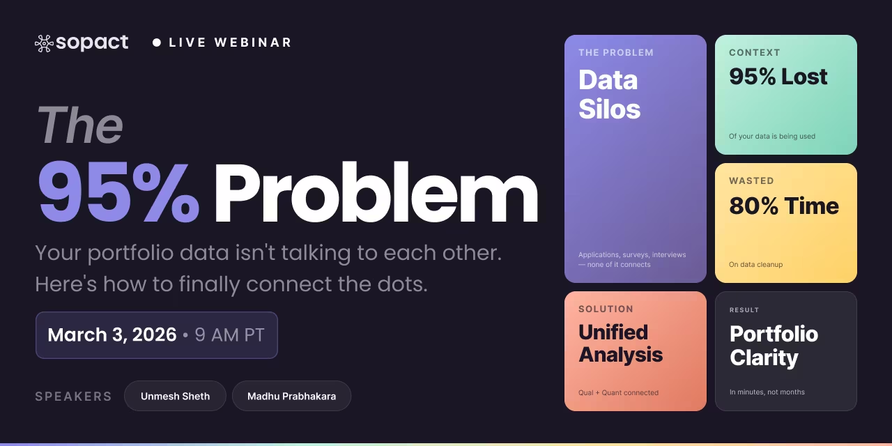
80% of time wasted on cleaning data

Data teams spend the bulk of their day fixing silos, typos, and duplicates instead of generating insights.

Data teams spend the bulk of their day fixing silos, typos, and duplicates instead of generating insights.

Disjointed Data Collection Process

Hard to coordinate design, data entry, and stakeholder input across departments, leading to inefficiencies and silos.

Lost in Translation

Open-ended feedback, documents, images, and video sit unused—impossible to analyze at scale.

Survey Analysis: Turn Responses Into Evidence-Linked Insights | Sopact

If you run surveys, you already know the hard part isn’t “getting answers.” It’s turning those answers into decisions you can defend—to boards, auditors, and the people your programs serve. That bridge is survey analysis.

Traditional methods struggle: exports into spreadsheets, copy-paste into slide decks, and disconnected dashboards that can’t show where a number came from. The result is slow cycles, inconsistent interpretation, and zero traceability.

Sopact’s stance: survey analysis must be clean at the source, continuous, and evidence-linked. That means every chart, score, and sentence should trace back to a document, a page, a data file, or a stakeholder voice response—with timestamps and owners. When the input is tidy and cited, AI and analysts can move fast without breaking trust.

What Is Survey Data Analysis?

Survey analysis is the process of converting raw questionnaire responses into structured, defensible evidence that guides decisions. It blends quantitative survey analysis (numbers, scales, crosstabs) and qualitative survey analysis (themes, quotes, narratives) and interprets them in context.

Analysis vs. reporting.

  • Analysis asks: What does the data say and how sure are we?
  • Reporting asks: How do we communicate the insight clearly and consistently?
    The boundary matters. If “reporting” happens without “analysis,” we end up with pretty dashboards that hide uncertainty and bias. If “analysis” isn’t designed for reporting, it rots in a spreadsheet tab that nobody opens.
Survey analysis is the step-by-step conversion of raw responses into defensible evidence—numbers with context and quotes with citations—so teams can compare options, prioritize actions, and show their work.
Survey Analysis

Survey Analysis Tool

Stop stitching tools. Start shipping evidence.

Most teams collect surveys in one place, analyze text somewhere else, and report in slides. The result: delay, duplication, and numbers no one can trace. A Survey Analysis Tool (Sopact Sense) unifies collection → cleaning → AI analysis → evidence-linked reporting in one pipeline.

What’s wrong
Fragmented pipeline across forms, sheets, coders, and BI

Every handoff drops IDs and context. By the time results land in a deck, the program has moved on.

  • Multiple exports/imports, version sprawl
  • No single source of truth for respondent IDs
  • Weeks wasted reconciling changes
How Sopact fixes it
One linked system from intake to board-ready report

Sense keeps data, prompts, and outputs in one place so updates flow through automatically.

Clean-at-source IDs Zero copy-paste Versioned updates
What’s wrong
Dashboards with no proof

“82% satisfied” with no way to see which responses support the number erodes trust fast.

  • No citation to raw verbatims
  • Quotes cherry-picked after the fact
How Sopact fixes it
Evidence-linked metrics and themes

Every KPI and theme links back to response IDs, transcript timestamps, or PDF page anchors.

Traceable KPIs Quote provenance Audit-ready
What’s wrong
Manual data cleaning taxes every project

Deduping, fixing typos, merging sheets: the “invisible work” that kills velocity.

How Sopact fixes it
Clean-at-source with rules and unique IDs

Validation, dedupe, and structure at intake cut noise before it hits analysis.

Input validation Dedupe guardrails Schema-aware forms
What’s wrong
Open-ended text, PDFs, interviews go unread

Large volumes stall coding; insights arrive too late to act.

How Sopact fixes it
AI-assisted coding with human oversight

Intelligent Cell/Row/Column rapidly extracts themes, sentiment, rubrics—reviewers can accept or refine.

Themes + sentiment Rubric scoring Reviewer controls
What’s wrong
Quant and Qual live in separate tools

Numbers lack narrative; narratives lack scale. Decisions stall.

How Sopact fixes it
Mixed-method outputs by design

Every number pairs with rationale and representative quotes; Intelligent Grid rolls it up by cohort.

Metric + quote Cohort comparison Equity cuts
What’s wrong
Missing/ambiguous data disappears

Gaps don’t get tracked; reports hide uncertainty.

How Sopact fixes it
“Fix Needed” tasks with owners & due dates

Gaps become visible work items, improving coverage every cycle.

Gap logging Assignees & SLAs Close-the-loop
What’s wrong
Episodic reporting; insight arrives after the moment

Stakeholders wait weeks; priorities shift; trust fades.

How Sopact fixes it
Continuous analysis; instant briefs

As data updates, briefs and dashboards refresh with citations and change history.

Minutes, not months Auto-versioning Portfolio rollups

Quantitative Survey Analysis

What it is.
Quantitative survey analysis turns closed-ended answers into counts, percentages, averages, and statistical relationships. Done right, it gives you scale (how many), direction (better or worse), and comparability (this group vs. that group).

Common methods you actually use:

  • Descriptive statistics. Frequencies, means/medians, standard deviation, confidence intervals. Great for Likert scales (e.g., 1–5 satisfaction), multiple choice, check-all-that-apply.
  • Crosstabs. Split results by segment (e.g., region, program cohort, gender, role). Add column percentages and a simple significance test to avoid over-reading noise.
  • Trend analysis. Compare waves (Q1 → Q2 → Q3). Use the same question wording, options, and population to keep time series honest.
  • Correlation / regression (lightweight). Explore relationships (e.g., “participation hours” → “confidence score”). Use as signal, not proof of causation.
  • Benchmarks & thresholds. Define “meets target” and “needs attention” before you look at the data to avoid moving the goalposts.

Real example: training evaluation.

  • You run an upskilling program. Participants rate confidence in Data Analysis (1–5) before and after.
  • Descriptives show average +1.2 point lift.
  • Crosstabs show the largest lift among participants with <1 year experience.
  • A simple regression indicates that practice projects completed explains more variance than hours watched.
  • Decision: expand project-based tasks; time-boxed videos matter less.

Limits—why numbers alone mislead.

  • A high average can hide polarization (half thrilled, half frustrated).
  • “Improved” may be within the margin of error.
  • Averages without rationales become trivia.

Where to go deeper on metrics: see Survey Metrics (/use-case/survey-metrics) for common KPIs and how to avoid vanity statistics.

Qualitative Survey Analysis

What it is.
Qualitative survey analysis interprets open-ended responses—what people write in their own words. It captures stakeholder voice: the lived reasons behind the scores.

Core techniques (kept practical):

  • Deductive coding. Start with a rubric (e.g., “content quality,” “trainer support,” “access barriers”). Tag text into known categories for comparability.
  • Inductive theme finding. Let themes emerge (e.g., “lack of childcare,” “time-zone mismatch”). Use AI as a first pass, then validate with a human reviewer.
  • Sentiment + rationale. Don’t just tag positive/negative; extract the why sentence with a page or response ID.
  • Narrative synthesis. Build short story arcs: Context → Intervention → Outcome → Evidence.

Program evaluation example.
Participants comment: “Loved the projects, but feedback took too long.” Deductive coding hits content (positive) and feedback timeliness (negative). Inductive coding surfaces mentor bandwidth as a root cause. You now have a targeted fix, not just a satisfaction score.

Want examples to borrow? See Qualitative Survey Examples for prompt patterns and coding templates that reduce bias.

Mixed-Method Survey Analysis

Definition.
Mixed-method survey analysis integrates quantitative (how many) and qualitative (why/how) into one interpretation. It’s how you keep speed and depth without running two separate projects.

Why it matters.

  • Numbers flag where to look; narratives confirm what to change.
  • Quotes motivate action; metrics track whether the action worked.
  • Decision-makers see both precision and persuasion.

Common challenges.

  • Different teams own quant vs. qual.
  • Timeframes don’t match (numbers weekly, narratives quarterly).
  • Tools don’t align; version control breaks.

How Sopact integrates both—one pipeline.

  1. Clean collection (one form, one contact record, unique link per respondent or company).
  2. AI extraction with citations for open text, and safe stats for closed items.
  3. Rubric scoring that accepts both numeric rules and qualitative evidence thresholds.
  4. Outputs: shareable briefs, cohort comparisons, and portfolio grids—every number and quote links back to its source.

Mixed-method in training evaluation.

  • Quant shows a 24-point lift in job-readiness scores for first-time learners.
  • Qual reveals a barrier: evening sessions conflict with caregiving.
  • Action: pilot morning sessions for 30% of cohorts; measure if lift holds and no-show rate falls.
  • This use case aligns with Training Evaluation

AI-Driven Survey Analysis

What AI can do—safely.

  • Summarize at scale. First-pass coding of thousands of open-ended responses.
  • Detect missing data. E.g., “gender by level not reported” → auto-log to Fixes Needed.
  • Normalize language. Map synonyms to your rubric (e.g., “mentor,” “coach,” “TA” → “learning support”).
  • Link facts to citations. Pull the exact sentence and ID from the response or document.

What AI must not do.
Invent numbers, “guess” sentiment without context, or rewrite respondents’ words into marketing copy. Hallucinations collapse trust.

Sopact’s differentiator: AI with evidence linkage.
Our pipeline constrains AI to the evidence you collected—survey forms, uploads, transcripts, PDFs. Outputs include inline citations (document IDs, page numbers, response IDs). If a datum is missing, AI does not fill the gap; it files a Fix Needed with owner and due date.

Why this beats classic BI dashboards.
Dashboards are great for slicing numbers. They are weak at traceability (where did this number come from?) and qualitative sense-making. Sopact starts with evidence, then builds analytics and reporting on top—so your numbers and narratives stand up in diligence.

Concrete example.
A 200-page participant handbook and weekly survey responses feed the pipeline. AI extracts:

  • Program mentions of “career coaching” (with page cites)
  • Participant complaints tagged “feedback delay” (with response timestamps)
  • “Fix Needed: clarify feedback SLA in onboarding materials” (owner: program lead, due in 14 days)
    The brief updates in minutes; the audit trail remains intact.

From Raw Data to Evidence-Linked Insights (Sopact Workflow)

1) Data collection (clean at the source).

  • Unique IDs for respondents, companies, sites.
  • Validation to prevent garbage (numeric ranges, allowed values, required fields).
  • Deduplication and reserved slots (no anonymous duplicates from generic links).
  • Mix structured items (Likert, multiple choice) with open prompts and file uploads.
    → Learn more: Data Collection Software.

2) AI extraction—always with citations.

  • Open text: deductive tags (your rubric) and inductive theme suggestions.
  • Highlighted quotes with response IDs.
  • Document uploads: page-level references pulled into findings.

3) Rubric-based scoring.

  • Define evidence rules: “Score 3 only if (a) average ≥4.0 and (b) at least two quotes demonstrate usefulness.”
  • Include recency windows (e.g., only last 12 months count).

4) Outputs: briefs & grids.

  • Company or program briefs: designer-quality sections (Overview, Quant Results, Themes, Risks, Fixes Needed), with links to original evidence.
  • Portfolio grid: roll up coverage KPIs (e.g., response rate, evidence completeness, time-to-close fixes), compare cohorts, drill down to a quote or page.

5) Continuous updates.

  • If a respondent corrects data using their unique link, the brief and grid refresh after review.
  • Change logs capture what changed, who approved, and when—critical for audit readiness.

Minutes, not months.
The analytics/reporting distance shrinks from a month-long memo to a same-day brief you can share with partners and boards.

Why Clean Input Matters in Survey Analysis

Garbage in, garbage out.
No algorithm can rescue surveys with duplicate respondents, ambiguous options, or missing identifiers. Clean input is the cheapest way to improve analysis quality.

How Sopact enforces clean-at-source:

  • Identity and uniqueness. Every respondent or company has a canonical record; surveys are linked, not orphaned.
  • Form design that captures context, not just numbers. Add evidence fields (URL/file + page reference) beside critical claims.
  • Controls against drift. Question text and options are versioned so time-series remain valid.
  • Bias-aware prompts. For open items, prompts reduce social desirability bias and invite specifics: “Describe a time when… Include one direct example.”
  • Validation and deduping. Required fields, range checks, and automatic duplicate detection before the data hits your tables.

Why this beats “collect once, use many” without traceability.
Reusing the same spreadsheet across programs sounds efficient—until you need to show source links, compare cohorts, or reconcile duplicates. With traceable collection, reuse becomes safe, not sloppy.

How to Analyze Survey Data (Step by Step)

Use this eight-step sequence to move from raw responses to decisions you can defend.

  1. Confirm the question.
    What decision will this analysis drive? Define acceptance thresholds before you peek.
  2. Stabilize the input.
    Freeze wording, map answer options, and lock your respondent universe. If you must make changes, version them explicitly.
  3. Run descriptive stats.
    Frequencies, means, CIs. Look for N, missingness, and variance before declaring wins.
  4. Segment with purpose.
    Choose 3–5 segments you can actually act on (e.g., first-time learners, returning participants, site A/B/C).
  5. Code open-ends.
    Start with your rubric (deductive), then allow emergent themes (inductive). Extract one representative quote per theme with IDs.
  6. Integrate (mixed-method).
    Combine the “where” (quant) with the “why” (qual). For every material metric, add a one-line rationale and a quote.
  7. Log gaps.
    Anything missing becomes a Fix Needed with owner, due date, and enforcement of recency windows.
  8. Publish the brief.
    Build once, share many times: program brief, cohort comparison, portfolio grid. Keep the evidence links alive.

Survey Data Interpretation: From Numbers to Action

Avoid common traps.

  • Averages hide extremes. Always inspect distribution and top-2/bottom-2 boxes.
  • Correlation ≠ causation. Treat regressions as hypotheses for experiments, not verdicts.
  • Cherry-picking quotes. Require one quote per theme per segment to avoid anecdote bias.
  • Stale evidence. Enforce recency windows (e.g., last 12 months) to keep analysis honest.

Publish the rationale with the score.
A score without a sentence is a command. A score with a sentence is a decision you can defend:

Score 4/5 on “Mentor Support.” Why? 78% top-2 box (N=288); three cohorts cite “weekly office hours solved blockers” (response IDs 142, 301, 618).

Example in Depth: Training Evaluation (Mixed-Method, Evidence-Linked)

Context.
A foundation funds three training partners. Each runs surveys at enrollment, mid-course, and graduation.

Pipeline.

  • Quant: job-readiness Likert items, completion, placement within 90 days.
  • Qual: open-ended prompts on what helped, what hindered, and one concrete example.
  • Evidence fields: link to syllabus segment, project rubric, or mentor guidelines.

Analysis.

  • Quant shows +1.2 point average lift in job-readiness (significant at 95%).
  • Segments reveal first-time learners gain most from project-based units.
  • Qual themes: “fast feedback improves momentum,” “evening sessions conflict with caregiving.”
  • Fixes Needed logs: Add feedback SLA, pilot morning cohorts. Owners and dates assigned.

Outcome.
Two quarters later, the portfolio grid shows shorter time-to-close fixes and reduced no-show rate in morning cohorts. Every metric is linked to survey evidence or a specific document page.

👉 See how this structure fits our Training Evaluation use case

Why Teams Choose Sopact for Survey Analysis

  • Evidence-linked by default. Every number and theme links to a source. If there’s no source, it’s a Fix Needed, not a guess.
  • Clean at the source. Unique IDs, validation, deduplication, and reserved slots keep your tables trustworthy.
  • AI that you can audit. Constrained to your evidence; output includes citations and change logs.
  • Continuous, not episodic. When a respondent or organization corrects data through their unique link, briefs and grids update after review—maintaining version history.
  • Minutes, not months. From survey close → brief → portfolio roll-up in the same day.

Key Takeaways for Survey Analysis

  • Analysis ≠ dashboards. Dashboards display; analysis explains and defends.
  • Quant + qual beat either alone. Metrics tell you where; narratives tell you why and how.
  • AI helps only with guardrails. Keep it constrained to your evidence and publish citations.
  • Clean input wins. Unique IDs, validation, and deduping are the fastest path to trustworthy insights.
  • Publish the rationale. A short sentence and a citation beside each material metric is the difference between data and decisions.

Quick Answers (for searchers and skimmers)

What is survey analysis?
The process of converting raw responses into structured, defensible evidence—metrics with context and quotes with citations—so teams can decide and show their work.

How do you analyze survey data step by step?
Confirm the decision → stabilize input → descriptives → purposeful segments → code open-ends → integrate quant+qual → log gaps as Fixes Needed → publish briefs with evidence links.

What are quantitative survey analysis methods?
Descriptives, crosstabs, trend analysis, lightweight regression, benchmarks/thresholds.

What is qualitative survey analysis?
Coding open text using deductive rubrics and inductive themes, extracting representative quotes with IDs, and synthesizing narratives around causes and outcomes.

What is mixed-method survey analysis?
A combined approach that integrates numbers and narratives into one interpretation, enabling fast detection and targeted action.

How can AI help in survey analysis?
First-pass coding, theme extraction, gap detection, and citation linking—when constrained to your collected evidence and subject to human review.

Why is clean data collection important?
Because no analysis can rescue duplicates, missing IDs, ambiguous options, or stale evidence. Clean-at-source enables speed and trust.

  • Survey Metrics (/use-case/survey-metrics) — KPIs, targets, and anti-vanity rules
  • Qualitative Survey Examples (/use-case/open-ended-question-examples) — prompts and coding templates
  • Data Collection Software (/use-case/data-collection-software) — clean-at-source forms with evidence fields
  • Training Evaluation (/use-case/training-evaluation) — full mixed-method example pipeline

See survey analysis that’s evidence-linked end to end

Explore live briefs and portfolio grids built from real survey responses and documents—each metric and theme linked to its source.

Evidence-linked survey analysis, not spreadsheet archaeology. See a live training evaluation pipeline →

Survey Analysis FAQ

How do I determine the right sample size for survey analysis?

Pick a margin of error (e.g., ±5%) and confidence level (often 95%), then estimate population size and expected response variance. Use a standard sample-size calculator to get the minimum N, and add headroom for non-response (10–30% depending on audience). If you’ll segment results (e.g., by region or role), size for the smallest subgroup you care about. Sopact can track realized N per subgroup and flag when a cut is under-powered before you publish.

What should I do when response rates are low or uneven across groups?

Start by diagnosing: message timing, channel mix, and burden (length). Then apply targeted reminders and incentives. In analysis, report coverage transparently and consider weighting responses when one segment is over-represented. Keep a “Fixes Needed” log for missing groups and schedule a follow-up pulse. Sopact surfaces low-coverage segments and preserves links to outreach evidence so readers see exactly where gaps remain.

When is weighting appropriate, and how do I avoid introducing bias?

Weight to correct known sampling imbalances relative to a defensible frame (e.g., employee census by location/level). Document the frame, weighting scheme (raking/post-stratification), and sensitivity checks (show weighted vs. unweighted deltas). Don’t weight qualitative quotes—keep them contextual with subgroup tags. Sopact stores the frame and weighting rationale alongside results so auditors can reproduce the numbers.

How can I keep anonymity while still linking results to evidence?

Separate identity from analysis artifacts. Collect personally identifiable info in a protected contact object, store responses under a random unique ID, and limit join keys to non-identifying attributes (e.g., region, tenure bands). Evidence links point to documents or aggregates, not individuals. Sopact’s clean-at-source design supports anonymous modes with recency windows and audit trails without exposing respondent identities.

What’s the best way to analyze multilingual surveys without losing nuance?

Keep source text in the original language; standardize coding/metrics on a canonical language. Use domain-tuned prompts for translation plus back-translation on samples to validate fidelity. Code themes with a shared rubric and language-specific examples. Sopact stores original text, translation, and code assignments side-by-side with citations so reviewers can spot drift across languages.

How do I benchmark results across cohorts or time periods fairly?

Lock your rubric, scales, and question wording before the baseline; track any changes as versioned metadata. Normalize metrics (e.g., z-scores against baseline) and present deltas with confidence intervals. Flag structural breaks when the instrument or population shifts. Sopact’s portfolio grid annotates each metric with version info and links each change to the underlying evidence.

When should I not use AI in survey analysis?

Avoid AI where the evidence is sparse, legally sensitive, or the rubric is unsettled—humans should set criteria first. Don’t generate numbers that aren’t in your sources, and don’t summarize if anonymity could be compromised in small cells. Sopact constrains AI to your documents, forms, and rules; if the evidence is missing, it logs a gap instead of “filling in” an answer.

What retention and privacy practices should govern survey data?

Define a retention schedule by data class (raw responses, PII, derived metrics, exports). Minimize PII collection, encrypt at rest, and restrict access by role. Keep an audit log for exports and rubric changes. Publish your privacy notice and lawful basis (e.g., consent or legitimate interest). Sopact retains evidence links and version history while respecting organization-level retention rules.

Survey Analysis Methods, Techniques, and Results

Survey analysis is the process of turning raw responses—whether from structured surveys, open-ended interviews, or long-form reports—into actionable insights. Traditionally, survey analysis methods focused on descriptive statistics: response rates, averages, or percentages. While these methods are still useful, they rarely capture why participants answered the way they did.

With the rise of AI intelligence, survey analysis techniques have advanced far beyond manual coding or static dashboards. Instead of exporting CSVs and cleaning duplicates, AI-driven methods analyze multiple data types—interviews, PDFs, and continuous survey streams—at scale. These techniques detect sentiment, identify themes, and benchmark progress in minutes rather than months.

The result is more than just numbers. Survey analysis results today combine quantitative precision with qualitative depth, allowing organizations to prove outcomes, uncover hidden barriers, and continuously adapt their programs. This integration of human-centered stories with evidence is what sets modern AI survey analysis apart.

Survey Analysis Examples

Survey analysis turns raw responses into decisions. Classic methods stopped at counts and averages. Modern techniques add AI intelligence across interviews, PDFs, and continuous surveys to surface themes, sentiment, and causation—fast and defensible. Integrated Intelligent Cell, Row, Column, Grid layers produce consistent, evidence-linked outputs, ready for board-level reporting. :contentReference[oaicite:1]{index=1}

survey analysis methods survey analysis techniques AI survey analysis survey analysis results qualitative + quantitative

Example 1 — PDF Report → Intelligent Cell

From long-form documents to consistent, defensible insights.

Method: Multi-page PDF reports Layer: Intelligent Cell
“Summarize the top three participant challenges, include sentiment distribution, and highlight unexpected insights.”
Recurrent themes: internet access, financial stress, family support gaps. Sentiment splits 40% negative, 35% neutral, 25% positive. A new signal appears in rural responses—teacher availability—missed by manual coding. Outputs normalize wording and link evidence passages.

Example 2 — Interviews → Intelligent Row

Per-participant summaries with rubric alignment.

Method: Semi-structured interviews Layer: Intelligent Row
“Summarize each participant’s barriers and confidence trajectory in plain language.”
Each transcript condenses into one row. Example: “Began with low digital confidence, struggled with remote sessions, improved after targeted mentorship.” The system standardizes into rubric movement (Low → Mid → High) and flags contradictions for follow-up.

Example 3 — Open-Ended Survey → Intelligent Column

Theme frequencies with linked quotes—no cherry-picking.

Method: Open-ended survey question Layer: Intelligent Column
“Identify most common barriers and rank their frequency with supporting quotes.”
Barriers cluster as: transportation (32%), job conflicts (28%), digital access (25%), childcare (15%). Representative quotes are auto-linked to each theme, keeping evidence front-and-center for reviewers and funders.

Example 4 — Pre/Post Cohorts → Intelligent Grid

Cohort-level shifts and equity cuts in one BI-ready view.

Method: Intake vs. exit surveys Layer: Intelligent Grid
“Compare confidence and skill readiness across cohorts, and show improvement by demographic.”
A unified grid shows: Cohort A +42% (women +48%, men +38%), Cohort B +35% (rural +50%, urban +30%), Cohort C +39% (youth +46%, adults +32%). Managers see what works, for whom, and where gaps remain—ready for drill-down or export. :contentReference[oaicite:2]{index=2}

Survey Analysis Results — BI-Ready Grid

A compact cross-cohort view you can paste below your examples. Swap the sample numbers with your live metrics from the Intelligent Grid export. :contentReference[oaicite:3]{index=3}

Cohort Confidence Growth Equity Cut Key Driver (from Column) Action Next Sprint
A +42% Women +48% / Men +38% Transportation barrier (32%) Extend travel stipends
B +35% Rural +50% / Urban +30% Job conflicts (28%) Add evening cohorts
C +39% Youth +46% / Adults +32% Digital access (25%) Device lending + hotspots

Tip: keep this grid close to the stories above so readers see a clean thread from methodAI layerresult.

Why This Matters

Survey platforms used to capture only numbers. Now, AI survey analysis techniques provide narrative + evidence, moving from one-page stories to cohort-wide dashboards. The Intelligent Suite ensures survey analysis results are not only faster but more defensible—ready for boards, funders, and communities

Survey Analysis That Works at the Speed of AI

Sopact Sense delivers instant analysis of qualitative and quantitative data—no cleaning, no coding, no delay.
Upload feature in Sopact Sense is a Multi Model agent showing you can upload long-form documents, images, videos

AI-Native

Upload text, images, video, and long-form documents and let our agentic AI transform them into actionable insights instantly.
Sopact Sense Team collaboration. seamlessly invite team members

Smart Collaborative

Enables seamless team collaboration making it simple to co-design forms, align data across departments, and engage stakeholders to correct or complete information.
Unique Id and unique links eliminates duplicates and provides data accuracy

True data integrity

Every respondent gets a unique ID and link. Automatically eliminating duplicates, spotting typos, and enabling in-form corrections.
Sopact Sense is self driven, improve and correct your forms quickly

Self-Driven

Update questions, add new fields, or tweak logic yourself, no developers required. Launch improvements in minutes, not weeks.
FAQ

Find the answers you need

Add your frequently asked question here

*this is a footnote example to give a piece of extra information.

View more FAQs