play icon for videos
Use case

Survey Report Examples That Transform Raw Data Into Action

Real survey report examples from workforce training, scholarship programs, and ESG portfolios showing how pre-mid-post design and AI analysis deliver insights in minutes, not months.

Register for sopact sense

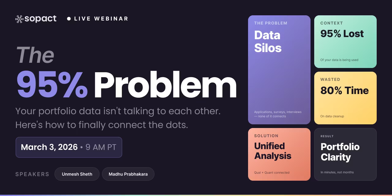
80% of time wasted on cleaning data
Reports overwhelm without insight or action

Data teams spend the bulk of their day fixing silos, typos, and duplicates instead of generating insights.

Data teams spend the bulk of their day fixing silos, typos, and duplicates instead of generating insights.

Disjointed Data Collection Process
Annual surveys arrive too late for adjustments

Hard to coordinate design, data entry, and stakeholder input across departments, leading to inefficiencies and silos.

Traditional reports take months to produce. By the time findings reach decision-makers, program cycles have moved forward and adjustment opportunities have passed. Intelligent Suite enables continuous feedback loops with real-time dashboards updating as responses arrive.

Lost in Translation
Quantitative and qualitative data stay separated

Open-ended feedback, documents, images, and video sit unused—impossible to analyze at scale.

Teams analyze test scores separately from open-ended feedback, missing correlation patterns. When satisfaction drops, no one knows why. Intelligent Column automatically integrates metrics with narrative themes, revealing which program elements drive outcomes beyond numbers alone.

TABLE OF CONTENT

Author: Unmesh Sheth

Last Updated:

October 31, 2025

Founder & CEO of Sopact with 35 years of experience in data systems and AI

Complete Survey Report Examples Guide
Complete Guide

Survey Report Examples That Transform Raw Data Into Action

Explore real-world examples from workforce training, scholarship programs, and ESG portfolios—showing how survey data becomes clean evidence that drives continuous improvement in minutes, not months.

<a href="bestpractice">Best Practices in Survey Report Design</a>
Foundation

Best Practices in Survey Report Design

Great survey reports don't just present data—they tell a story that drives decisions. This section outlines the architectural principles, design patterns, and structural foundations that transform raw survey responses into actionable intelligence.

1 Know Your Audience: Design for Multiple Stakeholders

Survey reports fail when they try to serve everyone with one document. Board members need executive summaries. Program staff need granular breakdowns. Funders need proof of outcomes. The best reports use a layered architecture that lets each audience find what they need without wading through irrelevant detail.

❌ What Doesn't Work
  • 50-page PDFs with no navigation
  • Charts without context or interpretation
  • Academic jargon that alienates non-researchers
  • Burying key findings on page 23
✓ What Works
  • 1-page executive summary up front
  • Clear section headers for scanning
  • Practitioner-level language
  • Key insights in first 2 pages
PRO TIP The "Bottom Line Up Front" Rule

Start every report with a 2-3 sentence TL;DR that directly answers: "What changed? What worked? What didn't?" Stakeholders who need more can dive deeper. Those who don't have their answer in 30 seconds.

2 Balance Quantitative Rigor with Qualitative Context

Numbers without stories are sterile. Stories without numbers lack credibility. The best survey reports integrate both. When you report "87% satisfaction," pair it with participant quotes that explain why. When you share themes from open-ended responses, quantify how often each theme appears.

Essential Mixed-Methods Elements:
  • Quantitative Anchor: Start with the numbers (%, averages, deltas)
  • Qualitative Depth: Explain patterns with 2-3 representative quotes
  • Visual Integration: Use charts + text boxes with human stories
  • Triangulation: Cross-reference survey data with interviews, documents, or observations
EXAMPLE Workforce Training Report

Weak: "Test scores improved by 12 points."

Strong: "Test scores improved by 12 points (pre: 68 → post: 80). Participants attributed gains to 'hands-on labs' (mentioned in 67% of open-ended responses) and 'peer learning groups' (43%). One learner wrote: 'I finally understood loops when we debugged each other's code.'"

3 Use Visual Hierarchy to Guide Attention

Reports compete with emails, Slack messages, and executive briefings. Visual hierarchy ensures your insights get noticed. Use typography, color, and spacing to create a clear information architecture where readers instinctively know what's important.

Level 1: Headlines & Key Findings
Large, bold text (28-36px). Use for main sections and critical insights.
Example: "Confidence Levels Doubled After 6-Week Training"
Level 2: Sub-sections & Themes
Medium weight (20-24px). Break major findings into digestible chunks.
Example: "Pre-Program Baseline", "Mid-Program Progress", "Post-Program Outcomes"
Level 3: Supporting Data & Quotes
Body text (16-18px). Provide evidence and participant voices.
Example: Charts, tables, pull quotes in bordered boxes
DESIGN TIP The 3-Second Scan Test

A well-designed report page should communicate its main point in 3 seconds. If someone only reads headlines and bold text, they should still understand the core message. Everything else is supporting detail.

4 Structure for Scannability, Not Linear Reading

Few people read reports cover-to-cover. Most scan for what matters to them. Design for scanners, not readers. Use short paragraphs (2-5 sentences), frequent headers, bullet points, and visual breaks to make content modular and navigable.

❌ Wall of Text
Dense paragraphs with no breaks. Academic sentence structures. No visual relief. Readers abandon after two pages.
✓ Scannable Format
Short paragraphs. Clear headers. Bold key phrases. Charts every 300-400 words. Readers find what they need instantly.
FORMATTING RULE The 300-Word Visual Break

Never go more than 300 words without a visual element—chart, callout box, table, or image. This rhythm keeps readers engaged and reinforces that your report values their time.

5 Build for Action, Not Just Documentation

The best survey reports don't end with "here's what we found." They end with "here's what this means and what to do next." Every major finding should connect to implications, recommendations, or next steps. Otherwise, your report becomes a filing cabinet item, not a decision tool.

Action-Oriented Report Structure
1. Executive Summary (1 page)
Key findings + 3 recommended actions. Decision-ready for busy stakeholders.
2. Context & Methods (0.5 pages)
Survey design, sample size, response rate, limitations. Establishes credibility without overwhelming.
3. Core Findings (3-5 pages)
Each finding = chart + interpretation + participant voice. Balanced quant + qual.
4. Implications & Recommendations (1-2 pages)
"Based on these findings, we recommend..." Specific, actionable, prioritized.
5. Appendices (as needed)
Full data tables, survey instruments, detailed methodology. For those who want deep dives.
STRATEGIC FRAMING The "So What?" Test

After every finding, ask: "So what?" If you can't articulate why this matters or what should change, the finding doesn't belong in the report. Ruthlessly cut insights that don't drive decisions.

The Sopact Advantage: From Best Practices to Built-In Automation

These best practices take weeks to implement manually. Sopact Sense automates them. The platform's Intelligent Grid generates designer-quality reports in minutes—complete with executive summaries, mixed-methods integration, visual hierarchy, and action-oriented recommendations—because the report architecture is built into the data collection workflow.

When you design clean data collection once (unique IDs, linked surveys, integrated qual + quant), Sopact's AI agents automatically structure reports following these principles. No manual formatting. No copy-pasting charts. No weeks of iteration.

How Sopact Implements These Best Practices:
  • Audience Layering: Generates executive summaries + detailed sections in one workflow
  • Mixed Methods: Intelligent Columns correlate quant + qual automatically
  • Visual Hierarchy: Pre-built templates with professional design systems
  • Scannability: Auto-generated headers, callouts, and section breaks
  • Action Orientation: Prompts for implications and recommendations built into report generation
Workforce Training Survey Reports - Real Examples
Section 2

Survey Report Examples For Students: From Test Scores to Transformation Stories

Training programs need more than completion rates. This section shows how pre-mid-post survey design reveals confidence shifts, skill gains, and employment outcomes—and how correlating quantitative test scores with qualitative feedback uncovers patterns traditional dashboards miss.

Use Case Context: Girls Code Program
Challenge: A workforce training program for young women learning technology skills needed to prove impact to funders. Traditional surveys captured completion rates but missed the why behind success or failure.

Solution: Multi-stage survey design (application → pre-program → mid-program → post-program → 6-month follow-up) with unique participant IDs linking all responses. Sopact's Intelligent Columns automatically correlated test scores with confidence measures from open-ended responses, revealing which interventions worked.

The Continuous Feedback Lifecycle

Instead of a single post-program survey, workforce training requires continuous measurement across the participant journey. Each stage captures different dimensions of change—from initial readiness to long-term employment outcomes.

Stage Feedback Focus Stakeholders Outcome Metrics
Application / Due Diligence Eligibility, readiness, motivation Applicant, Admissions Risk flags resolved, clean IDs
Pre-Program Baseline confidence, skill rubric Learner, Coach Confidence score, learning goals
Mid-Program Progress check, early barriers Learner, Peer, Coach Test scores, confidence delta
Post-Program Skill growth, peer collaboration Learner, Peer, Coach Skill delta, satisfaction, completion
Follow-Up (30/90/180 days) Employment, wage change, relevance Alumni, Employer Placement %, wage delta, retention
💡 Why This Lifecycle Design Works
  • Unique IDs keep data connected: All surveys link back to the same participant, eliminating fragmentation
  • Pre-mid-post reveals trajectories: Single snapshots miss the story; longitudinal data shows confidence arcs
  • Follow-ups measure real outcomes: Training is only effective if it leads to employment or wage growth
  • Multiple stakeholders = richer context: Peer feedback + self-assessment + coach observations triangulate truth

Example 1: Correlating Test Scores with Confidence

1 The Challenge: Numbers Don't Tell the Full Story

Most training programs track test scores (quantitative) separately from learner confidence (qualitative). This creates blind spots: What if scores improve but confidence doesn't? What if confidence rises despite lower scores? Traditional tools can't answer these questions without weeks of manual coding and cross-referencing.

How Sopact Solves This in Minutes
Collect Clean Data at Source
Pre-program survey captures baseline test scores + open-ended question: "How confident do you feel about your coding skills and why?"
Apply Intelligent Column Analysis
Intelligent Column automatically extracts confidence measures (low/medium/high) from qualitative responses and correlates them with numerical test scores across all participants.
Generate Instant Correlation Report
The platform identifies patterns: Do high scores = high confidence? Where do they diverge? Which participants need additional support despite good grades?
🎥 Demo: Correlating Test Scores with Confidence Measures
Watch how Intelligent Columns reveal the relationship between test performance and self-reported confidence in under 5 minutes.
Transformation
Traditional Approach: 2-3 weeks of manual coding open-ended responses, then exporting to Excel to cross-reference with test scores. High risk of bias. Results often too late to inform program adjustments.

Sopact Approach: 4 minutes. Automated correlation with bias-free AI analysis. Real-time insights allow mid-program interventions for struggling learners.

Example 2: Designer-Quality Impact Reports in Minutes

2 From Static PDFs to Living Reports

Impact reports traditionally take months and tens of thousands of dollars to produce. By the time they're ready, the data is stale. Sopact's Intelligent Grid generates funder-ready, narrative reports with charts, executive summaries, and participant voices—automatically, in under 5 minutes.

🎥 Demo: Building Impact Reports That Inspire Action
See how clean data collection flows directly into designer-quality reports—no manual chart building, no weeks of iteration.
🔍 What These Reports Reveal
  • Executive Summary: 1-page snapshot with key metrics (average test score improvement: +7.8 points, 67% built web apps by mid-program)
  • Participant Experience: Both positive feedback (rapid skills growth) and negative feedback (time pressure, debugging frustration) are surfaced
  • Confidence Trajectory: Pre: 100% low confidence → Mid: 50% medium, 33% high → Post: continued growth with measurable skill validation
  • Shareable Links: Every report has a unique URL for funders, boards, and stakeholders—always up-to-date as new data arrives
Transformation
Traditional Approach: Hire a designer, spend 2-3 months iterating on report layouts, manually pull charts from Excel, create static PDFs that can't be updated.

Sopact Approach: Type plain-English instructions into Intelligent Grid. Report generates in 4-5 minutes. Share live link. Report updates automatically as new survey responses arrive.

Key Takeaways for Workforce Training Leaders

What You Can Apply Today
  • Design for the lifecycle, not the endpoint: Pre-mid-post-follow-up surveys reveal trajectories that single snapshots miss
  • Always link quant + qual: Test scores without context are meaningless. Confidence without evidence is anecdotal. Together, they tell the full story.
  • Use unique participant IDs: Every survey, every stage, same person. This is the foundation of clean, centralized, analysis-ready data.
  • Automate correlation analysis: Manual cross-referencing takes weeks and introduces bias. AI-powered Intelligent Columns do it in minutes, consistently.
  • Share live reports, not static PDFs: Stakeholders want current insights, not year-old data. Living dashboards enable continuous improvement.
Scholarship & Grant Application Reports
Section 3

Scholarship & Grant Application Reports: Reducing Bias, Accelerating Decisions

Reviewing hundreds of scholarship applications is slow, subjective, and prone to bias. This section demonstrates how AI-powered survey analysis transforms essay evaluation, rubric scoring, and applicant comparison into consistent, transparent, and rapid decision-making processes.

⚠️ The Application Review Bottleneck
The Challenge: Organizations receive 200+ scholarship applications with lengthy essays, PDF portfolios, and subjective talent assessments. Manual review takes 3-4 weeks. Different reviewers apply different standards. High-potential candidates slip through. Decision rationale is poorly documented, creating compliance and transparency risks.

The Cost: Late decisions frustrate applicants. Inconsistent scoring undermines fairness. Manual processes prevent scaling to larger applicant pools.

Example 1: From Weeks of Subjective Review to Minutes of Consistent Scoring

1 AI Scholarship Program Application Review

This real example shows an AI scholarship program evaluating applicants based on essays, technical experience, and demonstrated problem-solving ability. The challenge: surface future AI leaders who show critical thinking and solution-creation capabilities, not just high test scores.

1
Multi-Level Application Forms
Interest form (quick eligibility screening) → Full application (essays, PDFs, talent statements) with unique IDs linking all submissions. No duplicate applications, clean data from day one.
2
Intelligent Row: Summarize Each Applicant
AI agent reads all essays, PDFs, and responses for each applicant. Generates plain-language summaries: "Applicant demonstrates strong systems thinking through autonomous vehicle project. Essay shows depth in ethics of AI."
3
Rubric-Based Scoring
Intelligent Cell applies consistent evaluation criteria across all applicants: critical thinking (1-10), technical depth (1-10), future potential (1-10). Same standards for everyone, eliminating reviewer variability.
4
Correlation Analysis
Intelligent Column examines: Does field of study correlate with talent scores? Do gender or demographics predict certain essay themes? Surfaces hidden patterns and potential biases in selection criteria.
5
Cohort-Level Report Generation
Intelligent Grid creates selection committee reports: top 50 candidates ranked, scoring breakdowns by dimension, demographic distributions, documentation trails for transparency.
Transformation
Traditional Approach: 3-4 weeks. Each reviewer reads 50+ applications. Scores vary wildly between reviewers. Committee meetings to reconcile differences take hours. No audit trail for why decisions were made.

Sopact Approach: 2-3 hours. AI summarizes and scores all applicants consistently. Committee reviews top candidates with full context. Every scoring decision is documented and explainable. Time-to-decision drops from weeks to days.

Example 2: Uncovering Hidden Patterns in Application Data

2 Field of Study × Gender × Talent Correlation

Beyond individual scoring, selection committees need to understand systemic patterns: Are certain fields of study consistently rated higher? Does gender correlate with specific talent dimensions? Are there geographic biases in selection? These questions require cross-tabulation analysis that traditional manual review can't provide.

❌ Manual Review Blind Spots
Each reviewer only sees their assigned applications. No visibility into patterns across the full applicant pool. Unconscious biases remain hidden. Post-selection analysis reveals disparities too late.
✓ AI-Powered Pattern Detection
Intelligent Column automatically correlates multiple variables. Surfaces patterns like "applicants from engineering programs score 15% higher on technical depth but lower on ethics discussions." Enables proactive bias correction.
🔍 What These Correlation Reports Reveal
  • Rubric Calibration: Are scoring dimensions weighted appropriately? Does "future potential" correlate with specific fields?
  • Demographic Fairness: Do selection criteria inadvertently favor certain demographics? Are there gaps in outreach?
  • Predictor Identification: Which essay themes predict long-term success? (Requires linking to follow-up surveys)
  • Committee Alignment: Do all reviewers interpret rubric criteria consistently? Where do scoring gaps appear?
Real-World Impact: Transparent Selection
One scholarship program discovered through correlation analysis that their "leadership potential" rubric inadvertently penalized introverted applicants who demonstrated leadership through technical contributions rather than public speaking. They adjusted rubric language and saw a 23% increase in diverse candidate selection the following year.

Example 3: Beyond Selection—Tracking Scholar Success

3 Longitudinal Scholar Assessment

Scholarship programs don't end at selection. The best programs track scholar outcomes: Did the scholarship enable degree completion? Career placement? Skill development? Pre-and-post assessment surveys linked to original application data reveal which selection criteria actually predict success.

1
Application Data (Baseline)
Initial essays, skills assessments, career goals captured during application process. Unique ID assigned.
2
Mid-Program Check-In
6-month survey: How is coursework progressing? Financial challenges? Mentorship effectiveness? Links back to application ID.
3
Post-Program Outcomes
Graduation survey: Degree completion rate, GPA, job placement, salary, skills gained. Compare to initial goals from application.
4
Predictive Analysis
Intelligent Column correlates application criteria (essay themes, initial scores) with actual outcomes. Which applicant characteristics predicted degree completion? Career success?
5
Refine Selection Criteria
Evidence-based adjustments to rubrics for future cohorts. If "community engagement" essays predicted 85% graduation rates, weight that dimension higher.
Transformation
Traditional Approach: Selection and outcomes tracked in separate systems. No longitudinal analysis. Scholarship criteria remain unchanged for years despite lack of evidence.

Sopact Approach: Unique IDs link application → selection → outcomes across years. Predictive analysis reveals which selection criteria actually matter. Continuous improvement loop transforms scholarship effectiveness.

Key Takeaways for Scholarship & Grant Managers

What You Can Apply Today
  • Multi-level application design reduces noise: Quick interest form screens out non-eligible applicants before they invest time in full applications
  • Rubric-based AI scoring eliminates reviewer variability: Same standards applied to all applicants, every time, with full audit trails
  • Correlation analysis surfaces hidden biases: Cross-tabulate demographics, fields of study, and essay themes to ensure fair selection
  • Link application data to outcomes: Track scholar success longitudinally to refine future selection criteria based on evidence
  • Document every decision: AI-generated summaries + scoring provide transparent rationale for all selection and rejection decisions
  • Reduce time-to-decision from weeks to days: Automated essay analysis and scoring lets committees focus on top candidates, not administrative review
ESG Portfolio & Impact Reporting
Section 4

ESG Portfolio & Impact Reporting: From 200+ PDFs to Aggregated Insight

ESG reporting isn't a survey in the traditional sense—but it follows the same pattern: collect structured feedback (sustainability disclosures, supply chain data, stakeholder inputs), analyze against frameworks (GRI, SASB, TCFD), and generate portfolio-level intelligence. This section shows how Intelligent Row transforms document analysis from weeks to minutes.

The ESG Portfolio Challenge
The Problem: Investment managers review 50-200 portfolio companies annually. Each company submits 20-100 page ESG reports, sustainability disclosures, and quarterly filings. Manual gap analysis takes consultants weeks per company at $10k-$50k each. By the time analysis is complete, data is outdated.

The Opportunity: Treat each company report as a "survey response." Apply consistent evaluation criteria across all companies. Generate individual gap analyses + aggregated portfolio views in hours, not months.
🎥 Demo: CSR to ESG Automation—Standardize 200+ Reports Instantly
Watch how portfolio ESG data flows from PDFs → structured analysis → real-time reporting with evidence links.

Example 1: Individual Company ESG Gap Analysis

1 Tesla & SiTime: Deep-Dive Gap Analyses

These real examples demonstrate how Intelligent Row processes quarterly reports, sustainability disclosures, and supply chain documentation to identify ESG strengths and gaps against industry frameworks. Each company receives a custom report highlighting compliance, risks, and improvement opportunities.

1
Document Collection
Upload company PDFs (10-K, sustainability reports, TCFD disclosures). Sopact treats each document as a data source.
2
Framework Mapping
Intelligent Row applies evaluation criteria: GRI standards, SASB metrics, carbon reporting completeness, supply chain transparency.
3
Gap Identification
AI identifies what's disclosed vs. what's missing. Example: "Scope 1&2 emissions reported, Scope 3 absent. No board-level climate oversight disclosed."
4
Evidence Linking
Every finding links back to source documents (page numbers, sections). Auditable, transparent, defensible analysis.
🔍 What These Gap Analyses Reveal
  • Disclosure Completeness: Which ESG dimensions are well-documented vs. missing entirely?
  • Framework Alignment: How does reporting stack up against GRI, SASB, TCFD requirements?
  • Year-Over-Year Progress: Are gaps closing or widening compared to previous reports?
  • Peer Benchmarking: How does this company's disclosure compare to industry leaders?
  • Risk Flags: Material ESG risks inadequately addressed (supply chain labor, climate transition plans)
Transformation
Traditional Approach: Hire consultants at $10k-$50k per company. Wait 3-4 weeks. Receive static PDF report. No updates when new data arrives.

Sopact Approach: Upload documents. Intelligent Row generates gap analysis in 15-30 minutes. Living report updates automatically when company releases new disclosures. Cost per analysis drops 95%.

Example 2: Aggregated Portfolio ESG Dashboard

2 From Individual Analyses to Portfolio Intelligence

Individual company reports are valuable. Aggregated portfolio views are essential. Investment committees need to see: What % of portfolio companies meet minimum ESG disclosure thresholds? Where are systemic gaps? Which sectors lag behind? Intelligent Grid creates these roll-ups automatically.

1
Individual Scoring
Each portfolio company receives ESG scores across dimensions: Environmental (0-100), Social (0-100), Governance (0-100).
2
Portfolio Aggregation
Intelligent Grid combines individual scores into portfolio-level metrics: average ESG score, distribution by quartile, sector comparisons.
3
Gap Identification
Identify systemic weaknesses: "62% of portfolio lacks Scope 3 emissions reporting." "Only 38% disclose board diversity metrics."
4
Engagement Priorities
Generate action plans: Which companies need engagement letters? What disclosure improvements would move the portfolio score most?
💡 Strategic Value of Portfolio Aggregation
  • Investment Committee Reporting: Single dashboard for board-level ESG oversight
  • Regulatory Compliance: EU SFDR, SEC climate disclosure rules require portfolio-level metrics
  • Engagement Targeting: Focus limited resources on companies with biggest gaps and highest impact potential
  • LP Reporting: Limited partners demand transparent, evidence-backed ESG performance data
  • Competitive Differentiation: "Our fund has 85% portfolio ESG disclosure vs. industry average 62%"
Transformation
Traditional Approach: Manually aggregate individual company reports in Excel. No standardization. Outdated by the time it's compiled. Massive effort to update quarterly.

Sopact Approach: Real-time portfolio dashboard. Automatically updates when any company releases new disclosures. Drill down from portfolio → sector → company → specific disclosure. Always current, always auditable.

Key Takeaways for ESG & Impact Investors

What You Can Apply Today
  • Treat company disclosures like survey responses: Standardized evaluation criteria across all portfolio companies
  • Intelligent Row for document intelligence: Automatically extract ESG metrics from 100-page PDF reports
  • Evidence-linked findings: Every gap analysis claim links back to source documents for audit trails
  • Portfolio-level aggregation: Move from company-by-company analysis to systemic portfolio intelligence
  • Real-time updates: Living dashboards replace static annual reports—always current as new disclosures arrive
  • 95% cost reduction: Eliminate consultant fees by automating gap analysis and aggregation workflows
Continuous Learning Dashboards
Section 5

Continuous Learning Dashboards: Turning One-Time Surveys Into Ongoing Evidence

The fundamental shift isn't better survey tools—it's continuous data architectures that replace annual snapshots with always-on feedback loops. This section reveals how clean-at-source data collection, unique participant IDs, and real-time intelligent analysis transform static PDF reports into living dashboards.

The Paradigm Shift
Traditional survey reporting treats data collection as an event—something you do once or twice a year, export to Excel, and spend months analyzing before producing a static PDF. Continuous learning treats data collection as a system—an always-on infrastructure where evidence flows continuously from source to insight, enabling real-time decisions and mid-cycle program adjustments.

From Annual Reporting to Real-Time Learning

❌ Old Way: Annual Survey Events
  • Survey once or twice per year
  • Export to Excel, manually clean data
  • Spend 2-3 months on analysis
  • Produce static PDF report
  • Insights arrive too late to inform program adjustments
  • Next year, repeat entire process from scratch
✓ New Way: Continuous Learning Systems
  • Data collected continuously across lifecycle
  • Clean at source with unique IDs, no export/cleanup needed
  • AI analysis runs in real-time as responses arrive
  • Living dashboards update automatically
  • Insights enable mid-program course corrections
  • Historical data accumulates, revealing multi-year trends

Three Architectural Principles of Continuous Learning

1 Clean-at-Source Data Collection

The Problem with Traditional Surveys: Data quality problems emerge after collection. Duplicates, typos, missing values, and fragmented records force teams to spend 80% of time on cleanup before analysis can even begin.

The Continuous Learning Solution: Design data quality into the collection workflow. Unique participant IDs prevent duplicates. Follow-up workflows let stakeholders correct their own data. Validation rules catch errors at entry. Result: Zero cleanup time.

Real-World Example
A workforce training program used to spend 3 weeks per cohort cleaning survey data—reconciling duplicate entries, fixing typos in names, tracking down missing responses. After implementing unique participant IDs and correction workflows, cleanup time dropped to zero. Analysis could start immediately as the last survey response arrived.
2 Linked Longitudinal Data

The Problem with Siloed Surveys: Pre-program surveys live in one spreadsheet. Mid-program surveys in another. Post-program follow-ups in a third. Linking responses across time points takes days of manual matching.

The Continuous Learning Solution: Every survey, at every stage, links back to the same unique participant ID. Pre → mid → post → 6-month follow-up data automatically connects. Trajectories emerge instantly. "This learner showed low confidence at baseline, improved to medium at mid-program, maintained high at 6-month follow-up."

Real-World Example
Girls Code program tracks participants across 5 survey stages. Because every response has the same participant ID, Intelligent Columns can automatically calculate "confidence growth rate" and correlate it with test score improvement— revealing which learners gained skills and confidence vs. skills alone. This insight enables targeted mentorship for those who improved technically but still lack self-belief.
3 Real-Time Intelligent Analysis

The Problem with Batch Analysis: Traditional workflows export data quarterly, run analysis in R or Python, generate charts manually, build PowerPoint decks. By the time insights reach decision-makers, the program has moved on.

The Continuous Learning Solution: AI agents (Intelligent Cell, Row, Column, Grid) run analysis as data arrives. The moment a participant completes a survey, their response flows into updated dashboards. Stakeholders see current state, always. No waiting for quarterly reports.

Real-World Example
An ESG fund used to hire consultants every quarter to analyze portfolio company disclosures—\$50k and 6 weeks per cycle. After implementing Intelligent Row, new company reports trigger automatic gap analysis updates. The portfolio dashboard reflects current state within hours of any company releasing new disclosures. Total cost: \$0 after setup. Total time: minutes.

The Continuous Learning Architecture

How Clean Data Flows from Source to Insight
Layer 1: Intelligent Collection (Contacts + Forms)
Unique participant IDs link all data points. Validation rules prevent errors at entry. Follow-up workflows enable stakeholder corrections. Data is clean from day one, no export/cleanup cycle needed.
Layer 2: AI-Powered Analysis (Intelligent Suite)
Cell: Extracts themes from individual responses. Row: Summarizes each participant. Column: Correlates metrics across participants. Grid: Generates cohort-level reports. All run automatically as new data arrives.
Layer 3: Living Dashboards (Shareable Reports)
Every report has a unique URL. Stakeholders bookmark dashboards, not PDFs. Reports update in real-time as new responses arrive. Historical trends accumulate, revealing multi-year patterns.
Layer 4: BI Integration (Optional)
For executive-level aggregated reporting, export BI-ready data to Power BI, Looker, or Tableau. But most use cases stay in Layers 1-3—faster, more flexible, and self-service.

Why Continuous Learning Transforms Organizations

💡 Strategic Benefits
  • Mid-Cycle Program Adjustments: Identify struggling participants or failing interventions during programs, not after
  • Real-Time Stakeholder Communication: Share live dashboards with funders and boards—always up-to-date, no manual updates
  • Reduced Analyst Burden: AI handles routine analysis, freeing staff for strategic interpretation and action planning
  • Cumulative Organizational Learning: Multi-year data reveals what works across cohorts, not just within single programs
  • Scalability Without Overhead: Serve 10x more participants without hiring 10x more data staff
  • Culture of Experimentation: When insights arrive fast, teams test more interventions and iterate rapidly

Static Reports vs. Living Dashboards

Static PDF Reports
  • Snapshot of data at a single point in time
  • Outdated the moment it's shared
  • Requires manual updates for new data
  • Recipients can't drill down or explore
  • No historical context or trend lines
  • Format locked, can't adapt to new questions
Living Dashboards
  • Always reflects current state of data
  • Updates automatically as new responses arrive
  • No manual work required for updates
  • Stakeholders explore interactively via shareable links
  • Historical data accumulates, showing trends over time
  • Re-run analysis with new prompts as questions evolve
Ready to Build Your Continuous Learning System?

The examples in this guide—workforce training, scholarship selection, ESG portfolio reporting—all follow the same architectural principles. Clean-at-source data. Linked participant IDs. Real-time AI analysis. Living dashboards.

Start with one use case. Design your data lifecycle once. Then scale the pattern across your organization.

Explore Sopact Sense →

Final Takeaways: From Survey Reports to Continuous Intelligence

Remember These Core Principles
  • Data quality is a design choice: Clean-at-source systems eliminate 80% of analysis time
  • Unique IDs are foundational: Without them, you can't link data across time or sources
  • AI enables real-time insights: Intelligent Suite processes data as it arrives, not weeks later
  • Living dashboards beat static reports: Stakeholders want current insights, not year-old PDFs
  • Continuous learning drives better outcomes: When insights arrive fast, programs adapt and improve mid-cycle
  • Architecture scales, ad-hoc solutions don't: Invest in the data infrastructure once, reuse it forever
Survey Report Examples FAQ

Survey Report Questions

Common questions about creating effective survey reports, workforce training analysis, and continuous feedback systems

Q1 How do pre-mid-post survey designs differ from traditional one-time surveys?

Pre-mid-post surveys track participants across their entire journey rather than capturing a single snapshot. This approach measures baseline readiness before programs start, checks progress at midpoint to identify early barriers, and assesses outcomes after completion. The architecture reveals confidence shifts, skill trajectories, and which program elements drive change—insights that single surveys miss entirely.

Q2 Why do survey reports need both quantitative metrics and qualitative narratives?

Numbers without stories lack context. Metrics show that satisfaction increased 15 points, but narratives explain which program elements drove improvement. Effective reports pair every major statistic with participant voices that reveal why outcomes shifted. This integration gives stakeholders both proof of change and understanding of causation.

Q3 How can scholarship programs reduce application review time while maintaining consistency?

AI-powered analysis processes essays, transcripts, and recommendation letters using consistent rubric frameworks across all applicants. Review committees receive plain-language summaries highlighting academic strength, financial need indicators, and leadership examples rather than reading every document manually. This cuts review time from 30 minutes per application to 5 minutes while improving consistency across reviewers.

Q4 What makes continuous feedback systems different from annual survey reports?

Annual reports arrive too late to inform program adjustments. Continuous systems collect feedback throughout participant journeys, analyze patterns in real-time, and update dashboards as responses arrive. Program managers see current state always, enabling mid-cycle corrections rather than retrospective documentation. The shift transforms surveys from evaluation endpoints into ongoing learning tools.

Q5 How do you create survey reports that drive action rather than just document findings?

Every major finding must connect to clear implications and next steps. Reports should end with "here's what this means and what to do" rather than stopping at "here's what we found." Use executive summaries that answer key questions in 30 seconds, visual hierarchy that guides attention to insights, and scannable sections that let different audiences find relevant information quickly.

Q6 Can survey reports be generated automatically without losing quality or customization?

When data collection is clean at source with unique participant IDs and linked surveys, automated report generation maintains quality through architectural design. Intelligent Grid processes complete datasets, integrates qualitative themes with quantitative metrics, applies visual formatting, and generates executive summaries in 4-5 minutes. The reports update as new data arrives without manual rebuilding.

Upload feature in Sopact Sense is a Multi Model agent showing you can upload long-form documents, images, videos

AI-Native

Upload text, images, video, and long-form documents and let our agentic AI transform them into actionable insights instantly.
Sopact Sense Team collaboration. seamlessly invite team members

Smart Collaborative

Enables seamless team collaboration making it simple to co-design forms, align data across departments, and engage stakeholders to correct or complete information.
Unique Id and unique links eliminates duplicates and provides data accuracy

True data integrity

Every respondent gets a unique ID and link. Automatically eliminating duplicates, spotting typos, and enabling in-form corrections.
Sopact Sense is self driven, improve and correct your forms quickly

Self-Driven

Update questions, add new fields, or tweak logic yourself, no developers required. Launch improvements in minutes, not weeks.