play icon for videos
Use case

Donor Impact Reports That Transform Contributors Into Lifelong Supporters

Learn how to create donor impact reports that strengthen relationships and drive 80%+ retention. Blend data with stories, position donors as heroes, and automate reporting from clean data sources.

Register for sopact sense

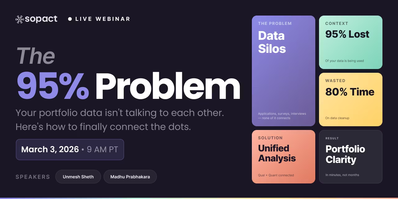
80% of time wasted on cleaning data
Data Fragmentation Delays Report Production

Data teams spend the bulk of their day fixing silos, typos, and duplicates instead of generating insights.

Data teams spend the bulk of their day fixing silos, typos, and duplicates instead of generating insights.

Disjointed Data Collection Process
Qualitative Analysis Creates Reporting Bottlenecks

Hard to coordinate design, data entry, and stakeholder input across departments, leading to inefficiencies and silos.

Manual coding of open-ended responses takes weeks, forcing organizations to skip stakeholder voices or delay distribution until insights lose relevance.

Lost in Translation
Generic Reports Fail to Engage Donors

Open-ended feedback, documents, images, and video sit unused—impossible to analyze at scale.

One-size-fits-all reports don't show major donors their specific impact or connect mid-level supporters to measurable outcomes they funded

TABLE OF CONTENT

Author: Unmesh Sheth

Last Updated:

October 31, 2025

Founder & CEO of Sopact with 35 years of experience in data systems and AI

Donor Impact Report Introduction
NONPROFIT IMPACT REPORTING

Donor Impact Reports That Transform Contributors Into Lifelong Supporters

Most nonprofits collect donations they never properly report on—leaving donors disconnected from the change they helped create.

Your donors write checks because they believe in transformation. They fund scholarships expecting changed lives. They support programs anticipating measurable outcomes. Yet months pass with silence, or worse, a generic thank-you email arrives devoid of substance. The relationship weakens. Renewal rates drop. Trust erodes quietly.

A donor impact report demonstrates how specific contributions generated tangible outcomes—connecting donor generosity directly to program results through clean data and stakeholder stories, turning annual obligations into relationship-building tools.

Traditional reporting fails because it treats donors as transaction endpoints rather than program investors. Organizations dump spreadsheets, bury insights under jargon, or share statistics disconnected from human experience. The result? Donors can't see themselves in your success. They funded 47 scholarships but never met the student whose trajectory shifted. They underwrote a health initiative but received no evidence of clinical improvements.

This disconnection isn't just unfortunate—it's expensive. Organizations lose 60-70% of first-time donors annually, largely because impact remains invisible. Meanwhile, high-performing nonprofits report donor retention rates above 80% by making impact transparent, frequent, and personally relevant.

Modern donor impact reporting solves this through integrated data collection that stays clean from day one, qualitative analysis that surfaces stakeholder voices authentically, and automated reporting that delivers insights when decisions matter—not months later when programs have moved forward.

What You'll Learn

  • How to structure donor reports that position contributors as heroes driving tangible community change rather than passive funders
  • Why quarterly impact updates outperform annual reports for retention, and how to produce them without overwhelming your team
  • The proven framework for blending quantitative metrics with qualitative stories so donors see both scale and human transformation
  • How clean data collection at the source eliminates the 80% of time typically spent on data cleanup before reporting
  • Specific design principles and distribution strategies that turn static PDFs into engagement tools donors actually open, read, and share

Let's start by examining why traditional donor reporting creates distance instead of connection—and what needs to change immediately.

Donor Report Design Best Practices

Best Practices in Donor Report Design

Professional design isn't decoration—it's decision architecture. How you structure information determines whether donors grasp their impact in 30 seconds or abandon your report unread. These practices separate reports that inspire continued giving from those that collect digital dust.

1

Lead With Donor Impact, Not Organizational Activity

Your executive summary should open with donor-funded outcomes, not operational updates. Replace "We served 500 families" with "Your support enabled 500 families to secure stable housing." Position donors as protagonists driving change.

Why this works: Donors scan for their role in transformation. Leading with organizational metrics forces them to translate activities into personal relevance—a cognitive load most won't undertake.
2

Balance Numbers With Narrative Context

Quantitative data proves scale; qualitative stories prove significance. Show "87% of participants reported increased confidence" alongside one participant's journey from self-doubt to career advancement. Data without context is noise.

Why this works: Numbers answer "how much," stories answer "so what." Donors need both to understand magnitude and meaning. Pure statistics feel sterile; pure narratives feel anecdotal.
3

Use Visual Hierarchy to Guide Attention

High-contrast infographics, bold section headers, and ample white space create scannable reports. Place your most compelling outcome—the "big win"—above the fold. Use color sparingly to highlight critical insights, not decorate every element.

Why this works: Donors spend 20-40 seconds on initial scan. Clear hierarchy ensures they absorb your core message even if they never read deeply. Poor visual design signals amateur operations.
4

Segment Reporting by Donor Investment Level

Major donors deserve personalized reports connecting their specific contribution to targeted outcomes. Mid-level donors receive cohort-based impact. General supporters get high-level aggregated results. One-size-fits-all reporting satisfies no one.

Why this works: A $50,000 donor expects granular insight into how their funds moved specific metrics. A $250 donor wants to feel part of collective progress. Mismatched detail levels signal you don't understand their investment psychology.
5

Include Transparent Financial Breakdowns

Show exactly where dollars went—program costs, overhead, administrative expenses. Use simple pie charts or bar graphs, not dense spreadsheets. If 82% went to direct services, lead with that. If overhead ran higher than planned, explain why and what changed.

Why this works: Financial opacity triggers donor skepticism. Organizations avoiding clear breakdowns appear to hide inefficiency. Even unfavorable ratios, when explained honestly, build more trust than vague financial summaries.
6

Embed Clear Next Steps and Future Vision

End with forward momentum—what's next, what challenges remain, how continued support advances the mission. Include specific calls to action: schedule a site visit, join monthly giving, introduce a corporate partner. Make engagement frictionless.

Why this works: Reports that end with "thank you" feel transactional. Reports that invite continued partnership signal you view donors as long-term mission investors, not one-time funding sources.

Choosing Your Report Format

Digital Interactive (Web)

Best for: Broad audiences, real-time updates

  • Easy sharing via link
  • Embed videos, live data
  • Track engagement metrics
  • Update continuously

PDF Document

Best for: Formal documentation, archives

  • Professional appearance
  • Printable for events
  • Controlled branding
  • Email attachment ready

Video Report

Best for: Major donors, emotional impact

  • Humanizes statistics
  • Shows facilities, people
  • Highly shareable
  • Strong retention

Printed Keepsake

Best for: Legacy donors, events, galas

  • Tangible reminder
  • Premium feel
  • Coffee table presence
  • No digital barrier

The Sopact Difference

Traditional reporting fails because organizations spend 80% of their time cleaning fragmented data before they can even begin design. Sopact Sense keeps stakeholder data clean and centralized from collection through analysis, eliminating the preparation bottleneck. The Intelligent Suite transforms qualitative feedback and quantitative metrics into report-ready insights in minutes, not months. You move from "Can we generate a report?" to "What story does our data tell today?"

Donor Impact Storytelling

Effective Donor Impact Storytelling

Data without narrative is forgettable. Narrative without data is unverifiable. The most effective donor reports merge quantitative proof with qualitative meaning—showing scale through metrics while demonstrating significance through stakeholder voices.

The Sopact Story-Data Framework

This four-step approach ensures every impact claim combines evidence with human experience.

STEP 1

Context: Establish the Challenge

Start with the problem your program addresses. What barriers existed? Who faced them? Use baseline data to quantify the challenge: "64% of participants entered with below-proficiency math skills."

STEP 2

Limitation: Show What Wasn't Working

Explain why traditional approaches failed. Reference systemic gaps, resource constraints, or outdated methods. This frames your intervention as solving real problems, not chasing theoretical outcomes.

STEP 3

Transformation: Detail Your Intervention

Describe what changed—the program structure, the support provided, the community built. Include one detailed stakeholder story showing individual experience. Pair it with aggregate data: "Program completion rate: 87%."

STEP 4

Result: Quantify and Qualify Outcomes

Present measurable improvements alongside stakeholder testimony. "Math proficiency increased 43 percentage points. As Maya shared: 'I never thought I'd be the one helping classmates with equations.'"

Weak Impact Narrative

"Our scholarship program served 150 students this year. Students appreciated the financial support and were able to focus more on their studies. We received positive feedback from many participants."

Why this fails: Generic claims, no specific outcomes, no stakeholder voice, no comparative data. Donors can't visualize impact.

Strong Impact Narrative

"Your scholarships removed financial barriers for 150 first-generation students. 89% maintained full-time enrollment versus 54% of unfunded peers. Carlos, who worked 35 hours weekly before his scholarship, now dedicates that time to research—resulting in his first published paper."

Why this works: Specific donor attribution, comparative metrics, named individual with tangible outcome, causal connection established.

Techniques for Blending Qualitative and Quantitative Data

📊

Lead with the Number, Follow with the Voice

"78% of participants reported increased job readiness. Listen to Jennifer: 'The mock interviews didn't just improve my answers—they rebuilt my confidence to walk into rooms where I'd been invisible.'"

🎯

Use Stories to Explain Statistical Patterns

"Why did completion rates jump 34% this cohort? The answer lives in changed circumstances: childcare support, flexible scheduling, peer accountability groups. Meet three participants whose barriers shifted."

🔄

Show Before-and-After Through Data and Narrative

"Pre-program baseline: 23% employment rate. Post-program: 81% secured positions. But averages hide transformation depth. Diego went from seven months unemployed to managing a team of eight."

💡

Extract Themes from Open-Ended Responses

"Across 200+ feedback forms, three themes dominated: belonging (mentioned 67%), skill growth (61%), future optimism (54%). These weren't survey checkboxes—participants wrote paragraphs describing newfound community."

Real Example: Workforce Training Impact

Context: Young adults aged 18-24 faced unemployment rates 2.3x the regional average. Traditional job training showed 41% completion rates.

Intervention: Integrated technical skill development with mentorship, mental health support, and employer partnerships. Your funding covered 65 participants across six months.

Results: 87% completion rate. Average starting wage: $18.50/hour versus $12.75 in comparable programs. 94% remained employed at 6-month follow-up.

Voice: "I walked in thinking I'd never code. Now I debug production systems at a fintech startup. The mentorship taught me the technical skills. The cohort taught me I belonged in rooms I'd never imagined entering." — Jasmine, Program Graduate

How Sopact Enables Better Storytelling

Traditional reporting tools force you to choose: spend weeks manually coding qualitative responses, or skip the narrative depth entirely. Sopact's Intelligent Cell extracts themes, sentiment, and insights from open-ended responses in minutes. The Intelligent Column correlates qualitative patterns with quantitative shifts, answering "Why did metrics improve?" automatically. You move from anecdotal examples to systematic evidence—every voice counted, every pattern surfaced, every story connected to measurable outcomes.

Nonprofit Impact Report Template

Nonprofit Impact Report Template

This template provides the proven structure nonprofits use to transform donor reporting from obligation into opportunity. Adapt each section to your organization's voice while maintaining the core framework that connects contributions to outcomes.

1

Personalized Gratitude Opening

PURPOSE: Acknowledge donors immediately and personally before presenting any organizational content

What to Include:

  • Direct acknowledgment of their specific contribution level or timing
  • Recognition of continued support (if applicable)
  • Brief statement connecting their gift to mission progress
"Your $5,000 scholarship contribution in March 2024 joined 47 other donors to remove financial barriers for an entire cohort of first-generation students. What you made possible this year exceeded our boldest projections."
2

Executive Summary: Your Impact at a Glance

PURPOSE: Deliver the "big win" in 60 seconds—what donor funding accomplished in aggregate

What to Include:

  • 3-5 high-level outcome metrics (people served, completion rates, key milestones)
  • One standout achievement that exceeded expectations
  • Comparison to baseline or prior period (show trajectory)
  • Visual infographic summarizing key numbers
"Your collective support enabled 487 participants to complete workforce training—a 43% increase from last year. 89% secured employment within 90 days at an average starting wage of $18.75/hour, lifting entire families above living wage thresholds."
3

Program Narrative: The Challenge, Intervention, and Transformation

PURPOSE: Tell the story of what donors funded—context, approach, and results

What to Include:

  • Baseline context: What problem existed? Who faced barriers?
  • Intervention details: What did your program provide? How did it differ from status quo?
  • Participant experience: One detailed story showing individual transformation
  • Aggregate outcomes: Population-level changes with comparative data
"When Maria enrolled, she was working three part-time jobs to support two children while attending community college. Like 73% of our participants, financial instability threatened her academic completion. Your scholarship removed that barrier. She graduated with honors, secured a systems analyst position, and now mentors incoming students facing similar challenges."
4

Financial Transparency: Where Dollars Went

PURPOSE: Build trust through clear breakdown of fund allocation

What to Include:

  • Simple pie chart or bar graph showing expense categories
  • Percentage allocated to direct program costs vs. overhead
  • Brief explanation of any significant variance from plan
  • Statement of financial stewardship and audit status
"82% of your contributions directly funded scholarships, mentorship, and support services. 12% covered program administration and evaluation. 6% invested in technology infrastructure that reduced processing time by 67%—allowing us to serve more students with existing resources."
5

Stakeholder Voices: Direct Testimonials and Feedback

PURPOSE: Let beneficiaries speak directly to donors about experienced impact

What to Include:

  • 2-3 direct quotes from program participants
  • Photos (with permission) showing people, not just facilities
  • Qualitative themes extracted from feedback surveys
  • Video testimonials (if format allows)
"From participant feedback: 94% reported increased confidence. 87% cited mentorship as transformational. As Devon shared: 'I came for the tuition support. I stayed because someone finally believed I belonged in spaces I'd been excluded from my entire life.'"
6

Looking Forward: Next Steps and Continued Partnership

PURPOSE: Invite ongoing engagement and signal future impact opportunities

What to Include:

  • Upcoming program expansions or new initiatives
  • Challenges that remain and how future funding addresses them
  • Specific calls to action: renew giving, join monthly donors, attend events, refer peers
  • Contact information for deeper engagement
"This cohort's success positions us to expand to three additional community colleges next year. We're 60% toward our $2.4M goal. Your continued partnership—whether through renewed giving, corporate matching, or introducing us to aligned funders—directly determines how many more students access this pathway."

Report Frequency: Choosing Your Cadence

QUARTERLY

High-Activity Organizations

Best for nonprofits running multiple campaigns, frequent events, or rapid program cycles. Keeps major donors engaged with continuous progress updates.

ANNUAL

Standard Cadence

Appropriate for most organizations. Provides comprehensive year-over-year comparison while not overwhelming donors or staff with excessive reporting.

HYBRID

Segmented Approach

Quarterly updates for major donors (>$10K), annual reports for mid-level and general supporters. Matches engagement intensity to contribution level.

Pre-Distribution Checklist

All metrics verified against source data
Participant stories have written consent for use
Photos include proper attribution and permissions
Financial breakdowns reconcile with accounting records
Report reviewed by leadership and program staff
Contact information and donation links functional
Accessible format (screen reader compatible, alt text for images)
Mobile-responsive if digital format

How Sopact Accelerates This Process

Traditional reporting means manually exporting data, cleaning duplicates, cross-referencing spreadsheets, and building visuals from scratch—consuming 40-80 hours per report. Sopact Sense keeps data clean and centralized from collection, eliminating preparation time. The Intelligent Grid generates report-ready insights in minutes using plain English instructions. You describe what you want to communicate; the system produces formatted output with integrated data visualizations, ready for distribution or further customization.

Donor Impact Report Examples

Donor Impact Report Examples That Drive Results

High-performing reports—from donor impact reports to community impact reports—share identifiable patterns: they open with gratitude, quantify outcomes clearly, humanize data through stories, and end with forward momentum. These examples reveal what separates reports donors and stakeholders read from those they archive unread.

Example 1: Workforce Development Program

DIGITAL PDF

A regional nonprofit serving 18-24 year-olds transitioning from unemployment to skilled trades. Report distributed digitally, 16 pages, sent to 340 contributors.

What Makes This Work

  • Opening impact snapshot: Single page infographic showing 87% completion rate, $18.50/hr average wage, 94% retention at 6 months—immediately demonstrating ROI
  • Segmented storytelling: Featured three participant journeys representing different entry points (high school graduate, formerly incarcerated, single parent)
  • Employer perspective: Included hiring partner testimonial: "These candidates arrive with both technical skills and professional maturity we don't see from traditional pipelines"
  • Transparent challenge section: Acknowledged mental health support costs ran 23% over budget; explained why and how funding gap was addressed
  • Visual progression: Before-and-after comparison showing participant confidence scores at intake versus graduation
Key Insight: Donor renewal rate increased from 62% to 81% after introducing this format—primarily because major donors finally understood the causal connection between funding and employment outcomes.
View Report Examples →

Example 2: Scholarship Fund Program

WEB + VIDEO

University scholarship program for first-generation students. Interactive website with embedded 4-minute video, accessed by 1,200+ visitors including donors, prospects, and campus partners.

What Makes This Work

  • Video-first approach: Featured three scholarship recipients discussing specific barriers removed and opportunities gained—faces and voices building immediate connection
  • Live data dashboard: Real-time metrics showing current cohort progress: enrollment status, GPA distribution, graduation timeline
  • Donor recognition integration: Searchable donor wall linking contributions to specific scholar profiles (with permission)
  • Comparative context: Showed scholarship recipients' retention rates (93%) versus institutional average (67%), proving program effectiveness
  • Social proof and sharing: Easy social media sharing buttons led to 47 organic shares, extending reach beyond direct donor list
Key Insight: Web format enabled A/B testing of messaging. "Your gift removed barriers" outperformed "Your gift provided opportunity" by 34% in time-on-page and 28% in donation clickthrough.
View Report Examples →

Example 3: Youth Program Impact Report

PROGRAM REPORT

Youth development program serving low-income families. Comprehensive report combining quantitative metrics with participant narratives and stakeholder feedback.

What Makes This Work

  • Mixed-method approach: Integrated survey data, interview transcripts, and observational notes to provide multi-dimensional impact evidence
  • Metrics that matter: Tracked participant outcomes (skill development, confidence measures, behavioral changes) not just service volume
  • Cost-per-impact transparency: Clear breakdown showing funding allocation and cost-effectiveness versus comparable programs
  • Participant voice integration: Direct quotes from youth and families about transformation and program experience
  • Challenge visibility: Transparent discussion of barriers encountered and program adaptations made in response
Key Insight: Comprehensive reporting format increased stakeholder confidence and led to expanded funding partnerships by demonstrating systematic approach to evidence collection and analysis.
View Youth Program Report →

Example 4: Community Impact Report

YOUTH PROGRAM

Boys to Men Tucson's Healthy Intergenerational Masculinity (HIM) Initiative serves BIPOC youth through mentorship circles. Community-focused report demonstrating systemic impact across schools, families, and neighborhoods.

What Makes This Work

  • Community systems approach: Report connects individual youth outcomes to broader community transformation—40% reduction in behavioral incidents, 60% increase in participant confidence
  • Redefining impact categories: Tracked emotional literacy, vulnerability, and healthy masculinity concepts—outcomes often invisible in traditional metrics
  • Multi-stakeholder narrative: Integrated perspectives from youth participants, mentors, school administrators, and parents showing ripple effects across community
  • SDG alignment: Connected local mentorship work to UN Sustainable Development Goals (Gender Equality, Peace and Justice), elevating program significance
  • Transparent methodology: Detailed how AI-driven analysis (Sopact Sense) connected qualitative reflections with quantitative outcomes for deeper understanding
  • Continuous learning framework: Report explicitly positions findings as blueprint for program improvement, not just retrospective summary
Key Insight: Community impact reporting shifts focus from "what we did for participants" to "how participants transformed their communities"—attracting systems-change funders and school district partnerships that traditional individual-outcome reports couldn't access.
View Community Impact Report →

Common Patterns Across High-Performing Reports

📊

Lead With Outcomes, Not Activities

Strong reports open with "Your funding achieved X outcome" rather than "Our organization did Y activities." Donors care about results first, methods second.

👤

Feature Named Individuals, Not Aggregates

Statistics prove scale; stories prove significance. Every high-performing report includes at least one named beneficiary with specific transformation details.

💰

Show Cost-Per-Impact Calculations

Donors increasingly think like investors. "Your $5,000 provided 12 months of mentorship for eight students" creates clarity that generic "supported our program" cannot.

📈

Include Baseline and Comparison Data

Improvement claims need context. "87% completion rate" means little without knowing previous years averaged 63% or that comparable programs achieve 54%.

🎯

End With Specific Next Steps

Reports that conclude with vague "thank you" feel transactional. Strong reports invite continued partnership: "Join monthly giving," "Attend our showcase," "Introduce us to aligned funders."

Element Weak Approach Strong Approach
Opening "Thank you for your support this year..." "Your $10,000 gift removed financial barriers for 23 first-generation students—here's what happened next..."
Data Presentation "We served 500 families" "500 families accessed stable housing—72% remained housed at 12-month follow-up versus 41% in comparable programs"
Story Integration "Many participants reported positive experiences" "Listen to Keisha: 'The mentorship didn't just improve my resume—it rebuilt my sense of what's possible when someone invests in your potential'"
Financials Dense spreadsheet buried in appendix Simple pie chart on page 2: "82% direct services, 12% evaluation, 6% administration"
Closing "We look forward to your continued support" "We're 60% toward our goal to expand to three additional sites. Your renewed $10K commitment funds eight more students. Can we count on you?"

Creating These Examples With Sopact

Traditional tools require manually gathering data from multiple sources, cleaning inconsistencies, conducting separate qualitative analysis, and assembling everything in design software—consuming 40-80 hours per report. Sopact Sense centralizes clean data from collection, the Intelligent Suite extracts both quantitative metrics and qualitative themes automatically, and the Intelligent Grid generates formatted report outputs in minutes. Organizations shift from "Can we produce quarterly reports?" to "What insights should we share this week?"

Explore Complete Report Library

Discover dozens of real-world impact report examples across sectors—from workforce development and education to health initiatives and community programs.

View All Report Examples
Donor Impact Report FAQ

Frequently Asked Questions About Donor Impact Reports

These questions address the practical challenges nonprofits face when creating transparent, engaging donor reports that strengthen relationships and drive continued support.

Q1. How often should nonprofits send donor impact reports?

Most nonprofits benefit from annual reports to all donors, with quarterly updates for major contributors giving $10,000 or more. High-activity organizations running multiple campaigns should consider quarterly reporting broadly to maintain donor engagement throughout the year.

The key is matching frequency to your program cycle and donor expectations. Quarterly reports work when you have meaningful new outcomes to share every 90 days. Annual reports suit organizations with longer program timelines or fewer discrete milestones.

Consider hybrid approaches: quarterly digital updates (brief, 2-3 pages) for major donors, comprehensive annual reports (12-20 pages) for all supporters.
Q2. What's the difference between a donor impact report and an annual report?

Donor impact reports focus specifically on demonstrating how contributions created outcomes, positioning donors as protagonists driving change. Annual reports provide comprehensive organizational overviews including governance, strategy, and stakeholder messages beyond just donor-funded results.

Impact reports can be produced quarterly or after specific campaigns, while annual reports typically cover full fiscal years. Impact reports often segment by donor level with personalized content, whereas annual reports address broader audiences with uniform messaging.

Many high-performing nonprofits now blend these formats, creating "annual impact reports" that emphasize donor-driven outcomes while including organizational context.
Q3. How do you measure the effectiveness of a donor impact report?

Track donor renewal rates comparing pre- and post-report periods, open and engagement rates for digital formats, and average gift increases among report recipients versus non-recipients. Survey a sample of donors asking whether the report influenced their decision to renew support.

For digital reports, monitor time-on-page, scroll depth, video completion rates, and social sharing metrics. Strong reports typically show 40-60% open rates, 3-5 minute average engagement time, and lead to 15-30% increases in donor retention compared to organizations not reporting consistently.

Q4. What if our data shows programs underperformed or didn't meet goals?

Transparency builds trust more than selective reporting. Acknowledge shortfalls directly, explain contributing factors honestly, and detail corrective actions taken. Donors respect organizations that learn from challenges rather than hiding difficulties.

Frame underperformance as learning opportunities and show how donor feedback or mid-course corrections improved outcomes. Present the full context including external factors like pandemic impacts, policy changes, or economic conditions that affected results beyond your control.

Organizations that report honestly during challenging periods often see stronger donor loyalty than those sharing only favorable data, because transparency signals integrity and adaptive capacity.
Q5. How can small nonprofits create professional impact reports without large budgets?

Focus on clean data collection from the start rather than expensive post-production design. Use free tools like Canva for visual design, leverage donor management systems that generate automated reports, and prioritize substance over elaborate formatting.

Start with simple digital PDFs combining basic infographics, one strong participant story, and clear financial breakdowns. As you grow, invest in platforms that keep data clean and centralized, eliminating the 40-80 hours typically spent preparing fragmented information for reporting.

Sopact Sense addresses exactly this challenge—enabling small teams to produce professional reports in minutes rather than weeks by maintaining clean, analysis-ready data throughout the program cycle.
Q6. Should donor impact reports be public or only shared with contributors?

Most organizations publish general impact reports publicly while creating personalized versions for major donors showing their specific contribution's outcomes. Public reports build credibility with prospects researching your organization and demonstrate transparency to regulators and community stakeholders.

Personalized reports for donors above certain thresholds should include individualized elements like contribution amount acknowledgment, specific program details their funding supported, and exclusive insights about upcoming initiatives. This hybrid approach maximizes both public credibility and donor stewardship.

Upload feature in Sopact Sense is a Multi Model agent showing you can upload long-form documents, images, videos

AI-Native

Upload text, images, video, and long-form documents and let our agentic AI transform them into actionable insights instantly.
Sopact Sense Team collaboration. seamlessly invite team members

Smart Collaborative

Enables seamless team collaboration making it simple to co-design forms, align data across departments, and engage stakeholders to correct or complete information.
Unique Id and unique links eliminates duplicates and provides data accuracy

True data integrity

Every respondent gets a unique ID and link. Automatically eliminating duplicates, spotting typos, and enabling in-form corrections.
Sopact Sense is self driven, improve and correct your forms quickly

Self-Driven

Update questions, add new fields, or tweak logic yourself, no developers required. Launch improvements in minutes, not weeks.