Traditional Reporting vs Analytics: Breaking the Accountability Trap
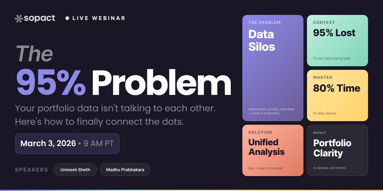
Your funder sends a mid-year check-in email with three questions: Which participant segment improved most? Did the intervention work better in the second cohort than the first? What would you do differently with 20% more budget? Your annual report sits in a folder. It has charts. It has numbers. It cannot answer any of these questions — because it was built to prove the money was spent, not to generate intelligence about what should happen next. That gap between what your reports show and what decisions actually require is The Accountability Trap: the condition where optimizing for funder accountability consumes the organizational capacity needed for learning. Most social sector organizations are caught in it.
Traditional reporting and analytics are not two versions of the same thing. They are architecturally opposed. Traditional reporting is a backward-looking compliance exercise — it answers "did we deliver?" Analytics is a forward-looking intelligence function — it answers "what should we do next?" Organizations that treat them as interchangeable end up with neither. They produce reports that satisfy funders and inform nobody, including the funders.
Core Concept
The Accountability Trap
When reporting is designed to satisfy funders, it consumes the capacity needed for learning. Most organizations never escape it — not because of effort, but because of architecture.
Traditional Reporting vs AnalyticsAI-Powered Reporting SystemsSocial Impact & NonprofitsSopact SenseData-Driven Programs
1
Identify your reporting trap
2
See the structural differences
3
Transform data collection
4
Build AI-powered intelligence
5
See real examples
84%
of data leaders say their strategy needs a complete overhaul before AI ambitions can succeed
80%
of analyst time spent cleaning data before a single insight is generated in traditional stacks
10 min
to complete a full analysis cycle in Sopact Sense vs. 5–7 weeks in a traditional workflow
Step 1: What Is Traditional Reporting — and Where It Traps Organizations
Traditional reporting is the process of summarizing program activity and outcomes for an external audience — typically a funder, board, or regulator — using aggregated counts, completion rates, and anecdotal stories collected after the program has ended. The format is standardized. The timing is retrospective. The audience is accountability-focused.
The structural problem is not the format. It is the architecture. Traditional reporting systems are built in reverse: programs run, data accumulates in spreadsheets and form exports, staff spend weeks cleaning and assembling reports, findings arrive after the decisions they were supposed to inform have already been made. By the time the report says "cohort 2 struggled with module 4," cohort 3 is halfway through module 4 and nobody told them.
That is The Accountability Trap in practice. Every hour spent assembling last cycle's report is an hour not spent understanding the current cycle. The trap is not laziness — it is architecture. When data collection, analysis, and reporting are three separate workflows built for three separate tools, accountability will always crowd out learning. There is not enough time for both.
Compliance Bottleneck
We produce reports but can't answer follow-up questions from funders
I run evaluation for a nonprofit with three workforce programs and roughly 600 participants per year. We deliver solid annual reports — completion rates, satisfaction scores, a handful of success stories. But when our foundation contact asks "which cohort improved most on employment readiness, and why?" or "how do outcomes differ by zip code?" I have nothing. The data exists, distributed across three spreadsheet exports and a SurveyMonkey account. Nobody has linked them. We spend more time assembling reports than learning from them. I need to close that gap before we lose a renewal.
Platform signal: Sopact Sense — persistent participant IDs + Intelligent Column + real-time dashboards serve this use case. The data linking you need cannot be retrofitted onto disconnected exports.
Analytics Scaling Point
We have one program running well but need to scale analytics across multiple sites
I lead a fellowship program that operates in four cities. Each site has a coordinator who collects data differently — one uses Google Forms, two use SurveyMonkey, one uses paper. When I try to produce a cross-site report, I spend three weeks reconciling field names and deduplicating records. The data quality varies by site. I can't tell whether outcome differences are real program differences or data collection artifacts. I need a system where all sites collect data the same way, I can see cross-site comparisons in real time, and I don't have to wait until cycle end to know which sites are underperforming.
Platform signal: Sopact Sense — standardized collection across sites + portfolio-level analytics. Multi-site programs are the canonical use case for this architecture.
Early Stage
We're small and just starting to measure outcomes — not sure what we need yet
Early-stage nonprofits · New program staff · First-time evaluators
We're a three-person team running a youth mentorship program with about 80 participants annually. We currently track attendance in Excel. A new funder wants to see pre/post outcomes and demographic breakdowns. I've looked at Sopact Sense but I'm not sure we have the data infrastructure to justify the investment yet. Honestly I'm not even sure what questions I should be designing surveys around — I don't have a logic model yet. I need to start collecting outcomes in a way that won't trap me in bad data for the next three years.
Platform signal: Start with KoboToolbox (free tier) to build collection habits and a logic model. Upgrade to Sopact Sense when longitudinal tracking or cross-program analysis creates a recurring capacity constraint — typically around 200+ participants or when a second program launches.
📋
Outcome framework or logic model
Defines what you're measuring and why. Even a one-page theory of change helps design surveys that produce analyzable data instead of interesting-but-disconnected responses.
🔗
Participant identifier plan
How will you track the same person across program stages? Name + email alone creates deduplication problems at scale. A persistent ID system resolves this from first contact.
📊
Reporting audience requirements
What questions does each audience need answered? Funder compliance reports, board dashboards, and program adaptation reviews require different data structures — design for all three upfront.
👥
Stakeholder roles and access
Who collects data, who reviews quality, who analyzes, who uses findings? Defining roles before configuring a system prevents the single-person M&E bottleneck.
📅
Program timeline and collection windows
Pre/post measurement requires knowing when "pre" and "post" are. Multi-cohort analysis requires cohort start dates captured at intake. These seem operational but determine longitudinal validity.
🗂️
Prior cycle data inventory
What data do you already have, in what format, in which tools? A realistic inventory of existing data helps identify whether migration is needed or whether starting clean is the faster path.
Multi-program or multi-site edge case: If programs share participants (e.g., a housing client who also uses job training), participant IDs must be consistent across programs from the start. Retroactive deduplication across systems is the most expensive data problem in social sector analytics — worth solving at design stage, not after two program cycles.
From Sopact Sense — what the platform produces for reporting and analytics
Longitudinal participant records
Every data point from intake through outcome survey linked to a persistent participant ID — no manual reconciliation, no "which Sarah?" problem across data sources.
Real-time disaggregated dashboards
Outcomes broken down by cohort, demographic segment, site, program type, or any structured field — available as the current cycle runs, not after it ends.
Qualitative-quantitative integration
Open-ended response themes correlated with quantitative outcome scores at the individual participant level through Intelligent Column — without manual coding.
Plain-English report generation
Intelligent Grid generates formatted reports from natural language queries — "compare outcomes by cohort for Q3 workforce program" — without BI tools or pivot tables.
Early warning indicators
Flags disengaged participants, completion risk segments, and performance outliers while programs are running — not in the post-program report.
Funder-ready compliance exports
Accountability reports formatted for compliance alongside analytics — the same data serves both functions without a separate report assembly workflow.
Starting from scratch
"I need to build an outcome measurement system for a workforce program starting next quarter. Help me design collection instruments and reporting structure from a theory of change."
Replacing a disconnected stack
"We use SurveyMonkey for surveys, Excel for tracking, and Google Slides for reports. I need a single system where all three functions work together and I stop spending 3 weeks on each report cycle."
Scaling to portfolio analytics
"I need to compare outcomes across 8 grantees who currently collect data differently. Help me standardize collection and build a portfolio dashboard I can show funders in real time."
The Accountability Trap: Why Traditional Reporting Can't Become Analytics
The Accountability Trap has a specific mechanism. When organizations collect data exclusively for reporting purposes — attendance counts, completion certificates, output tallies — the data architecture reflects that purpose. Questions are designed to satisfy reporting templates, not to generate insight. Demographic fields get added after the fact. Pre/post comparisons are impossible because nobody captured a baseline. Qualitative responses sit in a separate export from quantitative outcomes.
The result: even when organizations attempt analytics, they are running analytics on reporting data — data that was never designed to answer the questions analytics requires. The gap cannot be closed with a better dashboard. It can only be closed by redesigning where data originates and what it captures from the first interaction.
Sopact Sense addresses this at the source. Unique participant IDs are assigned at the moment of first contact — application, intake, enrollment — not added later. Every form, survey, and follow-up instrument is designed and collected inside the same system, linked to the same participant record. Longitudinal context builds automatically through the persistent ID chain. Pre-program and post-program data are connected not because a staff member manually matched them in Excel, but because they were always linked to the same ID. There is no "prepare data for analysis" step because the data was prepared at the point of collection.
Step 2: Traditional Reporting vs Analytics — The Four Structural Differences
Understanding traditional reporting vs analytics requires understanding four specific architectural differences — not stylistic ones.
Direction of time. Traditional reporting is backward-looking: it summarizes what happened in a completed cycle. Analytics is concurrent: it tracks what is happening now and models what is likely to happen next. A program coordinator using analytics can see that 40% of participants in the current cohort have not completed module 2 — not after the cohort ends, but while there is still time to intervene.
Unit of analysis. Traditional reporting aggregates: it tells you how many participants completed, how many didn't, what percentage hit the benchmark. Analytics disaggregates: it tells you which participants, in which segment, with which characteristics, under which conditions. Disaggregation is where program intelligence lives. Aggregates tell you the average; analytics tells you why the average is misleading.
Qualitative integration. Traditional reporting treats open-ended responses as stories to quote in the executive summary. Analytics treats qualitative data as a structured signal layer — themes extracted, sentiment scored, correlated with quantitative outcomes at the participant level. Sopact Sense's Intelligent Column performs this correlation automatically. SurveyMonkey and Qualtrics export open-ended responses as a separate text file. The integration step is manual, expensive, and usually skipped.
Learning feedback loop. Traditional reporting produces a document that lives in a folder. Analytics produces a continuous intelligence loop: findings surface, decisions get made, programs adapt, new data reflects the adaptation. This is why 84% of data and analytics leaders acknowledge their data strategies need a complete overhaul — they built for compliance output, not learning loops.
Step 3: How Analytics Can Transform Traditional Reporting
The question "how can analytics be used to transform traditional reporting" has a precise answer: analytics can only transform traditional reporting when the data infrastructure changes first. Better dashboards applied to compliance-collection data produce better-looking compliance reports, not analytics.
The transformation requires three shifts:
From event-based to ID-based collection. When every participant, applicant, or grantee has a persistent unique identifier from first contact, every subsequent data point — program completion, outcome survey, follow-up interview, annual check-in — is automatically connected to the full context of that person's journey. This is what makes longitudinal analysis possible without manual reconciliation. It is also what makes the traditional "data cleaning" step disappear: there is nothing to reconcile because everything was connected from the start.
From report templates to question-driven design. Instead of designing surveys to fill reporting templates, design surveys around the questions that would change program decisions. What do you need to know about participants before you can claim the program worked? What would a differentiated intervention look like, and what data would tell you which participants need it? When data collection starts with these questions, reports that answer them become a natural output rather than a manual assembly job. Explore how survey analytics use cases apply this approach in practice.
From periodic cycles to continuous monitoring. Traditional reporting produces quarterly or annual snapshots. Analytics replaces snapshots with continuous monitoring — participation patterns tracked in real time, early warning indicators flagging disengaged participants before they drop out, outcome trends visible week by week rather than after the program closes. Sopact Sense's Intelligent Grid generates this intelligence from plain-English queries — no BI specialist, no dashboard configuration, no export. See how this connects with longitudinal research approaches when multi-year tracking is required.
Step 4: How Sopact Sense Enables AI-Powered Reporting and Analytics
AI-powered reporting systems have a specific meaning in this context. The "AI" is not a layer applied to existing data — it is an architecture built into data collection from the start. Without that foundation, AI produces confident-sounding analysis of structurally compromised data.
Sopact Sense operates as four connected intelligence layers:
Intelligent Cell analyzes individual data points — a single open-ended response, a document, an interview transcript — extracting themes, sentiment, and rubric alignment without requiring a human coder.
Intelligent Row tracks participant journeys longitudinally — connecting application responses to baseline surveys to mid-program check-ins to outcome assessments — using the persistent ID chain established at first contact.
Intelligent Column performs cross-metric correlation: identifying which qualitative themes appear most often among participants who showed the strongest quantitative outcomes, and which appear most often among those who didn't. This is the analysis that answers "what worked, for whom, and under what conditions" — the question funders increasingly require and traditional reporting cannot answer.
Intelligent Grid translates the preceding layers into reports and dashboards from plain-English instructions. Program staff can ask "show me outcomes by demographic segment for cohort 3" without opening a BI tool. The query becomes a formatted report, not a pivot table exercise.
This is the architecture that makes AI-powered equity dashboards possible without importing data from external systems. Collection, analysis, and reporting are not three separate tools — they are three functions of one system. Build your program intelligence infrastructure at sopact.com.
Step 5: Traditional Reporting vs Analytics Examples
The clearest way to understand traditional reporting vs analytics examples is to trace the same program data through both approaches.
Workforce training program, traditional reporting approach: Staff export attendance records from one spreadsheet, pre/post skills assessments from a survey platform, and employer feedback from email into a third document. A consultant spends two weeks standardizing field names and matching participants across sources. The final report shows 78% completion rate and average skills gain of 2.3 points on a 5-point scale. The report is delivered six weeks after program close. The next cohort has already started.
Same workforce training program, analytics approach: Sopact Sense assigns IDs to all participants at registration. The pre-program assessment, weekly check-ins, skills assessment, and employer feedback are all collected in the same system, linked to the same participant ID from day one. At week 4, Intelligent Column flags that participants who scored below 3 on the week-2 self-efficacy item are showing 40% lower skills gains. The program coordinator is notified in week 4, not in the post-program report. Targeted support is deployed in week 5. The next cohort benefits from the adapted intervention before the current cohort has even ended.
The difference is not the reporting format. It is when the intelligence arrives and whether it can change anything. For additional examples across scholarship programs and grantee portfolios, see actionable insights from stakeholder data.
1
Non-reproducible AI results
Same survey export, different AI session, different theme groupings. Year-over-year comparison breaks because the analytical baseline shifts each run.
2
Unstable disaggregation
Segment labels generated by AI vary across sessions. "Youth participants" in one report becomes "young adults 18–24" in the next. Equity analysis requires stable segment definitions.
3
Survey design without logic model alignment
AI-assisted survey design optimizes for readability, not pre/post pairing or outcome validity. Structural problems surface 2+ cycles later when longitudinal comparison is impossible.
4
No persistent participant tracking
General AI tools analyze exports. They have no memory of who a participant was before the export. Longitudinal analysis requires linked records from first contact — not from last export.
Capability
Gen AI Tools ChatGPT / Claude / Gemini
Sopact Sense AI-native, clean-at-source
Participant tracking
No persistent IDs. Each session analyzes an export with no prior context about who the participant is or what they did in earlier stages.
Persistent unique IDs assigned at first contact — application, intake, or enrollment. All subsequent data links automatically.
Longitudinal analysis
Manual. Pre-program and post-program exports must be matched by an analyst before analysis can begin. No guarantee of consistent IDs across exports.
Automatic. Pre/post data is linked through the participant ID chain from the start — no matching step, no reconciliation, no deduplication.
Qualitative analysis
High quality per session — theme extraction, sentiment scoring, narrative summaries. Non-reproducible across sessions; analytical results vary.
Intelligent Column applies consistent rubrics across all participants. Same logic model alignment, same theme taxonomy, every cycle. Year-over-year comparable.
Disaggregation
Possible if segment fields are structured in the export. Segment label instability across sessions undermines equity reporting.
Structured at collection. Demographic fields captured at intake power real-time disaggregation without post-hoc labeling or session-to-session variance.
Report reproducibility
Different structure, different metric names, different narrative framing each run. Cannot produce consistent annual reports without manual standardization.
Intelligent Grid generates reports from consistent data structures. 2024 and 2025 reports are directly comparable without manual alignment.
Real-time monitoring
Not available. Analysis requires completed data exports. No in-cycle flagging of disengaged participants or performance outliers.
Real-time. Dashboards update as data arrives. Early warning flags surface during the program cycle, not after it ends.
Survey design validity
No access to logic model or Theory of Change. Surveys optimized for readability may miss pre/post pairing requirements or outcome validity criteria.
Instrument design starts from your outcomes framework. Pre/post pairing, longitudinal follow-up, and disaggregation fields are built into collection from the start.
What a complete reporting and analytics system produces — built in Sopact Sense
🔗
Linked participant records from intake to outcome
Every data collection event connected to a persistent participant ID — no manual matching, no deduplication across exports.
📊
Real-time disaggregated dashboards
Outcomes by cohort, segment, site, and program type — visible as the cycle runs, not after it closes.
🔍
Qualitative-quantitative integrated reports
Open-ended themes correlated with outcome scores at the participant level through Intelligent Column — without manual coding.
⚡
Plain-English report generation
Intelligent Grid produces formatted analytics reports from natural language queries in minutes — no BI tool, no export, no pivot table.
🚩
In-cycle early warning system
Flags disengagement risk, completion outliers, and performance segments while intervention is still possible.
📋
Funder compliance and learning reports from the same data
Accountability deliverables and analytical intelligence generated from one system — no separate assembly workflow.
📈
Longitudinal pre/post comparisons across cycles
Multi-year outcome trends with consistent segment definitions — reproducible and comparable without manual standardization.
Step 6: Affordable AI-Driven Data Ingestion and Automated Reporting Options
Affordable AI-driven data ingestion and automated reporting options exist across a spectrum. Understanding where each option hits its limits prevents organizations from investing in tools that solve the wrong problem.
Free and low-cost tier (Google Forms, KoboToolbox, SurveyMonkey Basic): Suitable for single-program collection with no longitudinal requirements. Data lives in separate exports. No AI analysis. Reporting requires manual assembly. The hidden cost is not the subscription — it is the 20–40 staff hours per reporting cycle spent reconciling exports.
Mid-tier survey platforms ($20–200/month — SurveyMonkey Standard, Typeform, Qualtrics Essentials): Better collection, basic dashboards, limited AI features. Quantitative analysis is automated; qualitative analysis is not. Cross-program analysis requires exporting to a third tool. Longitudinal tracking requires manual ID management. Better for organizations with single-survey use cases than for programs requiring pre/post or multi-year tracking.
Enterprise BI tools (Power BI, Tableau, $500+/user/year): Powerful visualization — when connected to clean, unified data. The catch: these tools require clean data inputs. Organizations using fragmented collection tools spend more time feeding clean data into the BI tool than the BI tool saves in analysis time. High setup cost, high maintenance cost, no qualitative analysis.
Integrated AI-native platforms ($500–5,000/year — Sopact Sense): Collection, qualitative analysis, longitudinal tracking, and report generation in one system. The architecture eliminates the data preparation cost entirely. No export, no reconciliation, no manual coding of open-ended responses. For organizations running multiple programs with diverse stakeholder populations, the ROI is measured in analyst-weeks recovered per quarter, not subscription cost comparisons. Learn what this looks like in practice at sopact.com.
The honest recommendation: organizations with fewer than 200 annual participants and a single program cycle should start with KoboToolbox. The upgrade to Sopact Sense is warranted when longitudinal tracking, cross-program analysis, or qualitative synthesis creates a recurring capacity constraint.
Step 7: The Gen AI Illusion in Reporting and Analytics
When reporting and analytics involve any task a program team might attempt with ChatGPT, Claude, or Gemini — writing report narratives, analyzing open-ended responses, building dashboards from survey exports — four structural problems emerge.
Non-reproducible analytical results. General-purpose AI models are non-deterministic by design. The same survey export analyzed in two separate sessions will produce different theme groupings, different sentiment scores, and different narrative summaries. Year-over-year comparisons built on AI-generated analysis are unreliable because the baseline and the current period were analyzed in different sessions with different outputs.
Dashboard variability with no standardized structure. AI tools produce differently formatted reports each run. Metric names shift. Section order changes. Visualization logic varies. The 2024 report and the 2025 report cannot be compared side by side without extensive manual alignment. This is not a bug — it is how language models work. For compliance reporting, this is tolerable. For longitudinal analytics, it is disqualifying.
Disaggregation inconsistencies. Segment labels produced by AI analysis are not stable across sessions. "Young adults 18–24" in one session becomes "youth participants" in the next. Cross-demographic comparisons — the core of equity-focused analytics — break when segment definitions are regenerated rather than locked at collection.
Weak survey design corrupts all downstream data. General-purpose AI tools have no access to your program's logic model, your Theory of Change, or your pre/post measurement design. Survey instruments designed with AI assistance optimize for grammatical quality, not structural validity. The design problems — missing baselines, misaligned outcome questions, no pre/post pairing — surface 2+ program cycles later, when the data needed for longitudinal comparison doesn't exist.
Sopact Sense's AI is applied to data that was designed for analysis, collected under a persistent ID architecture, and processed through consistent analytical rubrics. The result is not faster compliance reporting — it is reliable program intelligence. For the distinction applied to survey-specific workflows, see the survey analytics guide.
VideoThe Data Lifecycle Gap: Why Traditional Reporting Fails and What Replaces It
This video walks through the structural gap between data collection and decision-making in social sector reporting — and how AI-native architecture closes it without a separate analytics tool.
Traditional reporting is the process of summarizing program activities, outputs, and outcomes for external stakeholders — typically funders, boards, or regulators — using aggregated data collected retrospectively at the end of a program cycle. It answers "did we deliver?" rather than "what should we do next?" Traditional reporting optimizes for accountability compliance; it was not designed to generate organizational learning or enable real-time program adaptation.
What is the difference between traditional reporting and analytics?
Traditional reporting is backward-looking, compliance-oriented, and aggregated — it tells funders what happened after the program ends. Analytics is concurrent, learning-oriented, and disaggregated — it tells program staff what is happening now, which segments are underperforming, and what the data predicts if nothing changes. The difference is not cosmetic. The two functions require different data architectures; traditional reporting systems cannot be converted into analytics systems by adding a dashboard.
What is traditional reporting vs analytics examples?
A workforce program that produces an annual completion rate report is doing traditional reporting. The same program tracking weekly skill assessment scores by participant cohort, surfacing low-engagement flags in real time, and correlating early warning indicators with final outcomes is doing analytics. Traditional reporting tells you 78% of participants completed. Analytics tells you which 22% were identifiable as at-risk in week 3 and what intervention would have changed the result.
What is AI-powered reporting and analytics for nonprofits?
AI-powered reporting and analytics means AI is built into the data collection architecture, not applied to finished exports. Sopact Sense assigns persistent participant IDs at intake, links all subsequent data to those IDs, applies AI analysis through Intelligent Cell (individual responses), Intelligent Row (participant journeys), Intelligent Column (cross-metric correlation), and Intelligent Grid (report generation). Reports are generated from plain-English queries — no BI tool, no export, no manual coding.
What is the Accountability Trap?
The Accountability Trap is the structural condition where optimizing reporting for funder accountability consumes the organizational capacity needed for learning. When data collection is designed to satisfy reporting templates rather than generate intelligence, the data architecture reflects that design: no baselines, no longitudinal links, no qualitative integration. Even when organizations attempt analytics, they are analyzing compliance data — data that was never designed to answer the questions analytics requires.
How can analytics be used to transform traditional reporting?
Analytics can only transform traditional reporting when data architecture changes first. The transformation requires three shifts: from event-based to ID-based collection (persistent participant identifiers assigned at first contact); from report template design to question-driven survey design (starting from the decisions the data needs to inform); and from periodic cycles to continuous monitoring (tracking program health in real time, not at cycle end). Adding a dashboard to compliance-collection data produces better-formatted compliance reports, not analytics.
How do I compare platforms that focus on AI ingestion vs automated reporting?
Platforms focused on AI ingestion — importing spreadsheets and documents and analyzing them with AI — solve a different problem than platforms focused on automated reporting from clean-at-source data. AI ingestion tools work best when organizations already have data and need analysis. Automated reporting tools built on clean-at-source architecture (like Sopact Sense) eliminate the ingestion step entirely — there is nothing to import because the data was always structured inside the platform.
What are affordable AI-driven data ingestion and automated reporting options?
Free tools (Google Forms, KoboToolbox) handle basic collection but require manual export and reconciliation. Mid-tier platforms ($20–200/month) automate quantitative dashboards but leave qualitative analysis to analysts. Sopact Sense ($500–5,000/year) integrates collection, AI analysis, and reporting in one system — the cost saving is not the subscription but the analyst-weeks recovered per cycle from eliminating export, reconciliation, and manual coding.
What are AI-powered reporting systems for social impact organizations?
AI-powered reporting systems for social impact organizations are platforms that combine structured data collection with built-in qualitative analysis and automated report generation. They differ from BI tools (which require clean external data) and from survey platforms with AI add-ons (which analyze collection exports but don't integrate qualitative and quantitative data). The defining capability: connecting open-ended response themes with quantitative outcome scores at the individual participant level, automatically, without manual coding.
Why is traditional reporting being replaced by analytics?
Traditional reporting is being replaced by analytics because funders increasingly require evidence that programs learn and adapt, not just evidence that they deliver. A compliance report proves outputs were achieved. An analytics system proves outcomes were understood, variations were identified, and programs improved as a result. Organizations that cannot demonstrate learning from their data are disadvantaged in competitive grant environments — and miss the program improvements that better funding depends on.
Can Gen AI tools like ChatGPT replace a reporting and analytics platform?
No. General-purpose AI tools produce non-reproducible results — the same data analyzed in two sessions generates different themes, different scores, and different report structures. This makes longitudinal comparison unreliable. They also have no access to your program's logic model or pre/post design, so survey instruments built with AI assistance may optimize for readability while missing structural measurement requirements. Sopact Sense applies AI to data that was collected under a persistent ID architecture and designed for analytical validity from the start.
What does Sopact Sense produce differently from a survey platform?
Survey platforms collect data and export formatted results. Sopact Sense collects, links, analyzes, and reports within one system. The difference is structural: SurveyMonkey's export has no memory of who a participant was before they filled out the survey. Sopact Sense's Intelligent Row knows every data point collected from that participant since first contact — application, onboarding, mid-program assessment, and outcome survey — linked automatically through a persistent ID. This is what makes genuine pre/post comparison, longitudinal tracking, and disaggregated analytics possible without manual reconciliation.
Ready to break out of the Accountability Trap?
See how Sopact Sense replaces disconnected reporting stacks with AI-powered analytics built from first contact.
Most analytics tools analyze data you export. Sopact Sense builds the intelligence architecture before the first survey is collected — closing the Accountability Trap at the source, not after the cycle ends.