Build and deliver modern reporting and analytics without months of dashboard delays. Learn how clean-at-source data and AI-native reporting replace static visuals with trusted, adaptive insights.
Author: Unmesh Sheth
Last Updated:
November 13, 2025
Founder & CEO of Sopact with 35 years of experience in data systems and AI
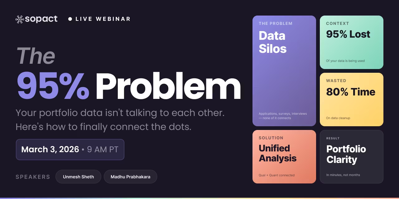
For decades, dashboard reporting has meant one thing: take messy data from multiple sources, spend weeks cleaning and reconciling it, build static visualizations, and present findings long after decisions needed to be made. The 80/20 problem—where 80% of effort goes to data preparation and only 20% to actual analysis—has become an accepted reality.
But the cost of this approach is staggering. Program teams wait months for insights that should be immediate. Data fragmentation creates silos where the same participant appears multiple times with different IDs. Qualitative feedback sits unused because traditional dashboards can't integrate stories with metrics. And when stakeholders finally see a report, the program has already moved forward—making insights retrospective rather than actionable.
In 2026, a fundamental transformation is underway. Organizations are moving from compliance-driven, retrospective dashboards to adaptive learning systems that keep data clean at the source, integrate qualitative and quantitative insights simultaneously, and empower program teams—not just IT departments—to own their reporting workflows. These aren't just prettier visualizations. They're architectures built for continuous learning.
This shift matters because impact work demands speed and context. Funders want evidence of outcomes, not just activities. Program staff need to understand what's working and why, in time to make meaningful adjustments. And participants deserve systems that honor their feedback rather than losing it in fragmented spreadsheets.
The dashboard reporting landscape of 2026 is defined by three core principles: clean-at-source data collection that eliminates manual reconciliation, AI-powered analysis layers that explain both what happened and why, and team ownership models that put insights directly in the hands of those who can act on them.
For over two decades, dashboard reporting has followed the same playbook: collect data in multiple tools, export to spreadsheets, spend weeks cleaning and reconciling duplicates, build static visualizations, and present findings to stakeholders long after decisions needed to be made. This model worked when reporting was primarily a compliance exercise—checking boxes for funders rather than driving program improvements.
But in 2026, that approach has become a liability. Organizations need insights in days, not months. Program teams need to understand both what's happening and why. And stakeholders expect evidence that connects numbers to real participant experiences. Traditional dashboard reporting can't deliver on these demands because it was never designed for continuous learning—only retrospective compliance.
Legacy dashboard reporting treats insights as fixed snapshots. You build a dashboard, populate it with historical data, and share it with stakeholders—who then ask new questions the dashboard can't answer without starting over. This static model creates a constant lag between what teams need to know and what dashboards can show.
Organizations spend 3-6 months building dashboards that become outdated within weeks because they can't adapt to evolving questions. When program priorities shift or funders request different metrics, teams rebuild from scratch rather than adjusting existing systems—losing weeks of momentum and burning through analyst capacity.
Adaptive dashboard reporting flips this model. Instead of fixed visualizations, modern systems let program teams ask new questions in plain English and generate updated views in minutes. When a funder asks about demographic breakdowns or outcome patterns, teams don't wait for IT—they customize dashboards themselves, maintaining velocity while preserving data integrity.
Traditional BI tools like Power BI, Tableau, and Looker excel at one thing: turning clean, structured data into visual charts. But they fail at the messy realities of impact work—where qualitative stories matter as much as quantitative metrics, where data arrives fragmented across multiple sources, and where the most important insights come from understanding why outcomes occurred, not just that they happened.
Legacy tools assume your data is already clean, integrated, and ready for analysis. They don't prevent duplicates, can't process open-ended feedback without manual coding, and require separate systems for participant tracking. Organizations end up spending 80% of their effort preparing data for dashboards that only visualize 20% of what matters—completely missing the qualitative context that explains quantitative trends.
Next-generation dashboard reporting integrates data collection, cleaning, and analysis into unified workflows. When systems maintain unique participant IDs from day one, combine qualitative and quantitative streams automatically, and explain insights rather than just displaying them, teams finally spend their time on learning instead of data preparation.
In most organizations, dashboard reporting lives in IT departments. Program staff submit requests, wait weeks for analyst availability, review drafts that miss crucial context, request revisions, and finally receive reports that arrive too late to inform decisions. This bottleneck doesn't just slow insights—it fundamentally breaks the feedback loop between data and action.
When only technical teams can create or modify dashboards, program staff become passive consumers of insights rather than active learners. Questions that should take minutes to answer instead wait in IT queues for weeks. By the time dashboards are ready, programs have already moved forward—making insights retrospective instead of actionable.
Modern dashboard reporting decentralizes ownership. When platforms are designed for practitioners instead of data scientists, program teams can create, customize, and share dashboards without technical dependencies. This shift transforms reporting from a compliance burden into a continuous learning system where insights reach decision-makers immediately.
A workforce training program needs to demonstrate impact to funders. They run pre and post surveys, collect qualitative feedback, and track job placement outcomes. Then the waiting begins: exporting data from multiple tools, cleaning duplicates, manually coding open-ended responses, cross-referencing test scores with confidence comments, building visualizations, writing narrative summaries. By the time the impact report is ready, the cohort has graduated and moved on.
The same program uses clean-at-source data collection with unique participant IDs. All surveys, interviews, and outcomes link to individual records automatically. When it's time to report, the program manager types a plain-English instruction into Intelligent Grid: "Show correlation between test scores and confidence growth, include demographic breakdowns and key participant quotes."
The difference is architectural, not cosmetic. Legacy dashboard reporting assumes data cleanup happens elsewhere. Modern systems ensure data stays clean from collection through analysis, eliminating the 80% preparation problem entirely. This shift enables continuous learning—where insights inform program improvements in real time rather than validating decisions made months earlier.
Legacy BI platforms vs. AI-native systems—what's the real difference?
Key Takeaway: Legacy survey tools and enterprise BI platforms weren't built for the realities of impact measurement—where clean data collection, qualitative context, and rapid iteration matter more than advanced visualizations. AI-native systems like Sopact eliminate the 80% cleanup problem by integrating data quality, analysis, and reporting into unified workflows that program teams can own.
Five critical steps to transform dashboard reporting from compliance burden to continuous learning system.
The foundation of clean dashboard reporting is preventing fragmentation before it happens. Instead of collecting data in multiple tools (Google Forms, SurveyMonkey, Excel spreadsheets, separate CRMs), establish a single system that assigns unique participant IDs at first contact and maintains those IDs across every subsequent interaction.
This architecture eliminates the 80% cleanup problem entirely. When every survey response, interview transcript, and outcome metric links to the same persistent ID, you never spend weeks reconciling duplicates or wondering which "John Smith" record belongs to which participant.
Critical: Unique IDs must be system-generated, not user-entered. Manual ID entry creates the fragmentation you're trying to avoid.Old approach: Separate intake forms, mid-program surveys, and exit interviews stored in different systems. Analysts spend 40+ hours manually matching records before analysis can begin.
New approach: Participants register once through a Contacts system that generates a unique ID. All subsequent data collection—surveys, assessments, follow-ups—automatically links to that ID. Dashboard reporting starts with pre-integrated data.
Traditional dashboard reporting treats numbers and stories as separate workflows. Quantitative metrics go into dashboards while qualitative feedback sits in spreadsheets waiting for manual coding. This separation breaks the connection between what happened and why it happened—leaving stakeholders with incomplete insights.
Efficient workflows capture both data types in unified systems that can process them simultaneously. When your dashboard reporting platform can analyze open-ended responses, extract themes, and correlate qualitative patterns with quantitative metrics in real time, you stop choosing between speed and context.
Look for platforms with "Intelligent Cell" or similar capabilities that transform unstructured text into structured insights automatically.Quantitative: Track GPA changes, attendance rates, and course completion across 500 students.
Qualitative: Collect monthly check-in responses about barriers, support quality, and confidence levels.
Dashboard output: Instead of separate reports, staff see real-time dashboards showing GPA trends alongside thematic analysis of barriers—revealing that transportation issues correlate with attendance drops in specific zip codes.
Dashboard reporting workflows fail when only technical teams can create or modify dashboards. Program staff become passive consumers waiting in IT queues while opportunities to act on insights disappear. Efficient workflows decentralize ownership by choosing platforms that program teams can operate independently.
Look for systems that let non-technical users create dashboards through plain-English instructions, customize visualizations without code, and share live links without approval processes. When program teams own their reporting tools, insights reach decision-makers in hours instead of weeks.
Test this during vendor demos: Can a program manager with no technical training create a custom dashboard view in under 10 minutes?Old workflow: Program officers request custom impact reports from data team. 3-week turnaround. By the time reports arrive, grant decisions have already been made based on incomplete information.
New workflow: Program officers use Intelligent Grid to generate dashboards on demand: "Show outcome patterns by grantee size and geographic region, include key success factors from qualitative reports." Reports generate in minutes, informing real-time decision-making.
Static dashboard reporting treats insights as endpoints—you generate a report, share it with stakeholders, and move on. Efficient workflows treat dashboards as feedback loops that inform ongoing program improvements. This means designing systems where insights trigger actions, actions generate new data, and updated dashboards reflect those changes in real time.
Implement this by establishing regular dashboard review cycles (weekly or monthly), defining clear decision points where specific metrics should trigger program adjustments, and ensuring that dashboard access isn't limited to leadership—frontline staff need insights to adapt their approaches immediately.
Dashboards should answer "What should we do next?" not just "What happened before?"Dashboard metric: Weekly utilization rates for telehealth vs. in-person sessions, with qualitative feedback about access barriers.
Feedback loop: When dashboard shows declining telehealth utilization among Spanish-speaking clients, program adds Spanish-language tech support. Next week's dashboard confirms increased engagement—validating the intervention in real time rather than discovering the pattern months later in an annual report.
The most common mistake in dashboard reporting is prioritizing visual polish over actionable insight. Stakeholders don't need 15 interactive charts—they need clear explanations of what's working, what's not, and why. Efficient workflows use AI-powered narrative layers that automatically contextualize visualizations with plain-English summaries and key takeaways.
When designing dashboards, start with the questions stakeholders actually ask: Are participants achieving outcomes? What barriers are they facing? Which interventions show the strongest evidence? Then build dashboards that answer those questions directly—using visualizations only when they clarify rather than complicate.
Best practice: Every dashboard should have a "TL;DR" section at the top that answers the core question in 2-3 sentences before diving into details.Overcomplicated dashboard: 12 interactive charts showing demographic breakdowns, time-series trends, and correlation matrices. Stakeholders spend 30 minutes trying to interpret what it all means.
Explainable dashboard: Opens with automated summary: "Job placement rates increased 23% this quarter, driven primarily by enhanced interview prep for participants with limited work history. Key barrier remains transportation in rural areas." Charts below provide supporting detail only for those who want to dig deeper.
Common questions about modern dashboard reporting, clean data workflows, and AI-powered analytics systems.
AI-powered dashboard reporting means systems that automatically analyze both quantitative metrics and qualitative feedback in real time, providing contextual explanations alongside visualizations. Instead of just showing what happened, these dashboards explain why outcomes occurred by processing open-ended responses, documents, and survey data simultaneously—transforming raw information into actionable narratives without manual coding or analysis delays.
Clean data workflows eliminate the 80% cleanup problem by assigning unique IDs to every participant at the source, preventing duplicates and fragmentation before they occur. When data collection systems integrate with dashboards through centralized architectures—rather than exporting to spreadsheets—teams skip weeks of reconciliation work. Real-time validation rules and relationship mapping ensure that dashboard reporting starts with analysis-ready data instead of months of preparation.
Modern dashboard reporting platforms use API integrations and centralized data architectures to pull information from multiple sources while maintaining unique participant identifiers across all touchpoints. Instead of forcing teams to manually merge spreadsheets, these systems link surveys, intake forms, CRM records, and program data through persistent IDs—creating unified views that show participant journeys across time without duplicate records or missing connections.
When program teams own dashboard reporting rather than relying on IT departments or external analysts, insights reach decision-makers immediately instead of waiting weeks for technical reviews. Team ownership means faster iteration cycles, customized views that match real workflows, and the ability to adapt dashboards as program needs evolve. This decentralization transforms reporting from a compliance exercise into a continuous learning system where insights actually drive program improvements.
The best tool depends on whether you need AI-native capabilities or can add AI layers to existing platforms. Legacy tools like Power BI and Tableau offer strong visualization but require third-party integrations for qualitative analysis. AI-native platforms like Sopact Sense embed intelligence directly into data collection workflows, processing both numbers and narratives simultaneously. Organizations prioritizing clean data collection and mixed-method analysis benefit most from purpose-built AI-native systems rather than retrofitted solutions.
Modern dashboard reporting combines quantitative visualizations with automated narrative layers that contextualize metrics through participant stories and thematic patterns. AI agents process qualitative feedback to identify themes, sentiment trends, and outcome drivers—then surface these insights alongside charts and graphs. This integration means stakeholders see both the numbers and the human experiences behind them, creating reports that demonstrate impact rather than just displaying data points.
Dashboard reporting systems that provide live links, customizable views, and real-time updates enable distributed teams to explore data together without waiting for static reports. When dashboards refresh automatically as new data arrives, program staff can monitor feedback loops, identify emerging patterns, and test interventions continuously. This shift from quarterly reviews to ongoing collaboration accelerates organizational learning and helps teams adapt strategies based on evidence rather than assumptions.
Success metrics include time from data collection to actionable insights (should be days or hours, not months), percentage of program staff who can create and customize reports without IT support, and integration depth between qualitative and quantitative data streams. Additionally, measure how often dashboards inform real program decisions versus serving only compliance requirements. The best dashboard reporting systems reduce manual effort while increasing the speed and quality of evidence-based decision-making across organizations.
Dashboard reporting in 2026 prioritizes real-time, self-service access to integrated qualitative and quantitative insights, while traditional business intelligence often required IT teams to build static reports from purely quantitative data warehouses. Modern dashboard reporting platforms embed AI analysis at the data collection layer, transforming unstructured feedback into structured metrics automatically. This architectural shift enables practitioners to explore their own data, adapt questions based on emerging patterns, and share living reports that update continuously—replacing the months-long cycle of extract, clean, analyze, and present that defined legacy BI approaches.
The 80% cleanup problem refers to the reality that most teams spend the vast majority of their time preparing data rather than analyzing it. Data fragmentation across multiple collection tools, duplicate records from inconsistent IDs, missing fields from incomplete submissions, and manual reconciliation between systems consume 80% of effort before dashboard reporting can even begin. Modern platforms solve this by centralizing data at the source, assigning persistent unique identifiers to every participant, and validating entries in real time—eliminating cleanup work and making data analysis-ready from day one.
Real-world implementations showing how organizations use continuous learning dashboards
An AI scholarship program collecting applications to evaluate which candidates are most suitable for the program. The evaluation process assesses essays, talent, and experience to identify future AI leaders and innovators who demonstrate critical thinking and solution-creation capabilities.
Applications are lengthy and subjective. Reviewers struggle with consistency. Time-consuming review process delays decision-making.
Clean Data: Multilevel application forms (interest + long application) with unique IDs to collect dedupe data, correct and collect missing data, collect large essays, and PDFs.
AI Insight: Score, summarize, evaluate essays/PDFs/interviews. Get individual and cohort level comparisons.
A Girls Code training program collecting data before and after training from participants. Feedback at 6 months and 1 year provides long-term insight into the program's success and identifies improvement opportunities for skills development and employment outcomes.
A management consulting company helping client companies collect supply chain information and sustainability data to conduct accurate, bias-free, and rapid ESG evaluations.