
New webinar on 3rd March 2026 | 9:00 am PT
In this webinar, discover how Sopact Sense revolutionizes data collection and analysis.
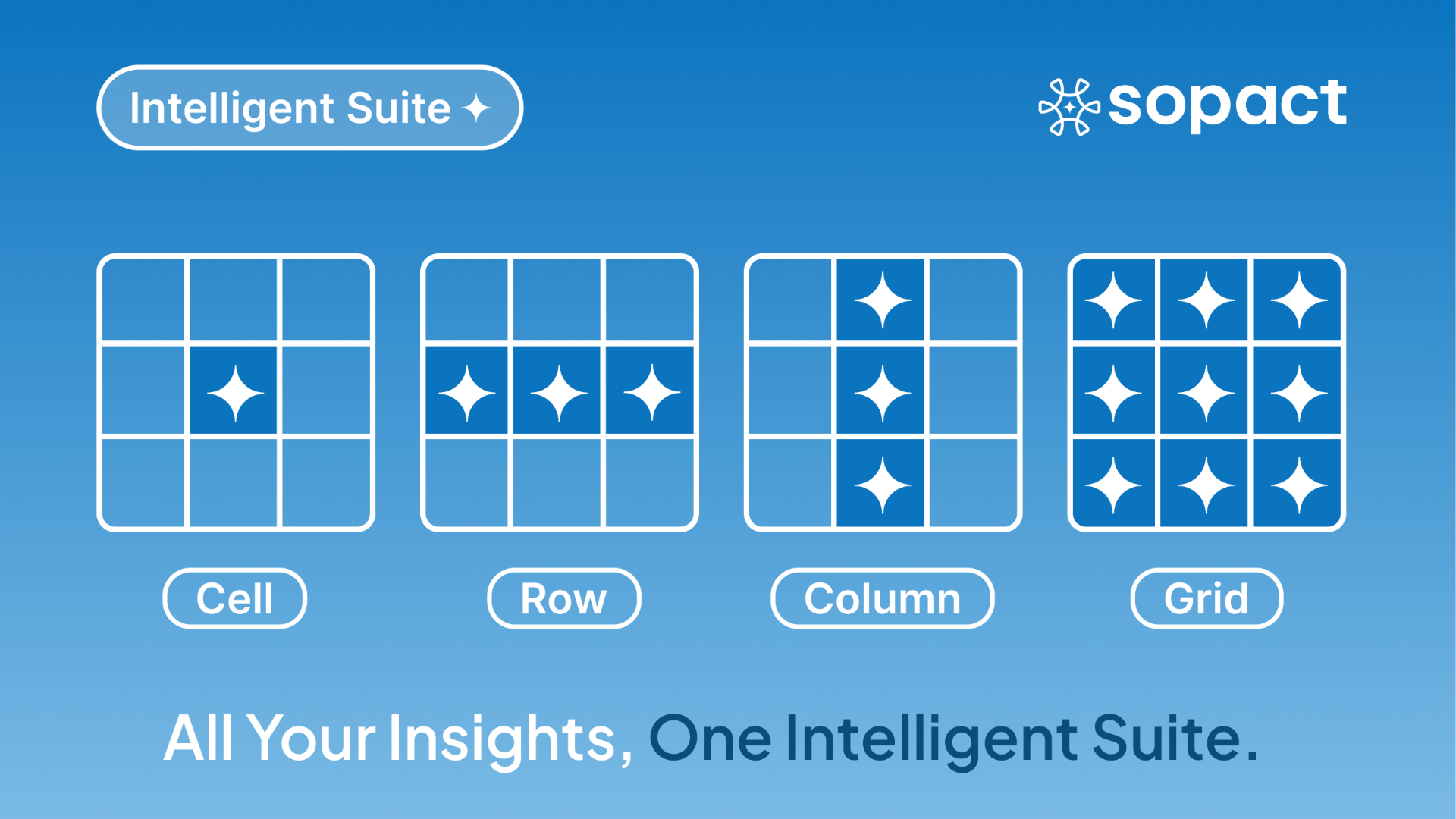
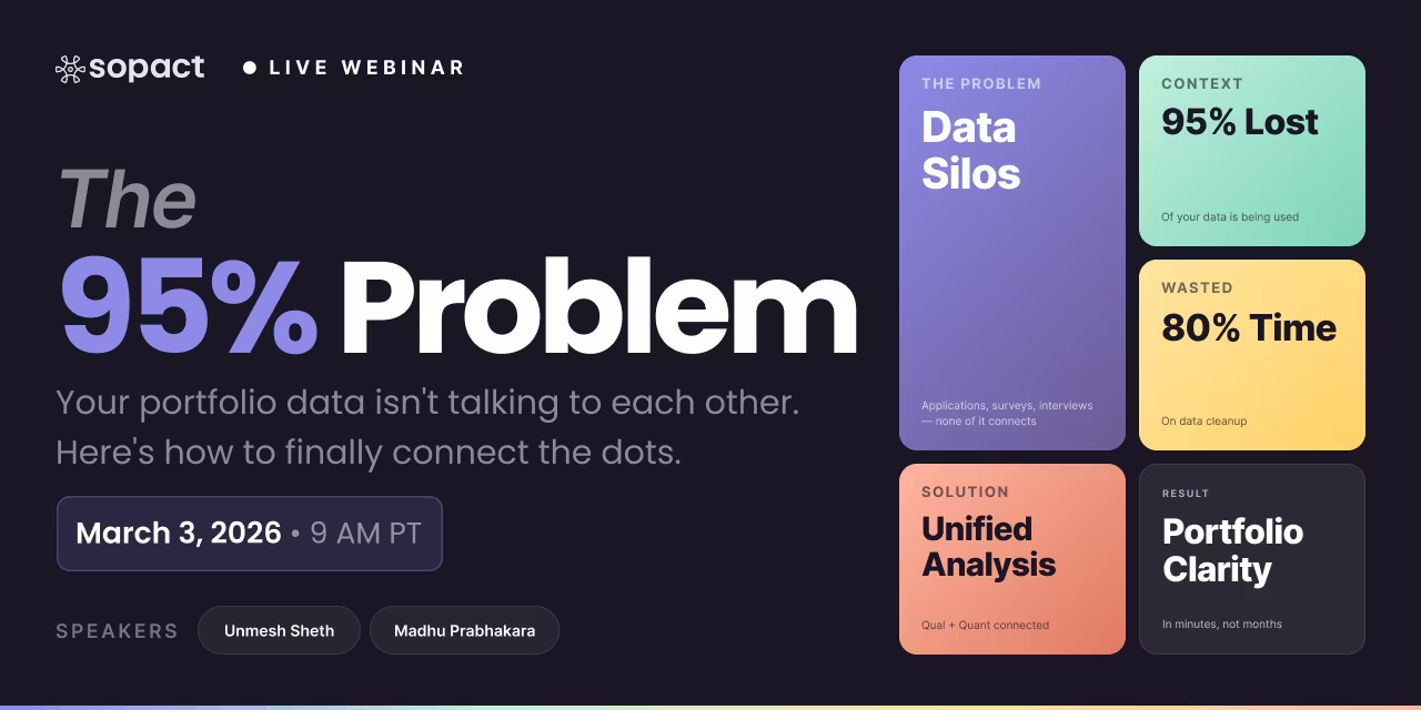
Most organizations struggle with data collected in multiple systems, missing data, wrong data, and teams spending months cleaning to make sense of the data. It is an opportunity loss of NOT delivering the assessment fast. Traditional tools capture numbers but leave context behind. Sopact’s Intelligent Suite, featuring Intelligent Cell, Row, Column, and Grid, bridges this gap by combining real-time qualitative and quantitative insights. Whether you’re analyzing a 50-page report, surfacing themes across hundreds of interviews, or cross-tabulating survey outcomes, the Suite delivers instant, AI-ready analysis. No vendor lock-in, no IT bottlenecks—just answers when you need them most.
Walk into any organization today—an accelerator, a CSR program, or a workforce training provider—and you’ll hear the same refrain: “We have the data, but we can’t make sense of it fast enough.”
Traditional platforms capture numbers but lack context. A Net Promoter Score (NPS) may drop, but the “why” is buried in long-form comments no one has time to code.
The Intelligent Suite—Intelligent Cell, Row, Column, and Grid—was built to end the tradeoff between depth and speed. Instead of picking one, you get both: qualitative nuance and quantitative clarity, in real time.
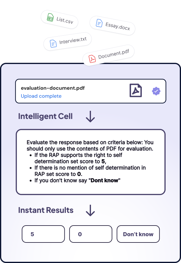
Most organizations collect rich, unstructured information—long reports, hours of interviews, or hundreds of survey responses—but struggle to make sense of it at scale. Intelligent Cell was designed for exactly this challenge.
You can feed it a 100-page PDF document, transcripts from 50 Zoom interviews, or hundreds of survey responses (both open- and closed-ended). Within minutes, Cell transforms that mass of text into structured, comparable insights.
What can you do with Intelligent Cell?
Analysis outputs include:
Example in action:
A workforce development program uploads a 100-page end-of-cohort evaluation report, plus 200 learner survey responses. Intelligent Cell instantly identifies that while confidence scores improved (quantitative), recurring comments flagged childcare conflicts and mentor matching delays (qualitative). These findings are tagged, scored, and exported as structured data—ready for program staff to act on immediately.
If Cell zooms into one data point, Intelligent Row zooms out just far enough to capture the full story of a single person, applicant, or record. It pulls together all the information attached to that row—quantitative scores, qualitative comments, and contextual data—and summarizes it in plain language.
Instead of toggling between spreadsheets, transcripts, and forms, program staff or evaluators see a holistic profile they can act on immediately.
What can you do with Intelligent Row?
Example in action:
A customer success team wants to understand churn risk. Intelligent Row pulls together each client’s NPS rating, SLA metrics, and recent support tickets. For one at-risk account, the summary reads:
“Churn risk score at 74; comments flag billing confusion and delayed responses. Account improved slightly after the roadmap call, but remains negative.”
In a workforce program, another row might summarize: “Participant confidence rose from low to high, attendance consistent at 92%, mentor notes highlight strong presentation skills. Ready for employer screening.”
By giving each row a human-readable story, organizations move from staring at fragmented data to prioritizing the right individuals, risks, or opportunities in real time.
If Cell focuses on one data point and Row captures one person’s journey, Intelligent Column looks across the dataset—aggregating one field at a time to reveal patterns, comparisons, and drivers of outcomes. It turns hundreds of scattered responses into structured insights you can immediately act upon.
What can you do with an Intelligent Column?
Example in action:
By examining one column at a time, organizations can move from raw lists of responses to comparative insights—identifying what changes over time, what barriers matter most, and what drivers most influence outcomes.
Where Cell gives precision, Row gives context, and Column shows patterns, Intelligent Grid ties everything together. It enables cross-table analysis—comparing multiple metrics, time periods, and participant groups in a unified, BI-ready format. This is where qualitative depth and quantitative breadth meet.
What can you do with Intelligent Grid?
Example in action:
By bringing every variable into one unified view, Intelligent Grid transforms disconnected metrics into a program effectiveness dashboard—a living map of what’s working, where gaps remain, and how strategies should evolve.
[.p-box-wrapper][.p-box][.p-box-block][.c-text-star][.c-text-star][.p-title-5]Sopact AI-powered intelligence for every layer of your data[.p-title-5][.p-button-modal]Click Here[.p-button-modal][.p-box-block][.p-rich][.p-list]Unlock real-time, AI-driven insights across every layer of your data.[.p-list][.p-rich][.p-box][.p-box-wrapper]
Why this matters now
Organizations no longer have the luxury of waiting months for impact reports. Funders, executives, and stakeholders expect clean data, transparent insights, and quick pivots.
The Sopact Sense delivers three core values:
What once took a year with no time left for action can now be done anytime. Continuous learning is finally a reality.
The debate between speed and depth in analysis is over. With the Intelligent Suite, you no longer need to choose.
From a single comment in a PDF to a multi-cohort workforce program, real-time qualitative and quantitative insights are at your fingertips. Built to adapt, easy to use, and free from IT dependency—this is the new standard for data collection and analysis.


