Impact Scorecard: Calculate Impact Scores That Drive Action
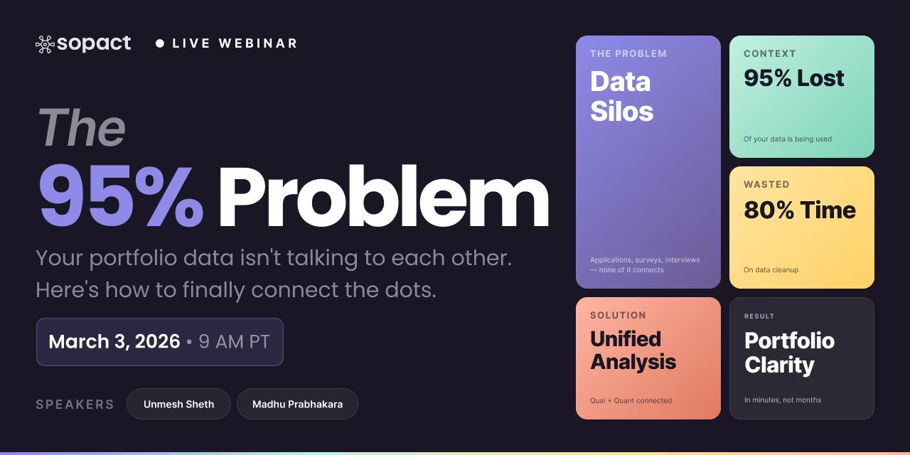
Your funder asks for your impact score at the end of Q1. You open three spreadsheets, a Google Form export, and last year's PDF report. Two hours later, you produce a number — already three months stale — that nobody can act on. That is The Snapshot Trap: a scorecard designed to be filled out at quarter-end, not populated continuously as data arrives. By the time the report is ready, the program has moved on.
This guide covers how to build an impact scorecard that calculates impact scores continuously — across application review, program outcomes, and portfolio SROI — so decision-makers see what's changing, not what changed.
Ownable Concept
The Snapshot Trap
Scorecards designed around reporting moments — quarter-end, board meetings, annual review — capture data too late to act on. By the time the report is assembled, the program cycle has moved on. The Snapshot Trap turns measurement into compliance theater instead of continuous intelligence.
For Nonprofits
For Foundations
For CSR Teams
Application Review
Program Outcomes
Portfolio SROI
80%
of time spent cleaning data, not analyzing it
3 mo
average lag from collection to insight in static scorecards
5%
of available context actually used for decisions
1
Identify Your Scorecard Type
Application review rubric, program outcome tracking, or portfolio SROI — each needs different collection architecture
2
Build the Collection Instrument in Sopact Sense
Rubric criteria, survey waves, and unique participant IDs are structured at the origin — not patched later
3
Scorecard Populates Continuously
Impact scores update as data arrives — no quarter-end assembly, no manual matching, no reconciliation step
4
Generate Funder-Ready Reports in Any Format
One data source produces dashboards, funder exports, and board summaries — automatically
Step 1: What Kind of Impact Scorecard Are You Building?
Three distinct scorecard patterns serve Sopact's primary users. An application review scorecard scores and ranks incoming grant, fellowship, or program applications against a shared rubric before a decision is made. A program outcome scorecard tracks whether enrolled participants are improving on the outcomes your program is designed to produce. A portfolio scorecard aggregates impact scores and SROI ratios across multiple grantees or investees to surface allocation insights. Each pattern requires different data sources, different indicator sets, and different collection timing — but all three share the same structural requirement: participant or applicant identity must be persistent from first contact.
Application Review Rubric
Program Outcome Scorecard
Portfolio SROI Scorecard
Your Situation
What to Bring
What Sopact Produces
High Volume · Manual Review
We get 200+ applications per cycle and reviewers aren't scoring consistently
Program Officers · Review Committee Chairs · Grants Managers
"I'm the Program Officer at a workforce foundation. We receive 280 applications per funding cycle. Five reviewers score each application independently using a Word doc rubric, then we reconcile scores in a committee meeting that takes three days. Inter-rater reliability is low — the same application scores 72 from one reviewer and 51 from another. We need a consistent rubric-based scorecard that all reviewers use in the same system, with AI pre-scoring to anchor calibration."
Platform signal: Sopact Sense application review is the right fit — rubric structure, AI pre-scoring, and reviewer calibration are core features.
Small Pool · Equity Focus
We want to score for equity and community rootedness, not just organizational capacity
Equity-Centered Foundations · Community Development Funders · Participatory Grantmakers
"I'm the Director of Grantmaking at a community foundation. We fund 30–40 organizations per cycle, mostly BIPOC-led. Our current scoring leans toward organizational capacity metrics — financials, staff size, board composition — which systematically disadvantages smaller, grassroots applicants. We need a rubric that weights community trust, lived expertise, and narrative quality alongside capacity. The scorecard should produce an overall impact score that can be defended to our board."
Platform signal: Sopact Sense handles custom rubric weighting well. Rubric dimensions, weights, and scoring scales are fully configurable before the cycle opens.
Simple Cycle · Early Stage
We review fewer than 40 applications per cycle and currently use a shared Google Sheet
Small Community Foundations · Donor-Advised Funds · Fiscal Sponsors
"We're a family foundation. We receive 35–40 letters of inquiry per cycle, and two program staff score them in a shared spreadsheet. The process works, but we're losing track of multi-year applicant history and can't compare this year's pool against last year's."
Platform signal: At under 50 applications per cycle, a structured spreadsheet or Airtable may be sufficient for now. Sopact Sense adds value when longitudinal tracking and AI pre-scoring matter more than cycle-level scoring alone.
📋
Rubric Criteria
Your evaluation dimensions, scoring scale (0–3 or 0–5), and the weight each dimension carries in the total score
📝
Application Form Questions
The specific questions applicants answer — mapped to rubric dimensions so AI pre-scoring knows which field to score against which criterion
👥
Reviewer Roles
Who reviews, who has final authority, and whether reviews are blinded. Conflict-of-interest rules need to be defined before system setup
📅
Cycle Timeline
Open date, close date, reviewer deadline, and decision announcement — Sopact Sense stages access by role at each phase
📊
Prior Cycle Data
Historical scores, funded/declined decisions, and grantee outcomes — used to calibrate rubric weights and set benchmarks for this cycle
🎯
Funding Priorities
Geographic focus areas, demographic priorities, program types, and budget range — filters that structure the scoring pool before review begins
Edge case: If reviewers are community members without professional evaluation backgrounds, plan for a rubric orientation session before review opens. Sopact Sense includes reviewer guidance notes on each rubric dimension.
AI Pre-Scored Application Rubric
Each application pre-scored on every rubric dimension using Intelligent Cell — giving reviewers an anchored starting point rather than a blank form
Composite Impact Score Per Applicant
Weighted total score across all dimensions, updated in real time as reviewer scores are submitted — with inter-rater reliability flag when scores diverge
Ranked Applicant Scorecard
Full pool ranked by composite score, filterable by geography, program type, budget tier, and equity dimensions — sortable for committee review
Longitudinal Applicant History
Prior cycle applications, scores, and decisions linked to each organization's record — so reviewers see multi-year trajectory, not just this cycle's application
Decision Audit Trail
Timestamped reviewer scores, committee overrides, and final decision rationale — exportable for compliance, funder accountability, and DEI reporting
Applicant Feedback Export
Rubric score summary and reviewer notes formatted for declined applicant notification — reduces post-cycle support burden on program staff
Start with these prompts in Sopact Sense
Set up 5-dimension rubric with equity weighting
Pre-score 200 applications against rubric criteria
Flag applications where reviewer scores diverge by 15+
Your Situation
What to Bring
What Sopact Produces
Longitudinal Tracking · Single Program
Our pre/post surveys live in separate spreadsheets and we can't link them to the same participant
Program Directors · M&E Managers · Evaluation Consultants
"I'm the Director of Programs at a workforce nonprofit in Chicago. We run a 14-week job training program with 3 cohorts per year, 45–60 participants each. We survey at intake, at graduation, and at 90-day follow-up. All three surveys are Google Forms. When it's time to build the program scorecard, we manually match rows by name and date of birth. It takes two staff members three weeks. By the time we know how cohort 1 did, cohort 2 is halfway through and we have no idea if it's tracking better or worse."
Platform signal: This is the core Sopact Sense use case. Persistent IDs, linked survey waves, and continuous scoring are built into the collection architecture from day one.
Multi-Site · Standardization Gap
Each of our program sites uses a different data collection tool and we can't compare outcomes
Network Organizations · Multi-Site Nonprofits · Backbone Organizations
"I'm the VP of Programs at a youth-serving network with 8 sites across three states. Each site director designed their own intake form. One uses Typeform, two use paper, three use different Google Forms. Our funder wants a unified program scorecard comparing outcomes across all sites. We have data — we just can't normalize it."
Platform signal: Sopact Sense works here, but the migration from disparate systems requires a standardization workshop before collection begins. Plan for 4–6 weeks of transition before the first unified cohort.
Qualitative-Heavy · Narrative Evidence
We collect rich participant stories but they never make it into our scorecard
Narrative Change Organizations · Arts Programs · Mental Health Nonprofits
"I'm the Evaluation Lead at a mental health nonprofit. Our program model is relationship-based — outcomes show up in participant narratives, not check-box surveys. We have hundreds of open-ended responses from participants describing what changed for them. We've never been able to analyze them at scale. Our scorecard is just numbers. The numbers don't capture what actually happened."
Platform signal: Sopact Sense's Intelligent Cell analyzes open-ended responses at scale, converting narratives into rubric scores and thematic categories automatically. This is the highest-leverage use case for qualitative-heavy programs.
🎯
Outcome Indicators
The specific changes you expect to see — employment at 90 days, retention at 6 months, skill scores, health metrics — with targets and baselines
📋
Survey Wave Design
Pre-program, mid-program, post-program, and follow-up timing. Each wave must be designed before the cohort starts — not retrofitted after
👤
Participant Identity Fields
How participants will be identified across waves — program-assigned ID, DOB + ZIP, or email. Sopact Sense assigns persistent IDs automatically at intake
📊
Disaggregation Dimensions
Gender, race/ethnicity, geography, program type, or cohort — must be collected at intake to appear reliably in the scorecard
💬
Qualitative Questions
Open-ended survey questions mapped to rubric dimensions — "Describe one barrier that almost stopped you from completing the program"
📁
Funder Reporting Requirements
Specific indicators, formats, and submission timelines for each funder. Sopact Sense maps one data collection to multiple report formats
Continuous Outcome Scorecard
Outcome rates — placement, retention, skill gain, health improvement — updated as data arrives from each survey wave, not at quarter-end
Longitudinal Participant Records
Pre-, mid-, and post-program responses linked to the same participant ID — enabling true individual-level change measurement without manual matching
AI-Coded Qualitative Evidence
Open-ended responses analyzed by Intelligent Cell into themes, sentiment, and rubric scores — surfacing "why" alongside "what" in the scorecard
Cohort Comparison Report
Cohort 1 vs. Cohort 2 vs. Cohort 3 outcome rates, disaggregated by gender, geography, and program type — identifying what's improving between cycles
At-Risk Participant Flags
Participants showing early risk indicators — attendance gaps, declining assessment scores, housing instability responses — flagged mid-program when intervention is still possible
Multi-Funder Report Exports
One cohort dataset generates DOL common measures, foundation scorecard, and city contract deliverable reports in each funder's required format automatically
Start with these prompts in Sopact Sense
Set up 3-wave survey for 14-week workforce cohort
Analyze cohort 1 open-ended responses for barrier themes
Compare 90-day placement rates across all 3 cohorts
Your Situation
What to Bring
What Sopact Produces
Funder · Portfolio Comparison
We fund 12–20 grantees and can't compare outcomes across the portfolio because each reports differently
Program Directors · Portfolio Managers · Family Office Advisors
"I'm the Portfolio Director at a housing-focused foundation. We fund 17 nonprofits across two states. Each submits annual reports in their own format. We know collectively we served 4,200 people this year, but we have no idea which grantees are producing the strongest housing stability outcomes, which are struggling, and whether our $8M is generating sufficient social return. We need a portfolio scorecard that makes outcomes comparable without forcing every grantee to adopt the same data system."
Platform signal: Sopact Sense standardizes collection across grantees using a shared instrument while preserving program-specific supplements. Portfolio SROI ratios are directly comparable because all grantees use the same proxy values and adjustment parameters.
Impact Investor · SROI Calculation
We need an auditable SROI ratio for each portfolio company at year-end
Impact Fund Managers · CDFI Loan Officers · Social Enterprise Investors
"I manage a $25M impact fund with 11 portfolio companies across workforce, housing, and financial inclusion. Each company tracks its own metrics. Our LPs expect an annual portfolio SROI report with individual company ratios and an aggregate. We've been hiring an evaluation consultant to produce this — it takes 4 months and costs $40K per year. We need an SROI scorecard system that updates continuously as data arrives from each portfolio company."
Platform signal: Sopact Sense builds the SROI calculation framework — proxy values, deadweight, attribution, displacement — once per portfolio. As portfolio companies submit outcome data, ratios update automatically without consultant involvement.
Accelerator · Cohort Benchmarking
We run 2 accelerator cohorts per year and want to benchmark impact scores across cohort graduates
Accelerator Directors · Fellowship Program Managers · Incubator Staff
"I direct a social enterprise accelerator. We run 2 cohorts of 15 ventures per year. At graduation we produce an impact scorecard for each venture, but they're all structured differently. We want to benchmark this year's cohort against last year's on key metrics — jobs created, revenue growth, community reach — and show investors a portfolio impact score."
Platform signal: Sopact Sense standardizes the venture scorecard template across cohorts so year-over-year comparison is automatic. The portfolio impact score aggregates across all active ventures weighted by investment size.
📊
Shared Outcome Framework
The 3–6 outcome indicators all grantees or portfolio companies will report against — must be defined before collection begins, not after reports arrive
💰
SROI Proxy Values
Financial proxies for each outcome — sourced from government databases (HUD, BLS, AHRQ) — with deadweight, attribution, and displacement parameters documented
🗓️
Grantee Reporting Timeline
When each grantee or portfolio company submits outcome data — quarterly, semi-annual, or annual — and what happens to the portfolio scorecard when data is late
🌍
Secondary Data Sources
Regional labor statistics, county unemployment rates, transit access scores, or industry benchmarks that contextualize each grantee's results in their local environment
⚖️
Weighting Logic
How grantees are weighted in portfolio aggregation — by investment size, population served, or program intensity — so the portfolio impact score reflects reality
👥
Stakeholder Access Tiers
Who sees what: grantee staff see their own scorecard; portfolio managers see all; board members see aggregate with anonymized grantee data
Individual Grantee SROI Ratios
SROI ratio per grantee or portfolio company — comparable across the portfolio because all use the same proxy values, deadweight, and attribution parameters
Portfolio Aggregate Impact Score
Weighted portfolio SROI with 95% confidence interval from sensitivity analysis — updated as grantee data arrives, not at annual review
Cross-Portfolio Pattern Detection
Intelligent Column identifies which program model features — transit proximity, cohort size, employer partnerships — correlate with higher SROI across the portfolio
Underperformer Flags with Cause Analysis
Grantees below portfolio threshold flagged with AI-identified contributing factors from their qualitative survey responses — not just a red number
Proxy Defense Documentation
Every proxy value, its source, and adjustment parameter rationale documented in an auditable record — shareable with LPs, boards, and independent evaluators
Board and Investor Scorecard Export
One-page portfolio impact score summary with individual grantee rankings, total social value created, and comparison to prior year — formatted for board presentation
Start with these prompts in Sopact Sense
Build shared outcome framework for 17 housing grantees
Assign SROI proxies using HUD and BLS data sources
Generate Q3 portfolio scorecard for board meeting
The Snapshot Trap: Why Most Impact Scorecards Fail Before They Start
The Snapshot Trap is the structural flaw in scorecards designed around reporting moments — quarter-end, annual review, board meeting — rather than continuous data collection. When a scorecard is built to be assembled at period-end, the participant-level context that makes course correction possible has already evaporated.
Here is what the Snapshot Trap looks like in practice. A workforce nonprofit surveys participants at intake and at 90-day follow-up. The pre-survey and post-survey live in separate CSV exports. When it's time to build the scorecard, a staff member manually matches rows by name and date of birth — the "Which Sarah is this?" problem. Three weeks of cleanup later, the scorecard shows what happened to cohort 1. Cohort 2 is halfway through and nobody knows whether it's tracking better or worse.
The Snapshot Trap compounds across programs. A CSR team collecting supplier audit data in one format, grantee reports in another, and employee volunteer hours in a third cannot produce a unified CSR scorecard without weeks of reconciliation. The data exists. The insight doesn't — because the collection architecture was designed for compliance, not continuity.
Sopact Sense eliminates the Snapshot Trap at its root. Participants and applicants enter the system with a unique persistent ID at their first interaction — application, intake survey, or enrollment form. Every subsequent touchpoint — mid-program check-in, post-program survey, 90-day follow-up — links automatically to the same ID. The scorecard populates continuously. There is no assembly step.
Step 2: How Sopact Sense Builds Your Scorecard
Sopact Sense is the origin system for impact scorecards, not a destination for data you've already collected elsewhere. The distinction matters because every scorecard failure traces back to collection — dirty data, disconnected identity, missing qualitative context — and none of those failures can be fixed downstream.
For an application review scorecard, evaluation rubric criteria are built inside Sopact Sense before the application window opens. Applicants complete structured forms whose fields map directly to rubric dimensions — organizational capacity, theory of change quality, measurement plan rigor, community rootedness. Intelligent Cell scores each open-ended response against the rubric automatically, producing a 0–3 score per dimension per applicant. Reviewers see a pre-scored summary, not a pile of PDFs. The final application scorecard ranks applicants by total rubric score, disaggregated by program type, geography, and budget tier. Carnegie Mellon University closed a $12K/year application management engagement in one day using this workflow for an NFL-funded program.
For a program outcome scorecard, participants enter with unique IDs at intake. Sopact Sense then administers pre-program, mid-program, and post-program surveys — all linked to the same participant record, with no manual matching required. Intelligent Column aggregates open-ended responses about barriers, confidence, and coaching quality into themes and rubric scores across the cohort. The program outcome scorecard shows outcome rates (placement, retention, wage gain), qualitative themes by cohort, and week-by-week trend lines — not a quarterly snapshot.
For a portfolio or SROI scorecard, Sopact Sense collects standardized outcome data from each grantee or investee using a shared instrument, then layers in financial proxies and adjustment parameters (deadweight, attribution, displacement) to calculate SROI ratios that are directly comparable across the portfolio. Secondary data — labor statistics, regional wage indices, county unemployment rates — contextualizes each ratio without requiring manual research. The portfolio scorecard updates as grantee data arrives, not on an annual cycle.
Learn how these workflows apply to nonprofit impact measurement, program evaluation, and impact investment examples.
Step 3: What Your Impact Scorecard Produces
Application Review
Program Outcome
Portfolio SROI
Program Officer — Setup Prompt
"I'm the Program Officer at a workforce foundation. We receive 280 applications per cycle. Our rubric has five dimensions: organizational capacity, theory of change clarity, measurement plan rigor, community rootedness, and equity alignment. Capacity and equity each get 25% weight; the other three get 16.67% each. Build the application scorecard with AI pre-scoring against each dimension. Reviewers should see the AI score as a starting anchor — not as the final score."
Sopact Sense produces
- Five-dimension rubric scorecard with configured weights — each application form field mapped to its corresponding rubric dimension for AI pre-scoring
- AI pre-score for every applicant using Intelligent Cell — scoring each open-ended response on a 0–3 scale per dimension before any human reviewer opens the file
- Reviewer interface showing AI pre-score, AI rationale, and blank reviewer override field side by side — calibrated starting point, not forced agreement
- Inter-rater reliability flag: when two reviewers' scores on the same dimension diverge by more than 1.0 point, the application is flagged for committee discussion
- Longitudinal applicant record: prior cycle scores and decisions visible to reviewers, with a tag for returning applicants who improved their measurement plan since last cycle
Program Officer — Review Prompt
"Review is closed. All 280 applications have at least two reviewer scores. Generate the ranked applicant scorecard for our committee meeting. Show me the top 40 by composite score. Flag any in the top 40 where equity alignment scored below 1.5 — that's a non-negotiable threshold for us. Also show me if any applicant in positions 41–60 would move into the top 40 if equity weighting were increased to 35%."
Sopact Sense produces
- Ranked scorecard of all 280 applications by weighted composite score — filterable by geography, program type, and budget range
- Top 40 highlighted with equity alignment scores displayed — 3 applications flagged with equity dimension below 1.5 threshold
- Sensitivity analysis: 7 applications in positions 41–60 would enter the top 40 if equity weighting increased to 35% — with their current composite scores and equity scores shown
- Committee-ready export: PDF scorecard ranked by composite score with reviewer notes, AI rationale summaries, and flagged exceptions — formatted for on-screen presentation
Program Officer — Post-Decision Prompt
"Decisions are final. 38 funded, 242 declined. Generate declined applicant feedback letters that include their rubric scores by dimension and one sentence of constructive guidance per dimension where they scored below 1.5. Do not include reviewer names. Also update all 280 applicant records with this cycle's scores so we have a longitudinal baseline for next year."
Sopact Sense produces
- 242 personalized declined applicant feedback letters — each with rubric scores by dimension and dimension-specific guidance for scores below 1.5, no reviewer attribution
- All 280 applicant records updated with this cycle's scores, review notes, and decision — searchable in next cycle's reviewer interface as longitudinal history
- Post-cycle analytics: dimension score distribution across the full pool, identifying which rubric dimension showed lowest overall performance (measurement plan rigor: avg 1.4 out of 3) — informs next year's applicant webinar content
Program Director — Setup Prompt
"I'm the Program Director at a 14-week workforce training nonprofit in Chicago. Cohort 4 starts in three weeks. Our three outcome indicators are: job placement within 90 days (target 68%), six-month wage retention (target 72%), and skill assessment score gain (target 1.8 points on a 4-point scale). Build a linked survey system with intake, graduation, and 90-day follow-up waves — all connected to the same participant ID. Include open-ended questions that Intelligent Cell can analyze for barriers and confidence themes."
Sopact Sense produces
- Three linked survey waves — intake, graduation, 90-day follow-up — with unique participant IDs assigned at first intake response, automatically connecting all subsequent waves
- Intake form with skills assessment baseline, employment history, barrier inventory (transportation, childcare, criminal record, housing), and demographic fields (gender, race/ethnicity, ZIP code)
- Graduation survey with skill assessment post-score, open-ended response: "Describe one thing about this program that most changed how you approach job searching" — mapped to job-readiness rubric in Intelligent Cell
- 90-day follow-up survey (automated reminder at day 85) with employment status, current wage, employer sector, and open-ended: "What almost stopped you from completing the program?" — mapped to barrier rubric
- Program outcome scorecard dashboard: three indicators with targets visible from day one, updating as each wave of data arrives
Program Director — Week 8 Prompt
"It's Week 8 of the 14-week program. 52 participants enrolled. Show me the current cohort outcome scorecard — attendance rates, mid-program assessment scores, and any early risk indicators. Flag anyone with more than two unexcused absences, a declining assessment score trajectory, or a Week 6 barrier check-in mentioning housing instability. I need this before tomorrow's case management meeting."
Sopact Sense produces
- Cohort 4 mid-program scorecard: 52 enrolled, 49 active. Attendance rate 91.3%, average assessment score gain so far 0.9 out of target 1.8 — pacing at 50% of goal at Week 8
- 9 participants flagged for case management: 4 with more than two unexcused absences, 3 with flat or declining assessment score trajectory, 2 with housing instability flag in Week 6 barrier check-in
- Open-ended analysis from Week 6 check-ins: Intelligent Cell finds "transportation" appearing in 34% of responses, "childcare" in 21% — higher than Cohort 3 baseline of 18% and 14% respectively
- Recommendation: transportation barrier spike in this cohort suggests a transit stipend or schedule adjustment could improve the at-risk group's attendance without full curriculum change
Program Director — 90-Day Prompt
"90-day follow-ups are in for 44 of 49 graduates. Generate the Cohort 4 final outcome scorecard. Compare to Cohorts 1–3 on placement rate and wage retention. Show me which employer sectors produced the strongest 90-day placement rates. Also generate the DOL common measures report and the foundation program scorecard — both from the same data."
Sopact Sense produces
- Cohort 4 final scorecard: 90-day placement rate 71% (target 68% — exceeded), 6-month wage retention 68% (target 72% — 4pp below target), average skill score gain 2.1 (target 1.8 — exceeded)
- Cohort comparison: placement rate trend C1 (64%) → C2 (67%) → C3 (69%) → C4 (71%) — consistent improvement. Wage retention flat across all four cohorts (67–71%) — suggests a systemic factor unrelated to curriculum
- Employer sector analysis: healthcare support placements show 6-month retention of 84% vs. logistics/warehousing at 61% — recommends shifting job developer time toward healthcare pathway for Cohort 5
- DOL common measures report: credential attainment, entered employment, employment retention, and median earnings — formatted to DOL specification, ready for submission
- Foundation program scorecard: narrative summary, outcome table, qualitative highlights from Intelligent Cell analysis, and year-over-year comparison — formatted as PDF for funder submission
Portfolio Director — Setup Prompt
"I'm the Portfolio Director at a housing foundation. We fund 17 grantees across two states. Assign financial proxies to our three core outcomes: housing stability maintained at 12 months, ER visit reduction, and employment rate improvement. Use government sources only. Set deadweight conservatively — our region has low emergency shelter availability, so our counterfactual is strong. Attribution at 75% for grantees who are the primary service provider in their catchment area."
Sopact Sense produces — portfolio proxy library locked to all 17 grantees
- Portfolio proxy table (see below) — shared automatically across all 17 grantees; no grantee can change proxy values, ensuring comparability
- Sensitivity analysis showing SROI ratio range if proxy values vary ±20% — gives board a credible range rather than a single point estimate
- Proxy defense memo: each value, its source, and the rationale for deadweight and attribution parameters — formatted for auditor and independent evaluator review
- Grantee-specific adjustment flags: 4 grantees are co-providers with other organizations; attribution drops to 55% for those 4, documented in their individual scorecard records
| Outcome |
Indicator |
Proxy Value (Source) |
Deadweight |
Attribution |
SROI Range |
| Housing stability ≥ 12 months |
% of residents retaining tenancy at 12-month survey |
$18,500/person/yr avoided shelter cost (HUD AHAR) |
22% |
75% |
2.2:1 – 3.8:1 |
| ER visit reduction |
Reported ER visits per resident (pre-post annual survey) |
$1,389/visit (AHRQ HCUP 2023) |
18% |
65% |
0.4:1 – 1.2:1 additive |
| Employment rate improvement |
% employed at 12-month follow-up vs. intake baseline |
$14,200/person/yr wage gain (BLS OES, regional median) |
28% |
60% |
0.8:1 – 2.1:1 additive |
Portfolio Director — Q3 Reporting Prompt
"It's October. 12 of our 17 grantees have submitted Q3 outcomes data. Generate the portfolio SROI scorecard for our board meeting next week. Show individual grantee SROI ratios, portfolio aggregate, and flag any grantee where housing stability is below 65% — that's our program quality threshold. For flagged grantees, show me what their qualitative survey responses say about why stability is low."
Sopact Sense produces
- Portfolio aggregate SROI: 2.9:1 across 12 reporting grantees (95% confidence interval: 2.4:1 – 3.5:1) — all using the same proxy values and adjustment parameters
- Individual grantee SROI rankings: highest 4.1:1 (urban transit-accessible site, 94% housing stability), lowest 1.6:1 (rural site, 58% housing stability)
- 2 grantees flagged below 65% stability threshold: one at 58%, one at 61%. Intelligent Cell analysis of their Q2 open-ended responses identifies "lease renewal barriers" and "landlord discrimination" as dominant themes — not program delivery failures
- Board summary: total social value generated year-to-date across 12 grantees: $4.2M. Estimated full-portfolio total with 5 pending grantees: $5.8M (based on prior-year submission rates)
- 5 pending grantees noted with estimated contribution and historical submission delay — board briefed on projected complete figure
01
Participant Identity Lost Between Waves
Spreadsheet scorecards cannot link pre- and post-survey responses to the same person without manual matching. Longitudinal impact scores become impossible without weeks of cleanup.
02
Manual Aggregation Breaks at Scale
Merging 15 grantee reports into a portfolio scorecard by hand takes weeks. A single format inconsistency corrupts the aggregate. The scorecard is obsolete before it's complete.
03
Qualitative Data Never Analyzed
Open-ended responses about barriers, coaching quality, and confidence sit in CSV columns. Manual coding takes months. The scorecard reports what happened — never why.
04
No Audit Trail for Funder Accountability
Static scorecards have no version history, no data provenance, and no documentation of proxy sources or adjustment parameters. Funder scrutiny exposes methodology gaps.
| Static Scorecard (Spreadsheet / Manual) |
Sopact Sense |
|
Participant Identity
Manual name/DOB matching across waves — 3 weeks of cleanup per cohort
|
Participant Identity
Persistent unique IDs assigned at intake — pre, mid, and post waves link automatically
|
|
Scorecard Update Frequency
Quarterly or annual — data collected, exported, cleaned, merged, formatted. 6–12 week lag
|
Scorecard Update Frequency
Continuous — scorecard updates as data arrives from each survey wave
|
|
Qualitative Evidence
Open-ended responses unread in CSV columns. Manual coding: 6–8 weeks per cohort
|
Qualitative Evidence
Intelligent Cell codes open-ended responses into rubric scores and themes — hours, not weeks
|
|
Portfolio Aggregation
Manual grantee report merge — incompatible formats, weeks of reconciliation
|
Portfolio Aggregation
Standardized collection across all grantees — portfolio scorecard auto-aggregates as data arrives
|
|
Application Review
Word doc rubrics, inconsistent reviewer scoring, no inter-rater reliability tracking
|
Application Review
AI pre-scored rubric with configured weights, inter-rater reliability flags, and longitudinal applicant history
|
|
Funder Reporting
One report per funder, assembled manually from the same data — 3–5 days of formatting work
|
Funder Reporting
One dataset generates DOL common measures, foundation scorecard, and city contract report — automatically
|
|
SROI Calculation
Consultant-built model, $30–60K per year, 4-month timeline. Static once delivered
|
SROI Calculation
Proxy library built once in Sopact Sense, SROI ratios update continuously as grantee data arrives
|
📋
AI-Scored Application Rubric
Rubric criteria built inside Sopact Sense — each open-ended response pre-scored by Intelligent Cell before any human reviewer opens the application
📊
Continuous Program Outcome Scorecard
Outcome indicators — placement, retention, skill gain — tracked against targets with week-by-week trend lines, updated as each survey wave closes
💬
AI-Coded Qualitative Evidence Report
Open-ended responses analyzed by Intelligent Cell into themes, sentiment, and rubric scores — surfacing barrier patterns and coaching quality signals that manual review misses
🗂️
Portfolio SROI Scorecard with Sensitivity Analysis
Individual grantee SROI ratios and portfolio aggregate — comparable because all use the same proxy values — with 95% confidence interval from sensitivity analysis
📁
Multi-Funder Report Exports
One cohort dataset generates DOL common measures, foundation program scorecard, and city contract deliverable report in each funder's required format
🔒
Proxy Defense Documentation and Audit Trail
Every proxy value, its government source, and adjustment parameter rationale documented in an auditable record — shareable with LPs, boards, and independent evaluators
⚠️
At-Risk Flags with Cause Analysis
Participants or grantees below threshold flagged mid-cycle with AI-identified contributing factors from qualitative responses — not just a red number, but a reason and a suggested action
Stop assembling scorecards at quarter-end. Build the collection architecture that makes your scorecard continuous from day one.
Build With Sopact Sense →
Step 4: Scorecard Reporting That Funders Actually Use
Scorecard reporting is where most organizations lose the value they've built. The data exists. The analysis is done. But the report takes three weeks to produce, arrives in a format the funder didn't request, and omits the qualitative evidence that would make the numbers credible. Scorecard reports should be generated from a single live data source, not assembled from exports.
Sopact Sense produces scorecard reports in three formats. The live dashboard format gives program staff a continuous view of outcome rates, flagged participants, and cohort comparisons — updated as data arrives. The funder export format generates a structured PDF or CSV matching each funder's specific reporting requirements, pulled from the same underlying dataset that powers the dashboard. The board summary format produces a one-page evidence overview with key impact scores, SROI ratio, qualitative highlights, and comparison to prior cycles.
The critical design principle is that all three formats draw from the same data. When a program director updates a participant record, the dashboard, the funder export, and the board summary reflect the change without any reconciliation step. This is what makes scorecard reporting sustainable: the 80% of time previously spent on cleaning, matching, and formatting becomes analysis and action.
For organizations managing multiple funder relationships, Sopact Sense maps each data field to each funder's required reporting format automatically. A workforce nonprofit collecting one set of outcome indicators can generate a DOL common measures report, a foundation program scorecard, and a city contract deliverable report — all from the same cohort data. See how this applies to grant reporting and donor impact reports.
Step 5: Common Mistakes and How to Avoid Them
Building the scorecard before designing the collection instrument. Organizations often create a scorecard template, then try to fill it with data that was never collected to match it. In Sopact Sense, the scorecard structure is defined first — which indicators, which rubric dimensions, which outcome targets — and the data collection forms are generated from that structure. The scorecard and the collection instrument are the same system.
Using a single survey instead of linked waves. A single post-program survey cannot measure change — it can only measure current state. Linking a pre-program intake survey to a post-program assessment via unique participant IDs is what makes "impact score" meaningful: it represents a delta, not a snapshot. Sopact Sense enforces this architecture by default.
Treating qualitative data as supplemental. Open-ended survey responses about barriers, confidence levels, and coaching quality contain the highest-value evidence in any scorecard. When Intelligent Cell analyzes a cohort's responses and finds that 71% of participants who didn't achieve the 90-day placement outcome cited transportation barriers — that is an actionable finding. Manual analysis never surfaces it because it takes six weeks. Automated analysis surfaces it in hours.
Setting proxy values without documentation. SROI scorecards that cannot explain their deadweight, attribution, and displacement parameters cannot withstand funder scrutiny. Sopact Sense documents every proxy value, its source, and the rationale for each adjustment parameter in an auditable record that travels with the scorecard — not in a footnote that gets separated from the report.
Aggregating without disaggregating. A portfolio impact score that averages across all grantees hides the programs that are dragging the average down and the ones that are pulling it up. Effective scorecard analytics disaggregate by geography, program type, cohort, gender, and any other dimension structured at collection. Disaggregation is only reliable when it's built into the collection architecture — retrofitting from an export produces inconsistent segment labels across cycles.
For social impact consulting engagements where the scorecard must hold up to independent evaluation, these principles separate credible impact measurement from compliance theater.
Frequently Asked Questions
What is an impact scorecard?
An impact scorecard is a structured measurement system that tracks whether an organization's activities produce the intended outcomes for participants and communities. A modern impact scorecard links participant data, outcome indicators, qualitative evidence, and contextual benchmarks into a single continuously updated evidence base — replacing static quarterly reports with real-time insight that drives program improvement while programs are still running.
What is a social impact scorecard?
A social impact scorecard measures the outcomes a nonprofit, foundation, or CSR program produces for the people it serves — employment rates, income gains, health improvements, educational attainment, or similar metrics aligned to the organization's theory of change. Unlike a balanced scorecard (which measures internal organizational performance), a social impact scorecard focuses on external beneficiary outcomes, structured qualitative feedback, and alignment with social frameworks like SDGs or IRIS+.
How do you calculate an impact score?
An impact score is calculated by comparing actual outcome data against a defined baseline and target for each indicator. For example, if a workforce program sets a target of 65% job placement at 90 days and achieves 72%, the impact score for that indicator is the ratio of actual to target (110%). Aggregated across indicators with weighting, this produces a composite impact score. SROI-based impact scores add financial proxy values and adjustment parameters (deadweight, attribution, displacement) to express value created per dollar invested.
What is the Snapshot Trap?
The Snapshot Trap is the structural flaw in scorecards designed around reporting moments — quarter-end, annual review, board meeting — rather than continuous data collection. When a scorecard is assembled at period-end from exported spreadsheets, the participant-level context that enables course correction has already evaporated. The program has moved on. Sopact Sense eliminates the Snapshot Trap by linking every data touchpoint to a persistent participant ID from the first interaction forward.
What should a CSR scorecard include?
A CSR scorecard should include standardized outcome metrics from grantees and partners, supplier audit results, employee volunteer program outcomes, and secondary benchmarks such as wage indices and regional baselines. Effective CSR scorecards go beyond compliance checkboxes to incorporate qualitative evidence — stakeholder feedback, grievance analysis, and narrative themes coded by AI — so boards can see genuine impact rather than activity counts.
What should an assessment scorecard include?
An assessment scorecard should define the evaluation dimensions (rubric criteria), a scoring scale for each dimension, the data source for each score (application form, interview, site visit, survey), and the weighting logic that produces a composite score. For nonprofit and foundation use, assessment scorecards typically include organizational capacity, theory of change quality, measurement plan rigor, equity alignment, and community rootedness. Sopact Sense structures these rubric dimensions directly in the application form so scores generate automatically rather than from manual reviewer judgment.
How is an impact scorecard different from a balanced scorecard?
A balanced scorecard tracks internal organizational performance across four perspectives: financial, customer, internal processes, and learning and growth. It was designed by Kaplan and Norton for corporate strategy alignment. An impact scorecard measures whether an organization's activities produce positive change for participants and communities — tracking participant outcomes, program effectiveness, and social return. Impact scorecards include longitudinal participant tracking via unique IDs, AI-analyzed qualitative evidence, and alignment with social frameworks like SDGs and IRIS+ — none of which are part of a standard balanced scorecard.
What is scorecard reporting?
Scorecard reporting is the process of generating structured evidence summaries from a live impact scorecard for different audiences: program staff, funders, boards, and public accountability. Effective scorecard reports draw from a single continuous data source rather than assembling from exports — so the live dashboard, funder export, and board summary always reflect the same underlying data without reconciliation. Sopact Sense maps each data field to each funder's required reporting format automatically, allowing one cohort dataset to generate multiple compliant reports.
How do I get my regional teams using standardized scorecards instead of their own systems?
The fastest path to standardization is to build the shared data collection instrument first, not the reporting template. When regional teams collect data inside the same Sopact Sense system using the same forms, the standardized scorecard emerges from the collection architecture rather than from a change management campaign. Teams retain program-specific supplemental questions while contributing to a shared indicator set — so standardization feels like a tool they use, not a compliance requirement imposed on them.
What is a good impact score?
A good impact score is one that represents a meaningful, attributable change for the people a program serves — not simply one with a high number. An SROI ratio of 3:1 in a workforce context, for example, means every dollar invested generates three dollars of social value, accounting for deadweight, attribution, and displacement. What makes an impact score credible is transparent proxy sources, documented adjustment parameters, and longitudinal participant data that traces the change over time. Comparison against sector benchmarks or prior cycles is more meaningful than comparing to an absolute target.
How do I build a program scorecard?
Build a program scorecard in four steps. First, define your outcome indicators and set baseline targets before the cohort begins — use historical data or sector benchmarks if available. Second, design linked survey waves (pre-program, mid-program, post-program, follow-up) inside your data collection system with persistent participant IDs connecting each wave. Third, structure qualitative questions alongside quantitative ones so AI analysis can surface barriers and themes automatically. Fourth, define your reporting cadence and output format for each audience before the program starts. See program evaluation for detailed indicator frameworks by program type.
What is a portfolio scorecard?
A portfolio scorecard aggregates impact data across multiple programs or grantees to reveal patterns, enable resource allocation, and demonstrate collective impact. Foundations tracking 15 grantees, impact funds monitoring portfolio companies, and accelerators evaluating cohort outcomes all use portfolio scorecards. The critical enabler is standardized outcome collection with contextual secondary data — so grantee-level scores are comparable. Portfolio scorecards built on Sopact Sense update as grantee data arrives and disaggregate automatically by geography, program type, and cohort.
Can AI tools like ChatGPT build an impact scorecard?
AI tools like ChatGPT can draft a scorecard template, suggest indicator sets, and describe rubric frameworks. They cannot collect, store, or link participant data; they cannot administer survey waves and maintain identity continuity across them; and they produce non-deterministic output — the same prompt generates a different scorecard structure each session, making year-over-year comparison impossible. An impact scorecard is not a document; it is a continuous data system. That distinction is where generic AI tools hit their structural limit.
Your next cohort starts in a few weeks.
The Snapshot Trap is built into your scorecard if collection isn't structured before intake begins. Sopact Sense takes 2–3 days to configure — not months.
Start With Sopact Sense →
📊
Build Your Scorecard Before the Data Starts Flowing
The Snapshot Trap is a design problem, not a reporting problem. Sopact Sense structures your application rubric, program outcome tracking, and portfolio SROI framework before your next cycle begins — so your scorecard is live when participants are.
Build With Sopact Sense →
Request a 30-minute demo