


Academy / Measurement & reporting
Course progress and additional readings
Measurement & reporting
You will learn: how to build a theory of change level by level with the assumptions between levels, and show the same model as a logic model, logframe or results framework without rebuilding the evidence.
Who this is for: both sides, right after the onboarding call. The funded partner usually owns the change model; the funder needs it in the format its board or its own donors expect. You bring the draft theory of change from the onboarding call.
What is a theory of change, and how is it different from a logic model?
In short: a theory of change explains why your work should lead to a change and what must be true along the way. A logic model, a logframe and a results framework lay out the same chain in different boxes.
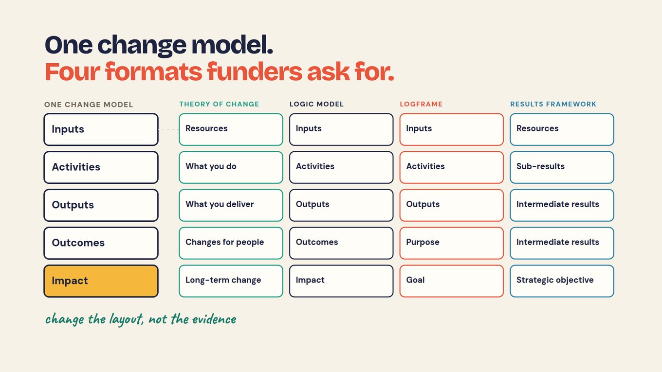
Most confusion comes from treating them as four documents. They share one skeleton: inputs, activities, outputs, outcomes and impact. What differs is the labels, how much room each gives to assumptions, and whether indicators sit in the same table.
How do you build a theory of change, step by step?
In short: start from the long-term change and the people who would experience it, work backward to the earlier changes that lead there, then connect your activities and write the assumption under each arrow.
Starting from your workshops gives you a list of activities. Starting from the change forces the question every funder will ask: why would this work lead there?
01 · THE CHANGE
Name the long-term change and who experiences it: graduates in living-wage jobs.
02 · WORK BACK
List the earlier changes it needs: retained at 12 months, placed within 90 days, certified.
03 · ACTIVITIES
Connect what you do: training and mentoring.
04 · ASSUMPTIONS
Under each arrow, write what must be true for the next step to follow.
05 · ONE QUESTION
Pick the assumption that would most change your plan if it were wrong.
Workforce fund example, fictional: training and mentoring → certification → placement within 90 days → retained at 12 months → living-wage jobs.
Ask the people affected what a useful outcome means to them. Graduates may value a steady schedule as much as the wage. An AI tool can organize their input into the model; it cannot supply views nobody collected. The Center for Theory of Change describes the same backward method in more depth.
How do you write each level, and the assumptions between them?
In short: write each level as something you could observe, keep what you deliver separate from what changes for people, and write the condition that links each level to the next.
| Level | Workforce model | Assumption to reach the next level |
|---|---|---|
| Inputs | Trainers, mentors, employer contacts | Staff and funding are in place for each cohort |
| Activities | Training and mentoring | Content matches what local employers hire for |
| Outputs | People enrolled, completed training, certified | Employers recognize the certification |
| Outcome | Placed in a job within 90 days of exit | The job fits the person, so they stay |
| Outcome | Retained in the same job at 12 months | The job, or the next one, pays a living wage |
| Impact | Graduates in living-wage jobs | The change the partner named on the call |
Workforce fund example, fictional. Inputs and assumptions are illustrative.
Keep delivery and change apart. Attendance tells you someone took part; it does not tell you their skills improved. Enrolled and completed are outputs the program controls. Placement and retention are outcomes that also depend on employers and on each graduate's life.
Separate the intended pathway from observed results. A count of people placed supports a statement about the people you reached. It does not prove the training caused the job, so write the assumption down rather than letting a clean diagram imply it.
Investigate the assumption that could change your plan.
In the example, "suitable jobs are within reach" matters more than which day workshops run. If it is wrong, placements stall however good the training is. Ask what records already exist before adding a survey, and name who will look and by when.
How does the same model look as a logic model, logframe or results framework?
In short: the levels stay the same and the labels change. A logframe calls outcomes and impact "purpose" and "goal" and puts indicators beside each row; a results framework reads from a strategic objective down.
| Logic model | Theory of change | Logframe | Results framework |
|---|---|---|---|
| Inputs | Resources | Inputs | Resources |
| Activities | What you do | Activities | Sub-results |
| Outputs | What you deliver | Outputs | Intermediate results |
| Outcomes | Changes for people | Purpose | Intermediate results |
| Impact | Long-term change | Goal | Strategic objective |
A logframe adds columns to each row: an indicator, the means of verification (where the number comes from) and the assumptions. Here is the workforce model as a logframe; the assumptions column comes straight from the table above.
| Logframe row | Narrative summary | Indicator | Means of verification |
|---|---|---|---|
| Goal | Graduates in living-wage jobs | Starting wage, hourly, by track | Placement survey |
| Purpose | Graduates placed and still employed | Placed within 90 days; retained at 12 months | Placement survey; 12-month follow-up |
| Outputs | Trained, certified participants | Enrolled (unique people); completed training | Enrollment form; completion record |
| Activities | Training and mentoring | Not in the agreement | Program records |
| Inputs | Trainers, mentors, employer contacts | Not in the agreement | Budget report |
RESULTS FRAMEWORK · FICTIONAL EXAMPLE
You will meet logframes most often in international development and government grants, and logic models in program planning; the CDC's guide to describing the program uses one.
What do you do when a funder asks for a format you don't use?
In short: re-lay the same evidence in their layout. Keep one model, one set of definitions and the same records; change only the labels and the order.
A new logframe from scratch, new wording for each outcome and a new indicator that means almost the same thing. By year two, two funders see two slightly different placement numbers.
The same five levels under the funder's labels, the same indicators from the agreement, the same sources. One placement number, shown in two layouts.
An AI tool handles the relabelling well if you forbid it to change the content, as the prompt below does.
Prompt · paste into Claude, ChatGPT or your AI tool
Below are our theory of change and the reporting agreement that goes with it. Lay the same model out as a [LOGFRAME / RESULTS FRAMEWORK / LOGIC MODEL].

Rules:
1. Do not change any outcome, definition, time window or number. Change only labels and layout.
2. Map our levels in order: inputs, activities, outputs, outcomes, impact.
   Logframe: Inputs, Activities, Outputs, Purpose, Goal.
   Results framework: Resources, Sub-results, Intermediate results, Strategic objective.
3. For a logframe, give each row four columns: narrative summary, indicator, means of verification, assumptions. Take indicators and sources only from our agreement, and assumptions only from our model.
4. If the format asks for something we do not have, such as a target or a baseline, write "not in our model". Do not invent it.
5. End with a list of every place the new layout forced a choice, so we can check it.

Our theory of change:
[PASTE]

Our reporting agreement:
[PASTE]

The funder's template, if they sent one:
[PASTE, OR WRITE "NONE"]
Where do the indicators come from?
In short: from the model. Each output and outcome gets an indicator, and those indicators become the rows of the reporting agreement and the entries in the data dictionary.
In the example, the five metrics of the agreement sit on the model: enrolled and completed training are outputs, placement and retention are outcomes, and starting wage by track speaks to the long-term change. If a metric has no level, ask why you collect it. If a level has no indicator, it is an assumption you have not yet tested.
Each indicator then needs one definition both sides count the same way, a dimension and, where one fits, a standard code. That is the next chapter, a shared data dictionary. The Center for Theory of Change also has a worked note on developing indicators.
ASK ANY TOOL, INCLUDING OURS
Paste your model and your agreement into any AI tool and ask: "Which level has no indicator, and which indicator has no level?" In Sopact Sense, the answer can be checked against real records: each participant keeps one ID from the first form, so enrollment, completion, placement and follow-up sit on the same person and every line of an answer links to a record you can open.
What this cannot do. A model is a claim about how change happens, not proof that it did. A neat diagram can make a doubtful connection look settled, and moving it into a logframe adds no evidence. Treat each arrow as a question your reports will answer over time.
Try it on your own reporting
- Write your long-term change in one line, and name who experiences it.
- Work back to three or four earlier changes, then add your main activity.
- Under each arrow, write one assumption.
- Take the format one of your funders asks for and put your levels under its labels.
- Mark any row where the format asks for something your model does not have.
Check your reasoning
In the workforce example, the logframe's purpose row holds two outcomes: placed within 90 days and retained at 12 months. The goal row holds the long-term change, living-wage jobs, measured by starting wage by track. Nothing was rewritten; the 90-day window and the 12-month window are the same ones in the agreement. If your re-laid table shows a different window or a new indicator, the layout changed the evidence, and that is the row to fix.
Questions teams ask
Is a logic model the same as a theory of change?
They describe the same chain. A theory of change puts the weight on why each step should lead to the next, so it gives more room to assumptions and the people affected. A logic model puts the weight on delivery, as a table of inputs, activities, outputs and outcomes. Build the theory of change first, because the logic model is quicker to check once the reasons are written down.
What is the difference between a logframe and a logic model?
A logframe, or logical framework, is a matrix. It uses goal, purpose, outputs and activities as rows, and adds indicators, means of verification and assumptions as columns. A logic model is usually a simpler chain without those columns. The levels match, so a logic model plus your reporting agreement already holds most of what a logframe asks for.
What is a results framework?
A results framework starts at the top with a strategic objective and branches down to the intermediate results and sub-results that lead to it. It is common with large public donors. In the workforce example, the strategic objective is graduates in living-wage jobs, the intermediate results are people certified, then placed within 90 days and retained at 12 months, and the sub-results are the training and mentoring delivered.
Do we need a separate model for each funder?
No. Keep one model and one set of definitions, and re-lay them in each funder's format. If a funder asks for an outcome you do not track, add it to the model once, with its definition, instead of creating a second model. Separate models drift apart and soon report different numbers for the same people.
How often should we update the theory of change?
Review it once a year, or when evidence changes one of your assumptions. Record the date, what changed and who approved it, and keep the earlier model with the reports that used it. Then anyone reading last year's report can see which pathway it assumed.