
Sopact is a technology based social enterprise committed to helping organizations measure impact by directly involving their stakeholders.
Useful links
Copyright 2015-2025 © sopact. All rights reserved.

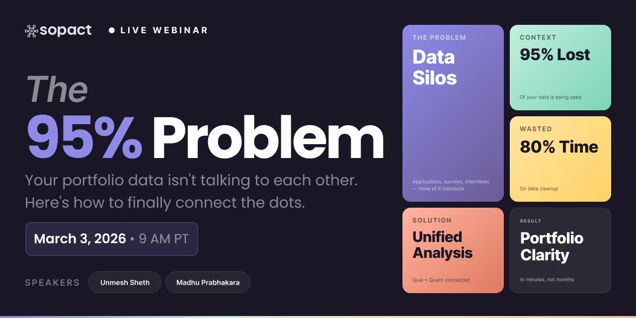
New webinar on 3rd March 2026 | 9:00 am PT
In this webinar, discover how Sopact Sense revolutionizes data collection and analysis.
Transform survey feedback into measurable insights with AI-powered analysis. Learn how to collect, analyze, and act on structured and open-ended feedback.
Place Sopact YouTube video embed here (end of introduction):
Video: https://www.youtube.com/watch?v=pXHuBzE3-BQ&list=PLUZhQX79v60VKfnFppQ2ew4SmlKJ61B9b&index=1&t=7s
A feedback survey is a structured data collection instrument that captures both quantitative ratings and qualitative open-ended responses from participants, customers, employees, or stakeholders. Unlike basic satisfaction polls, a well-designed feedback survey connects responses to unique participant identities, enabling longitudinal tracking, pre-post comparison, and AI-driven theme analysis that transforms raw text into measurable patterns.
The challenge most organizations face isn't collecting survey feedback—it's making sense of it. Open-ended responses pile up in spreadsheets, quantitative scores sit disconnected from the "why" behind them, and teams spend 80% of their time cleaning and merging data before any real analysis begins.
Effective feedback surveys share several characteristics that separate them from simple questionnaires. They capture both structured data (ratings, scales, multiple choice) and unstructured data (open-ended text, uploaded files, interview notes) within a single instrument. They maintain persistent unique participant IDs so that a respondent's baseline answers connect to their follow-up responses months or years later. And they produce analysis-ready data—clean at the source—so teams can focus on insights rather than cleanup.
The feedback survey meaning goes beyond "asking questions and collecting answers." In a modern data-driven organization, a feedback survey is the entry point for an entire intelligence pipeline: collection → validation → AI analysis → correlation → reporting. When designed correctly, survey feedback becomes the foundation for understanding not just what stakeholders think, but why they think it, how their perspectives change over time, and what actions produce measurable improvement.
Here are concrete examples of how organizations use feedback surveys across different contexts:
Most organizations spend 80% of their survey analysis time on data preparation—not actual analysis. Raw exports from SurveyMonkey, Google Forms, or Qualtrics arrive with inconsistent formatting, duplicate entries, missing fields, and no connection between responses collected at different time points. Teams manually clean, merge, and restructure data in spreadsheets before they can even begin to look for patterns.
This isn't a productivity issue—it's a structural failure. When your data collection creates fragmented, disconnected datasets, no amount of downstream dashboard sophistication produces meaningful insight. The architecture is broken before analysis begins.
Organizations collect open-ended feedback because they know it contains the richest insights. But when 500 participants each write a paragraph about their experience, who reads all of it? In practice, qualitative survey feedback gets sampled, skimmed, or ignored entirely. The "why" behind the numbers—the most valuable part of any feedback survey—disappears into unread spreadsheet columns.
Traditional tools treat open-ended text as an afterthought. They collect it but provide no way to systematically analyze it at scale. To extract themes, organizations resort to manual coding (weeks of work), expensive QDA software like NVivo ($1,800+ per license), or simply cherry-picking quotes that support pre-existing conclusions.
A training program sends a pre-survey, a mid-point check-in, and a post-survey. Each uses a generic survey link. There's no automated way to connect one participant's pre-survey answers to their post-survey answers. Manually matching responses across touchpoints—by name, email, or ID—takes hours and introduces errors.
This fragmentation means organizations can't answer their most important questions: How did individual participants change? What baseline characteristics predict better outcomes? Which program elements drove the greatest improvement? Without persistent participant IDs linking every touchpoint, these questions remain unanswerable at scale.
Sopact Sense reimagines the feedback survey pipeline from collection through analysis. Instead of bolting AI onto broken data architecture, it solves the data problem first—then applies intelligence at every level.
Every feedback survey response enters the system validated and structured. Unique participant IDs are assigned automatically at first contact, ensuring that a participant's application, pre-survey, mid-survey, post-survey, and follow-up are all linked under one persistent identity. Data validation rules catch errors and incomplete responses before they enter the dataset—not after.
This eliminates the 80% cleanup tax entirely. Teams go from "raw export that needs weeks of cleaning" to "analysis-ready data available the moment responses come in."
Sopact's Intelligent Suite processes survey feedback at four layers:
Whether you're processing 50 responses or 5,000, the system scales without additional manual work. Scalable systems capturing structured and open-ended feedback mean that AI analysis runs automatically as data arrives—not as a batch process weeks later. Real-time reporting shows emerging themes, changing sentiment, and outcome patterns as participants submit their survey feedback.
Building a standard operating procedure for feedback collection ensures consistency, data quality, and actionable results. Here's a practical framework:
Start with outcomes, not questions. What decisions will this feedback inform? What changes do you need to measure? What stakeholder perspectives matter most? Map your feedback survey to a clear theory of change so every question connects to an actionable insight.
Structure your feedback survey so responses connect over time. Assign unique participant IDs at first contact. Design pre/post survey pairs with matched questions so deltas can be calculated automatically. Include both scaled ratings (for quantitative measurement) and open-ended prompts (for qualitative depth).
Configure data validation rules so errors are caught during submission—not discovered months later during analysis. Required fields prevent incomplete responses. Range checks ensure numeric entries make sense. File upload requirements ensure supporting evidence is captured alongside survey data.
Configure Intelligent Cell rules for open-ended responses before launching your survey. When a participant writes about their experience, AI should immediately extract themes, score sentiment, and apply your custom rubrics. This transforms open-text feedback into structured, comparable data automatically.
Real-time dashboards show patterns as they emerge. Don't wait for the survey period to close before reviewing results. Monitor experience through interviews and open-ended feedback continuously, identifying issues early and adjusting programs in real time rather than discovering problems in a retrospective annual report.
Understanding the relationship between survey feedback and interview feedback analytics helps organizations design comprehensive feedback systems.
Surveys and feedback play a critical role in measuring how content, programs, and services actually perform from the stakeholder's perspective. While analytics tools can show engagement metrics (views, clicks, time on page), only direct stakeholder feedback reveals whether content achieved its intended impact—whether participants learned something, changed behavior, or gained confidence.
In program evaluation specifically, feedback surveys provide the "voice of the participant" that quantitative metrics alone cannot capture. When a training program shows 85% completion rates, survey feedback tells you whether completers actually found the content useful, whether they feel more confident in the skills taught, and what specific elements drove their engagement or caused frustration.
For organizations using Sopact Sense, feedback surveys become part of a continuous performance measurement system. Rather than annual satisfaction surveys that produce stale insights, feedback is collected at each program touchpoint—application, pre-program, mid-point, post-program, and long-term follow-up. AI analyzes open-ended responses in real time, correlating qualitative themes with quantitative outcomes to surface the "why" behind performance numbers.
The gap between collecting survey feedback and producing actionable insights is where most organizations fail. Raw survey data—even clean, well-structured data—isn't insight. Insight comes from analysis that reveals patterns, explains causation, and points to specific actions.
Impact investors and fund managers face a particular challenge: they collect quarterly reports from portfolio companies but struggle to synthesize narrative updates with financial metrics. With AI-powered analysis, investor feedback becomes actionable insights when the system can correlate qualitative founder narratives ("We pivoted our go-to-market strategy") with quantitative outcomes (revenue growth, team expansion) across the entire portfolio.
The most valuable survey feedback often lives in open-ended text. Tools for open-text feedback to measurable insights use AI to transform unstructured responses into quantified themes. Instead of reading 500 paragraphs, you see that 43% of respondents mentioned "scheduling flexibility" as a barrier, 67% cited "peer support" as a strength, and confidence scores correlate strongly with mentions of "hands-on practice."
Employee feedback surveys generate enormous volumes of qualitative data. Actionable staff survey insights emerge when AI can cluster themes across departments, track sentiment changes over time, and correlate engagement scores with specific workplace factors—all without manual coding or expensive consulting engagements.
A coding bootcamp collects feedback at three touchpoints: application (motivation essay + teacher recommendation), pre-training (baseline confidence and skill self-assessment), and post-training (skill growth, reflection, and artifact submission).
With Sopact Sense, each learner gets a unique ID at application. Their pre-survey confidence scores link directly to their post-survey outcomes. AI analyzes open-ended reflections to surface why some learners improved dramatically while others plateaued. The result: individual progress reports with evidence-backed recommendations, plus cohort-level improvement summaries ready for funders in hours instead of weeks.
An accelerator processes 1,000 applications through four phases: initial application with essay analysis, interview feedback with rubric scoring, mentorship tracking, and outcome documentation.
Traditional process: 12+ reviewer-months for initial screening alone. With AI-powered feedback analysis: every essay and pitch deck scored against rubrics automatically, interview transcripts summarized with claim extraction, and mentor session notes converted to structured progress evidence. Reviewers focus on top candidates instead of administrative triage.
A SaaS company collects NPS scores quarterly alongside open-ended "why" questions. Previously, open-ended responses went unread. With Intelligent Column analysis, AI aggregates thousands of text responses to identify the specific product features, support interactions, and onboarding experiences that drive promoter vs. detractor behavior—linking qualitative themes directly to quantitative scores.
Survey feedback refers to the responses collected through structured questionnaires that capture both quantitative ratings (scales, scores, multiple choice) and qualitative open-ended text from participants. Effective survey feedback goes beyond simple data collection—it connects responses to persistent participant identities, enabling longitudinal tracking and AI-powered analysis that transforms raw responses into actionable insights.
Transform survey feedback into actionable insights by connecting quantitative scores with qualitative open-ended analysis. AI-powered platforms like Sopact Sense automatically extract themes from text responses, correlate them with numeric ratings, and identify the specific drivers behind satisfaction, outcomes, or behavioral changes. This eliminates manual coding and produces evidence-based recommendations in hours instead of weeks.
Traditional survey analysis focuses on aggregating quantitative scores—averages, distributions, cross-tabs. Feedback analytics incorporates AI-powered theme extraction from open-ended text, sentiment scoring, longitudinal tracking across linked survey touchpoints, and correlation between qualitative themes and quantitative outcomes. Interview feedback analytics takes this further by processing transcripts and structured rubric scores simultaneously.
Start by defining the decisions your feedback will inform, then design surveys with persistent unique IDs for longitudinal tracking. Configure data validation at collection time to ensure clean data, set up AI analysis rules for open-ended responses, and establish real-time monitoring dashboards. The SOP should specify collection cadence, analysis triggers, reporting templates, and escalation criteria for negative feedback patterns.
Tools for open-text feedback to measurable insights should offer AI-powered theme extraction, sentiment analysis, and quantification of qualitative patterns. Sopact Sense processes open-ended responses through Intelligent Cell analysis, automatically converting free-text into categorized themes with frequency counts, sentiment scores, and correlation data—eliminating the need for separate QDA software or manual coding.
Monitor experience by collecting feedback at every stakeholder touchpoint—not just end-of-program surveys. Design feedback loops that capture real-time open-ended responses, apply AI analysis as responses arrive, and surface emerging themes before they become entrenched problems. Sopact Sense enables continuous monitoring by linking interview transcripts, survey responses, and document uploads under unified participant profiles.
Surveys and feedback provide the stakeholder perspective that analytics tools cannot capture. While engagement metrics show what users did, feedback surveys reveal whether content achieved its intended impact—learning, behavior change, or confidence gains. AI-powered feedback analysis correlates qualitative responses with quantitative outcomes to identify which content elements drive the greatest measurable impact.
Yes. Modern AI can process thousands of open-ended responses in minutes, extracting themes, scoring sentiment, applying custom rubrics, and identifying patterns that manual analysis would take weeks to discover. The key is architecture—AI analysis must be built into the data collection pipeline, not bolted on as an afterthought. Sopact Sense applies Intelligent Cell analysis at the moment of collection, making open-ended feedback instantly quantifiable and comparable.